*Lyrics from Sweet Pea as sung by Amos Lee of his album called Supply and Demand. I recall hearing this at the end of a movie, but can’t find any proof that that actually happened (seriously, I looked – I might have imagined it). Either way, it’s a sweet little song for a sweet little moment in my blog’s life.

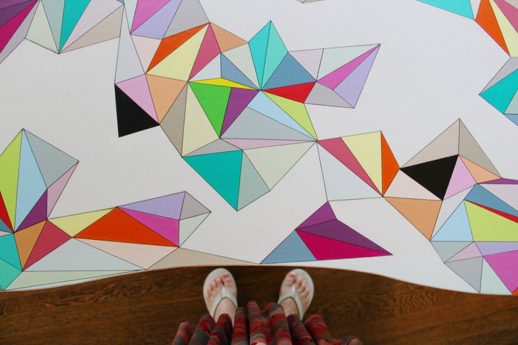
Inspiration point: the design I did for my niece’s desk gave us a direction to go in for the website design.
So, this has been a long time coming. Like, we’ve been working on ideas for this since last last January. January of 2012. Perhaps even longer, I can’t really recall. (I’ve been pinning inspirations and ideas to my color pinboard for years.) In July, we actually set aside some time to work up some (more) designs, and to try out some (more) ideas (turns out I’m hard to please – go figure!). But, life, work, and family obligations took over, and well, it didn’t seem as important as all of that other stuff. Even if it was important.
Anywho, I have a designed site! With a husband who is a talented web designer/technology geek person (don’t ask me what he does, it involves things that look like words, but are color-coded, and arranged in sequential tab-like indentations – whatever, it’s computer stuff), it’s hard to believe that we both allowed my site to look as stock and boring as it did for so long. But, well, his company’s site – an actual business, and not just a hobby – took him and his business partner over a year to design and build (and they’re still fiddling with it), so I shouldn’t really complain. And that was really top priority. Along with the normal workload that keeps my business-owning husband busy most of the year. So, the old adage has been proven true: the cobbler’s children really don’t have any shoes. Unless they wait and save up and then they get the shoes they’ve been wanting for years (provided, of course, that they still have feet to put them on).
Changes: the site is prettier (obvs), the site should be better organized with sections for recipes, portfolio features, and the music quotes that I use as inspiration are now listed for you to explore and devour. (Note: I’m still working on cataloguing past posts, and sorting through years of content. Bear with me if sections aren’t quite ready yet – we wanted to launch the beauty as soon as we could!) Food, music, pretty stuff – what more could you want? Keep in mind that some of the content will take me a bit to wrangle and reorganize, but the basics are there, so hopefully it’ll be a nicer experience for everyone.
Do let me know if there are any issues/problems that you find. My husband may have made time to design and build this (sometimes working through the night while I lay sleeping by his side), but he may not have made time to QA (er, that’s quality assurance to you non-computer-lingo peeps) the entire site for every scenario. He saves that stuff for his paying clients. I hope this will make your reading experience more enjoyable, and hopefully it will entice me to blog more frequently.
Man, remember when blog was a noun, and not a verb?
xoxo


