*Lyrics from I Wish You Love as sung by Frank Sinatra (though the National Youth Jazz Orchestra performance is cheerful and delightful, and certainly worth watching on a day like today). I considered an alternate title – “I wish you shelter from the storm, a cozy fire to keep you warm” – especially because the entire Eastern portion of the US is being battered by yet another bracing, snow-filled, ice-capped, rained upon bit of winter goodness, but I thought the above excerpt was more fitting. I heard this song ages ago and jotted it down to use at the end of something. Today’s weather makes the timing even more apt.
Le sigh. It’s over. This is the last installment of the Project W AFTER Tour (catch up here: master bedroom, kids’ rooms, main floor part one, and main floor part two). I am so proud and grateful that I got to have a hand in the complete transformation of this now gorgeous home. So, now, pictures! (Get ready, this is a long one…)
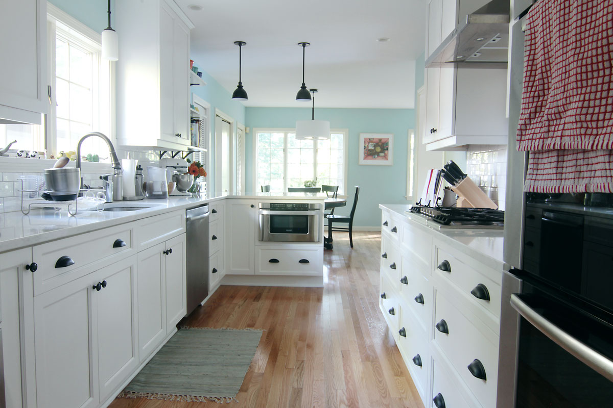
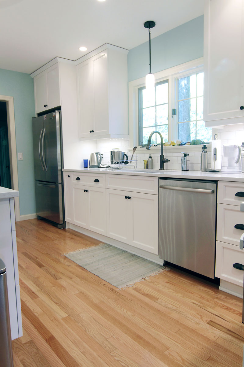
Bright, open, airy, efficient, classic. Hello, new kitchen.
Boom. Project W kitchen. Do you remember it when it looked like this?
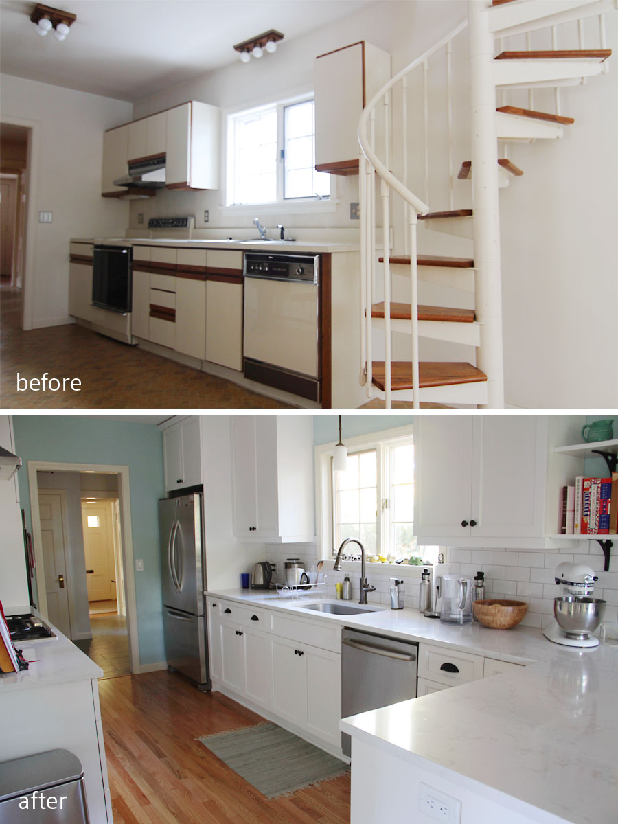
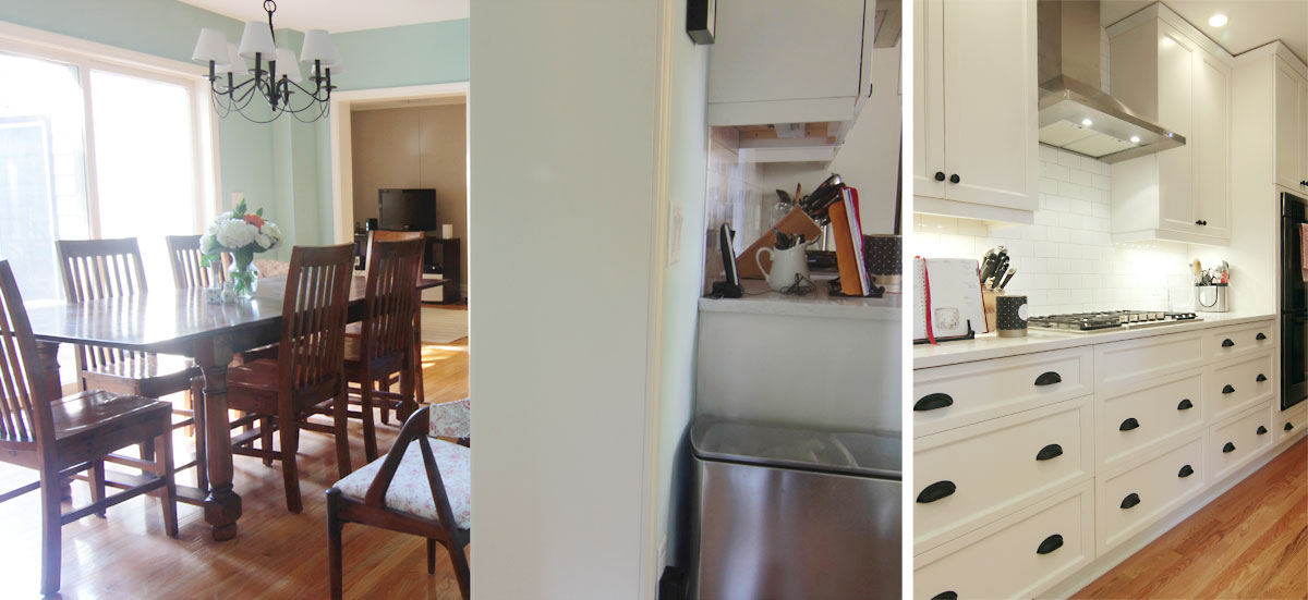
BEFORE: Dated is a kind way of putting what this kitchen looked like. AFTER: Better space planning really took this kitchen into a new world, and a new era.
Sort of major, right? When we toured the space, there was a giant spiral staircase – de rigueur in 1982 – that cut right through what I saw as perfectly usable kitchen real estate. When we first met, the clients – craving brightness, space, and fluidity – wanted to open up the wall between the kitchen and dining room, but I felt that they would lose too much storage space. The kitchen was a galley and, while efficient and completely appropriate to the home, it didn’t exactly ooze storage space. With a tween, a teen, and a big, hungry dog, I knew that losing those uppers would be a risk.
We moved things around to give the kitchen zones – pantry, baking, cooking, cleaning up – while respecting the traditional work triangle.
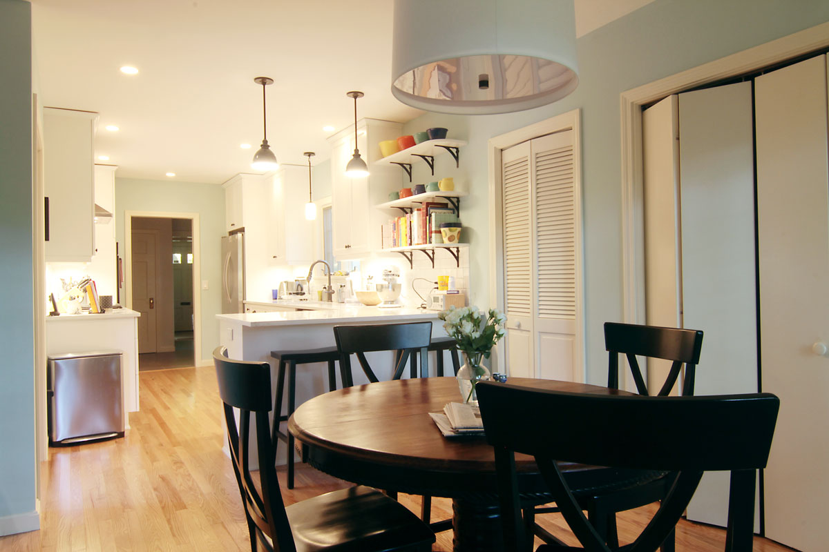
BEFORE: The broker standing (patiently, as I snapped my ‘befores’) in the gross, old kitchen. AFTER: We designated a small area just off the kitchen for a breakfast/game table, or simply another area to camp out and do homework or projects.
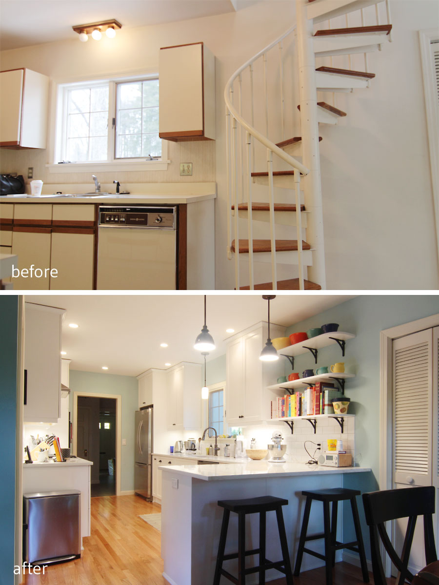
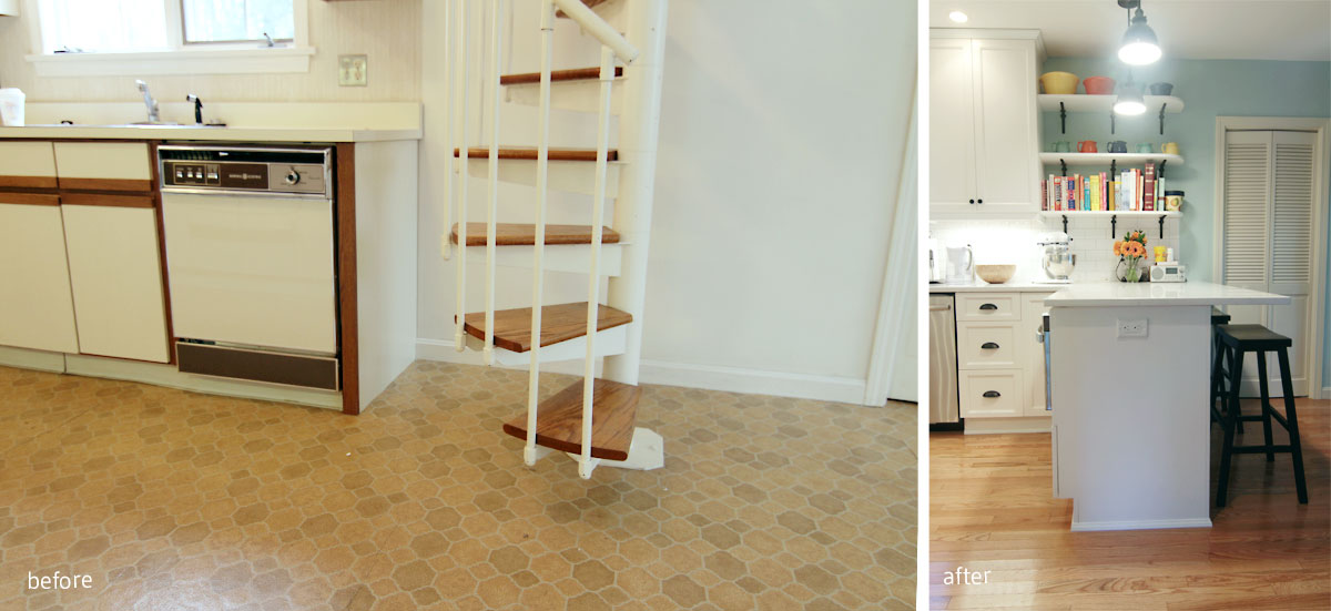
BEFORE: The spiral staircase was added on as an additional access point to the kids’ wing above. AFTER: We nixed the staircase to add a peninsula for baking, hanging out, and as a way to add a natural termination point for the kitchen without adding back a wall. The kitchen is open without taking over the entire house.
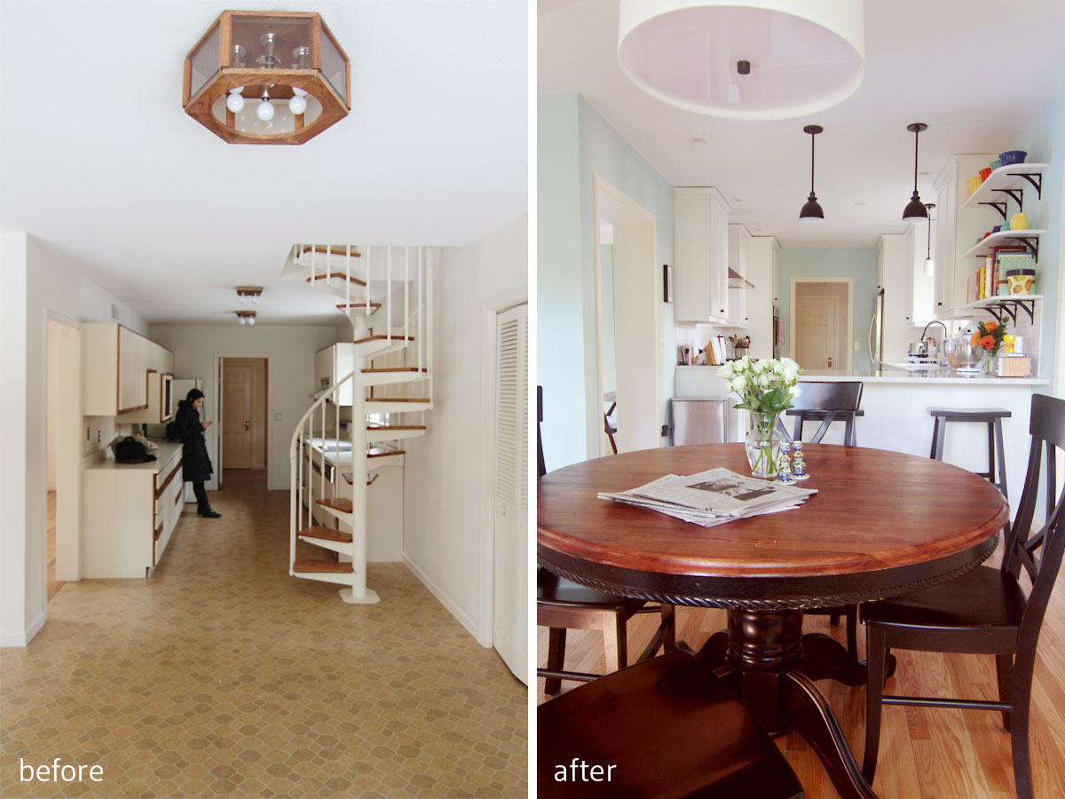
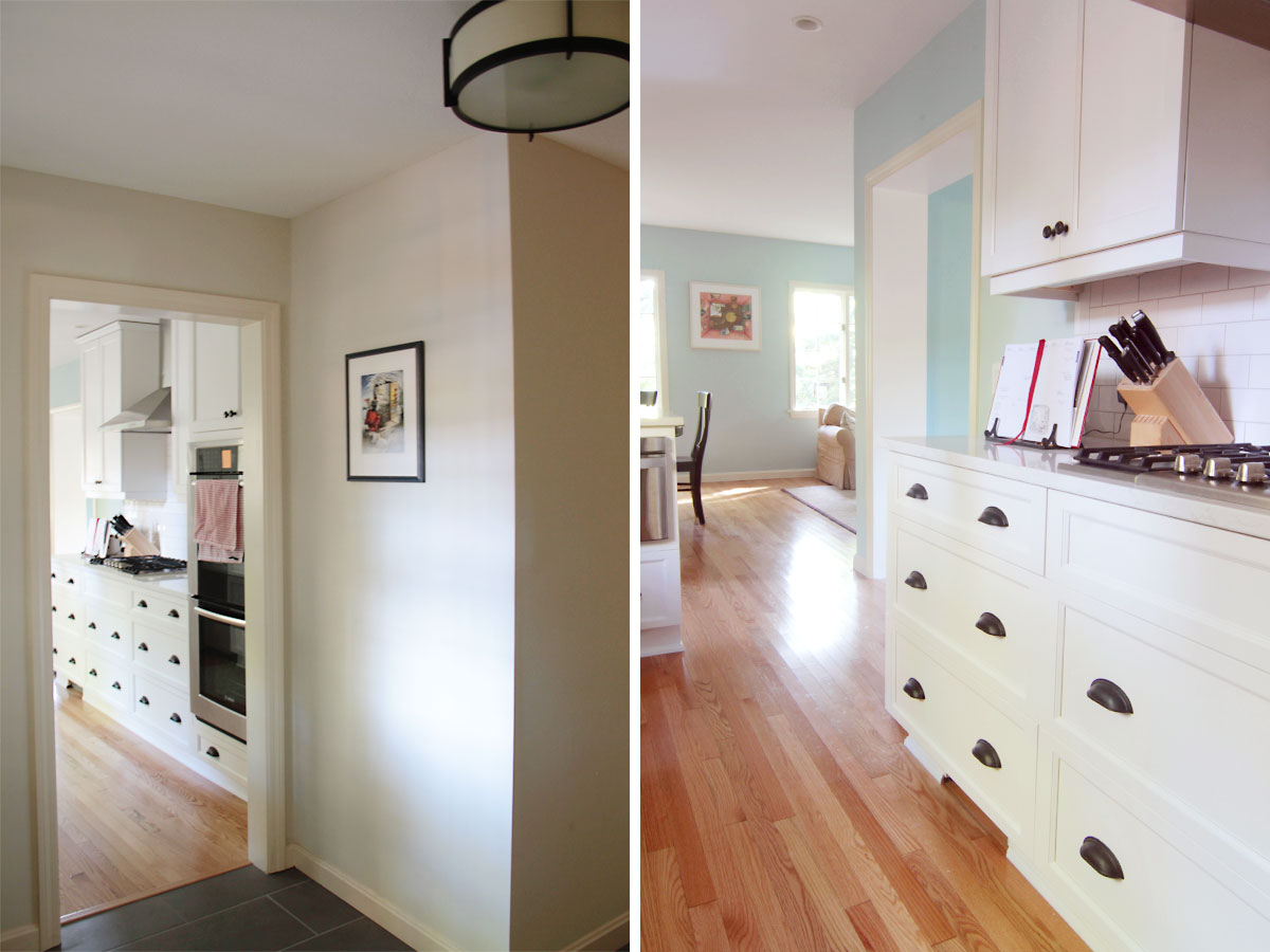
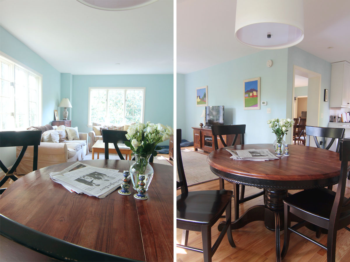
It turned out that the wall between the dining room and kitchen was completely full of utilitarian stuff – you know, central heat, ducting, plumbing, you name it – and moving all of that stuff would have been incredibly costly. Score one for saving the galley. I also knew that with new lighting, new cabinets, and countertops that the room would be the bright and open space they desired, even without cutting into that wall (their previous kitchen was DARK, small, and not very efficient). We did expand the opening to the dining room, though, in hopes of matching the opening that connects the game room to the dining room on the other side, and making the room seem original to the house, as well as improving the flow from room to room.
Left, view from the mud room entry area of the house; right, view down toward the family room through the much improved kitchen.
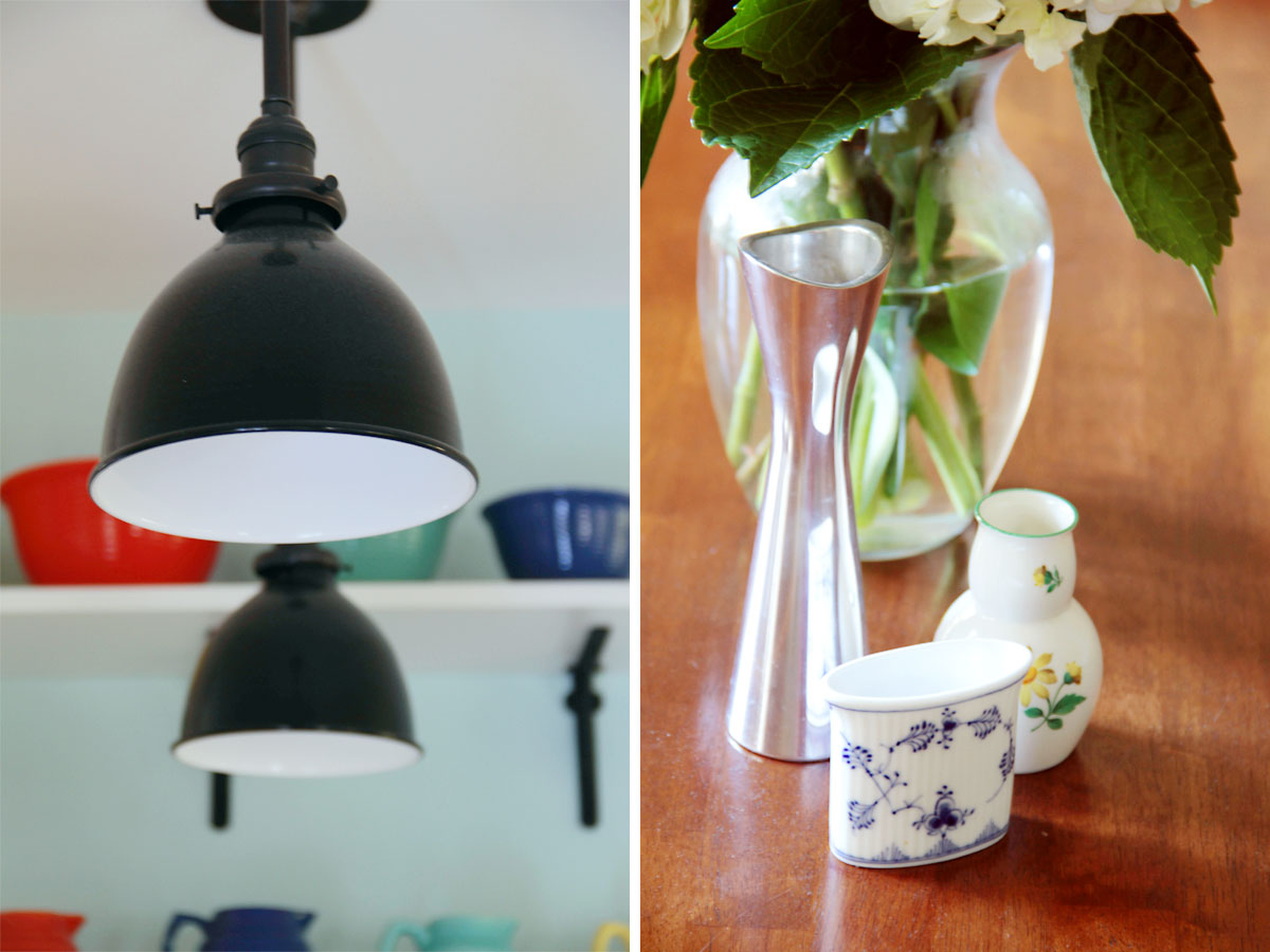
BEFORE: This would have been the view from the dining room toward the old kitchen. AFTER: Now a clean, bright, and attractive focal point, complete with display space, and splurge lighting from Schoolhouse Electric.
Initially I wanted to install French doors in the wall between the dining and family rooms. I wanted to expand on the openness and connectivity of the original front part of the house, while keeping some privacy. Budget ruled on that one, and in the end I think the family is happier that they have a cozier TV room than they would have otherwise. The space is casual, family friendly, yet elegant at the same time.
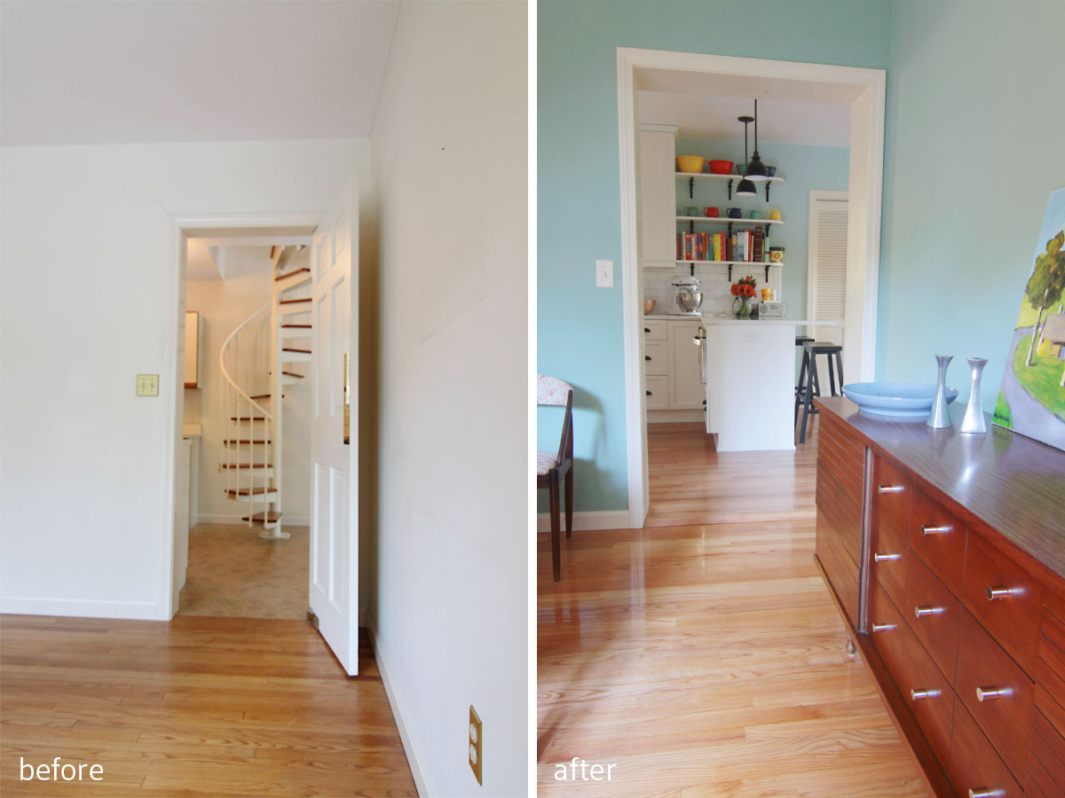
BEFORE: Linoleum flooring throughout most of the addition made for an unappealing transition. AFTER: Continuing wood floors throughout, and enlarging the opening to the kitchen gives a sense of continuity and flow.
In the kitchen, with an initial brief that a soft blue be used on the walls, we opted for painted white cabinets to harken back to the built-in look from the 1920s, and chose an almost-marble solid surface that could withstand cooking and baking lessons, slumber parties, and plenty of spills. The result is equal parts soft and strong, with the blue color connecting the existing trim color with the new cabinet color. I knew we needed to bridge the warm with cool (the original trim color in the house was a distinctly warm creamy-white, and it sadly wasn’t in the budget to change it), and this in-between warm-ish blue balances those forces beautifully.
Beauty shots: left, Schoolhouse lights; right, family treasures on easy display in the dining room.
Left, the dining room wall was full of mechanicals and couldn’t be opened up; right, so we turned that wall into the cooking zone, with double wall ovens on the end, and the star of the kitchen – the cooktop – flanked by easy-access drawered cabinets and full-height uppers.
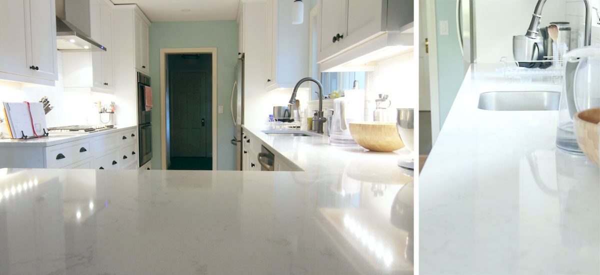
Details: the countertops are quartzite by Cambria in Torquay color. Urged by the builder and the supplier to go with a man-made material for durability and ease of installation we found one that mimicked the look of natural stone. It doesn’t stain, and is an easy maintenance surface for a busy family of four.
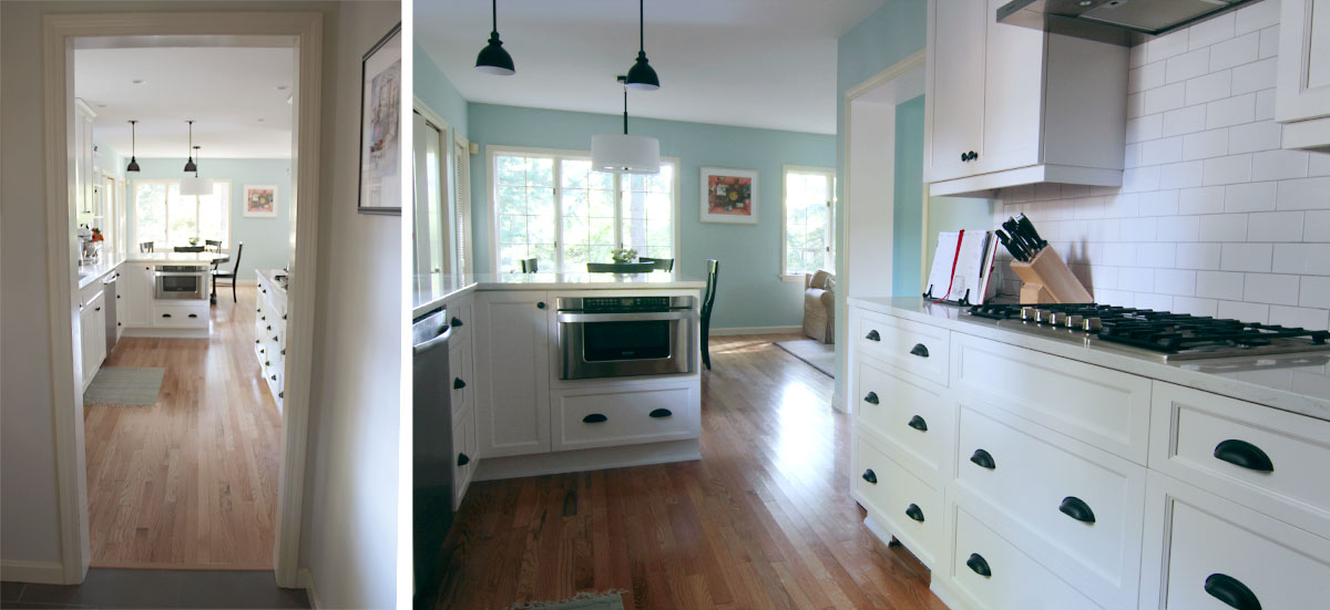
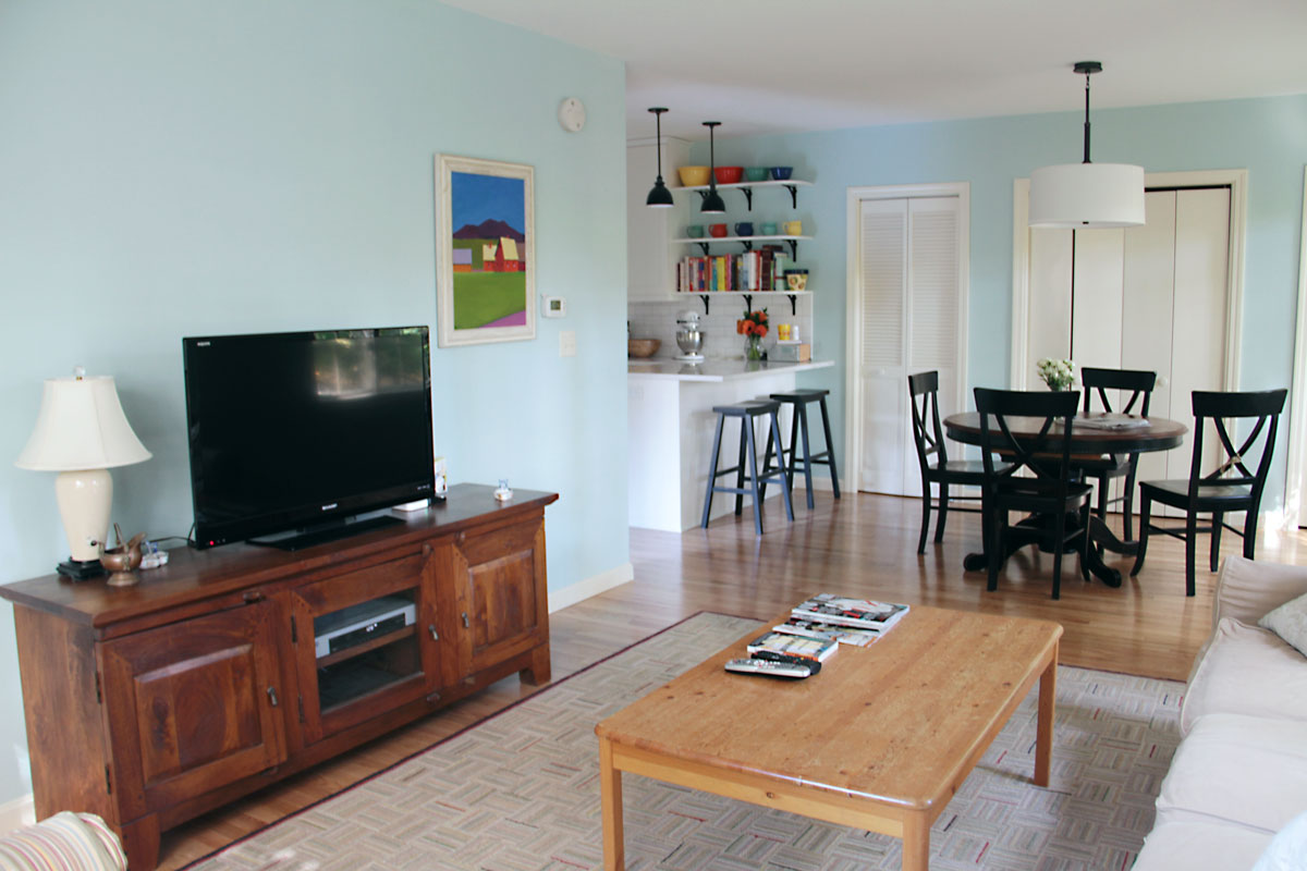
Left, view to the bright kitchen and family space; right, cooking zone on the right, baking zone on the peninsula.
I maintained the connection to the black and white that we used in the master bath tile and powder room tile to repeat that motif and make the home feel more unified. I really wanted the family to feel like their kitchen was part of the original story that the house told through its architecture, and we were able to achieve that while including modern comforts (microwave drawer, double wall ovens, hood that vents outside).
I wanted to show you what the lights looked like on – the space is plenty bright during the day, but at night it’ll stay that way. Lighting work by Osgood Electric; fixture details available on pinterest at www.pinterest.com/sohappyhome/project-w/ .
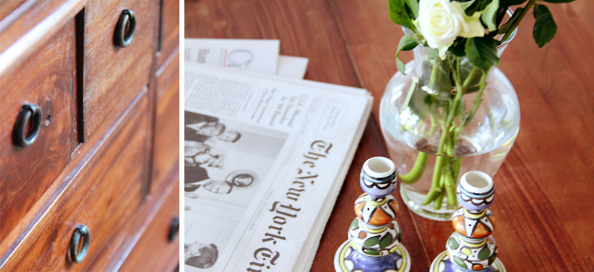
Beauty shots: left, vintage cabinet; right, breakfast ritual, old school style.
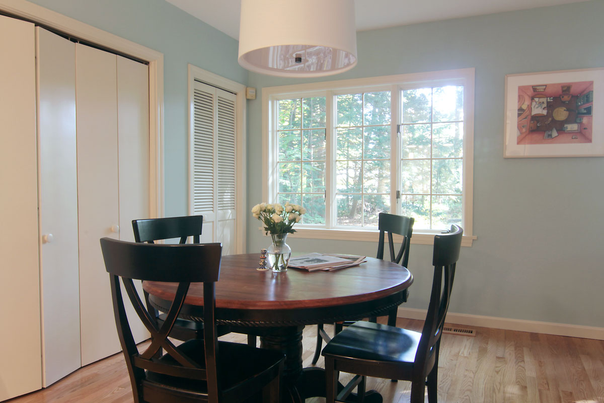
Eventually I’d love to see the homeowners add a door to the back yard through this area, but for now it’s a welcoming, quiet, and sunny spot to start the day.
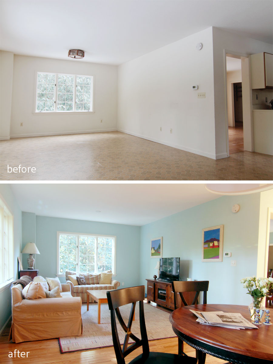
BEFORE: I had wanted to open up the wall between the dining room and the TV space, but budget won out. AFTER: The coziness of the TV space is enhanced by the semi-private, but still connected adjoining spaces. Adults could linger over dinner in the dining room, while kids retired to watch their glut of action/adventure movies. Sounds pretty nice, to me.
My clients were so wonderful to work with – I would suggest multiple options for things that would be within their budget – hardware, faucets, lights – and they chose what I would have chosen every time. We splurged on a few items – like the lights from Schoolhouse Electric – but saved on other things along the way (like the shelf brackets). In the end, we met our portion of the budget with room to spare. (Of course that room to spare was completely used up by budget overages in other areas of the house, but that’s the nature of renovation, right?)
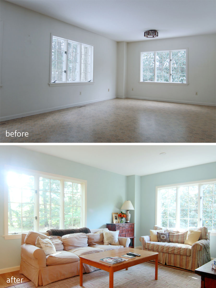
BEFORE: This little nook was a natural fit for the media portion of the family room. AFTER: Comfy well-worn sofas invite teens, dogs, and friends to plop down, put their feet up and hang out.
Wall color: Tidewater by Sherwin Williams.
I’m so proud of the work we were able to achieve, but I’m more thankful that my clients gave me their trust and confidence throughout the process. Renovating a home is hard – it always takes longer, always costs more, and there are always compromises – but this family really glided through the experience with grace and gratitude. I’m so happy that they ended up with the home of their dreams, and a place I know they will cherish for years to come.
Family friendly, cheerful, and casual, this grand home is easy to be in, and its residents a delight to be near.
xoxo
Looks great! I love the white millwork with the contrast of the black counter tops & the mix of cup pulls & knobs.
Thanks so much, Hollie!
So, so good! This whole house turned out so great!!!
Thanks, Katie!
What an awesome transformation! I’m all for open kitchens, but as someone trying to work with a galley in my own space, I totally understand that storage is a premium. The arrangement here looks ideal and I love the addition of the peninsula.
Thanks, girl. In our old house we had a galley that we were able to include a peninsula in and it totally transformed the energy of the space. Galley kitchens are actually really efficient – you get a lot of bang for your square footage.
Kati, this is major! Huge! Amazing! What a transformation.
Man, this has me pumped to rip out our nasty kitchen and start fresh as a daisy. I love it!
Thanks, Erin! Best of all, the kitchen is useful again. Nothing like pouring love into a space and seeing it grow into a home.