*Lyrics from Careful What You Say by Class Actress from their EP Journal of Ardency. This song resonated with me for this post because during the process of building/designing this home (and perhaps especially these last spaces), my relationship with my friend (the builder) was, to say it politely, strained. It’s inevitable to quarrel with those closest to you, and likely to happen again with someone else during my career/life. I’m sure it’s happened to you – with your spouse/partner, your client, your family – and I’m sure you hated it as much as I did. I loved this job, and was so completely grateful to have been able to be a part of it, but it took an emotional toll. And I guess I’m feeling a little nostalgic for the good times. (This winter feels really, really long this year.) Cheers to the happy times, to the promise of a new season, and of the hope for smoothing the scuffs and scratches that will just add patina to what I hope is a lifelong friendship.
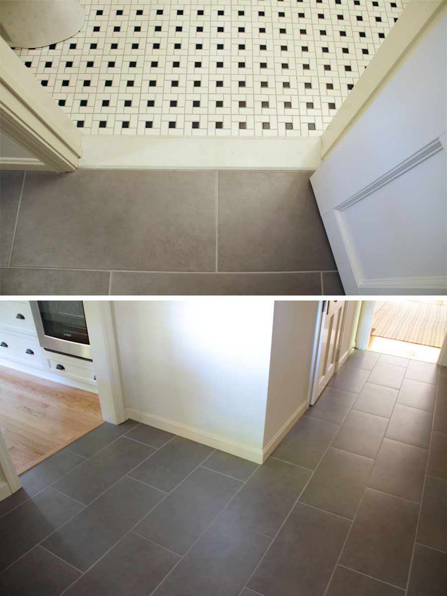
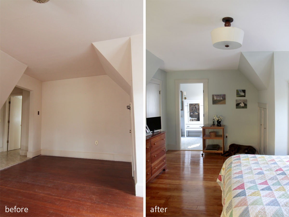
BEFORE: Linoleum, dingy paint, bad lighting. AFTER: Classic grey tile with modern rectangle shape, transitional fixtures, neutral walls.
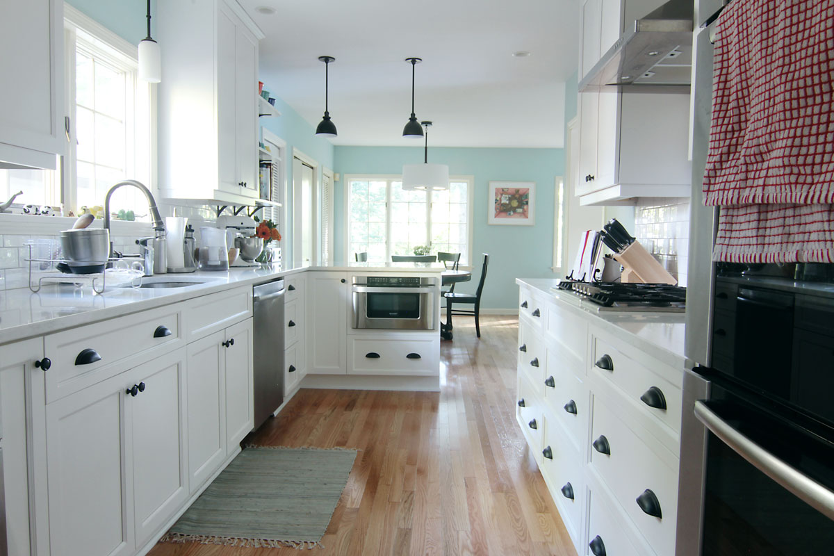
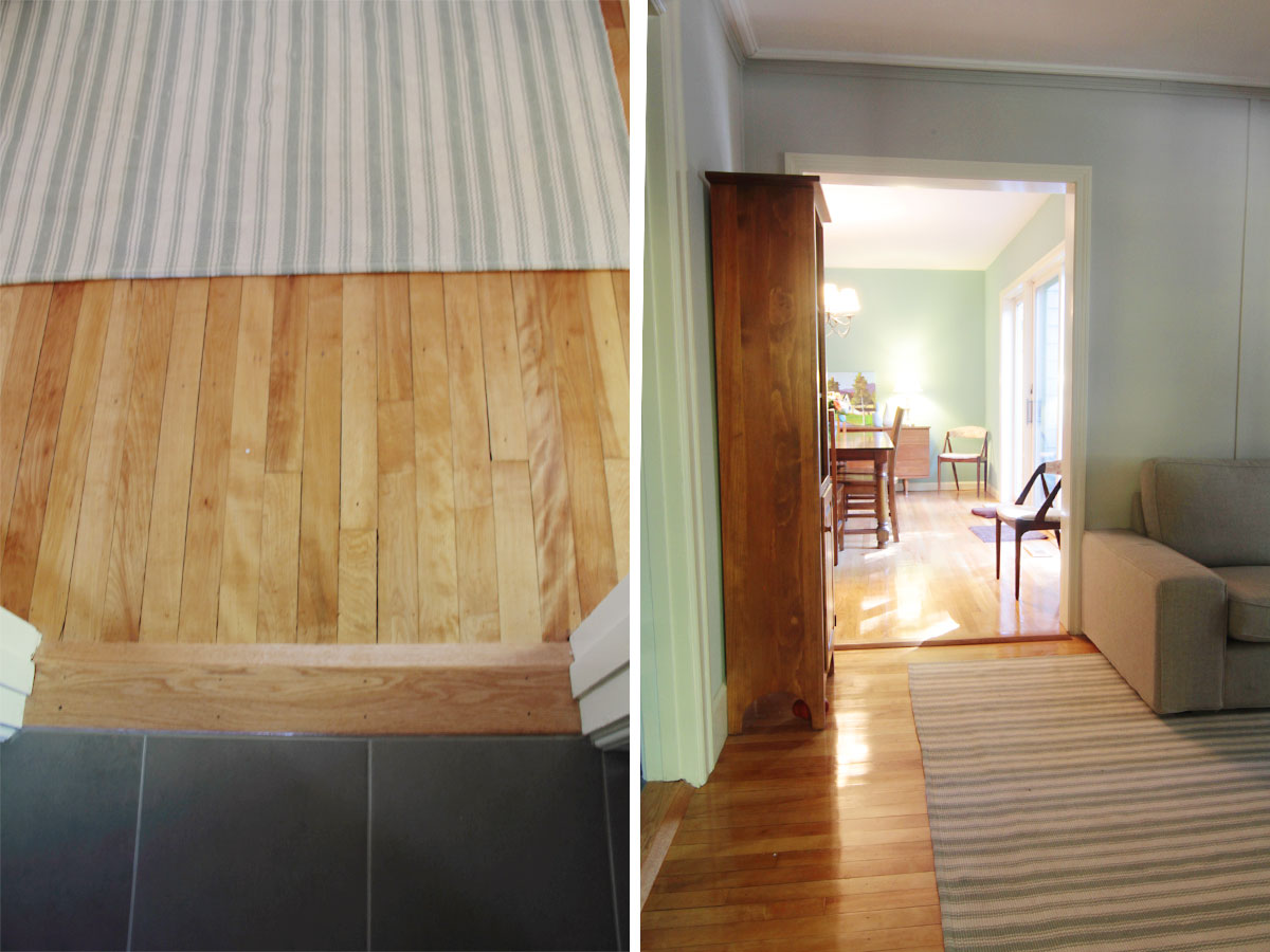
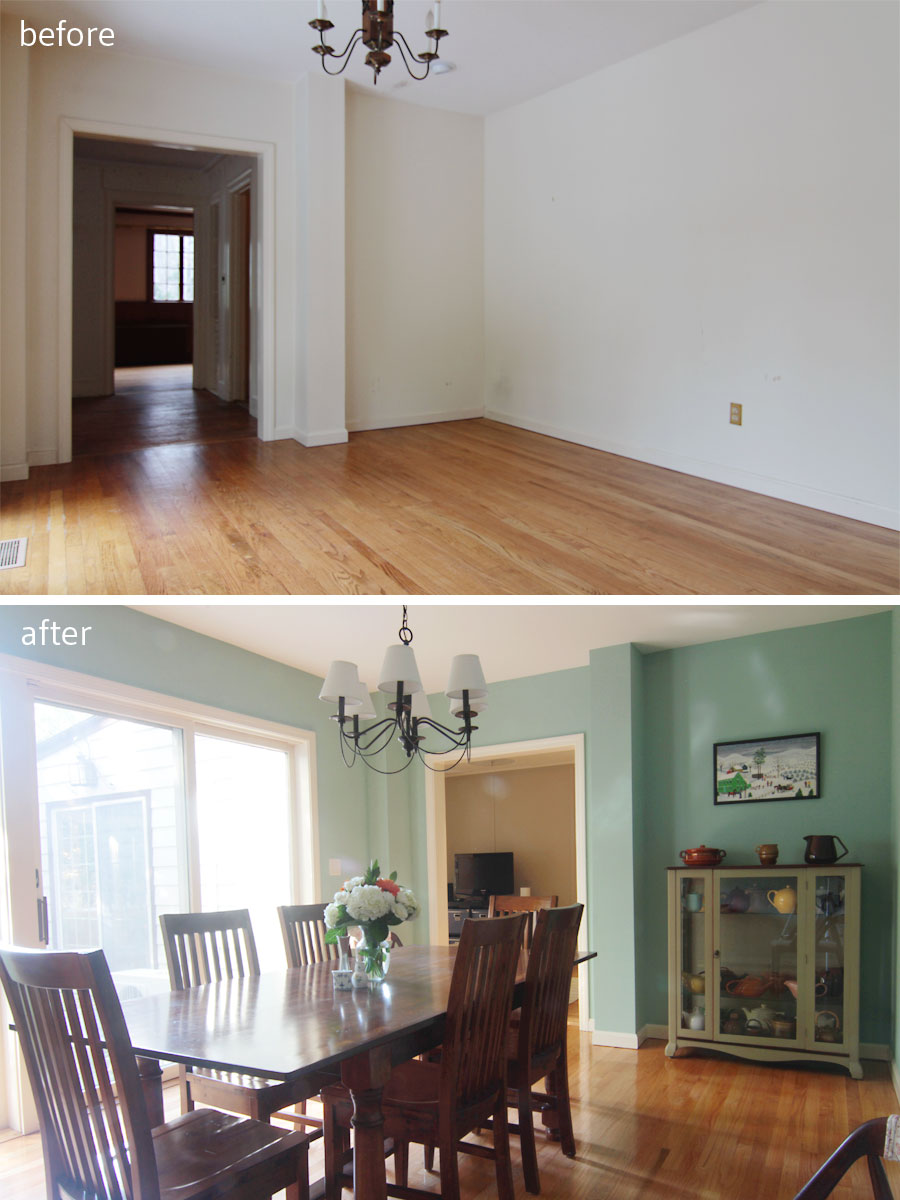
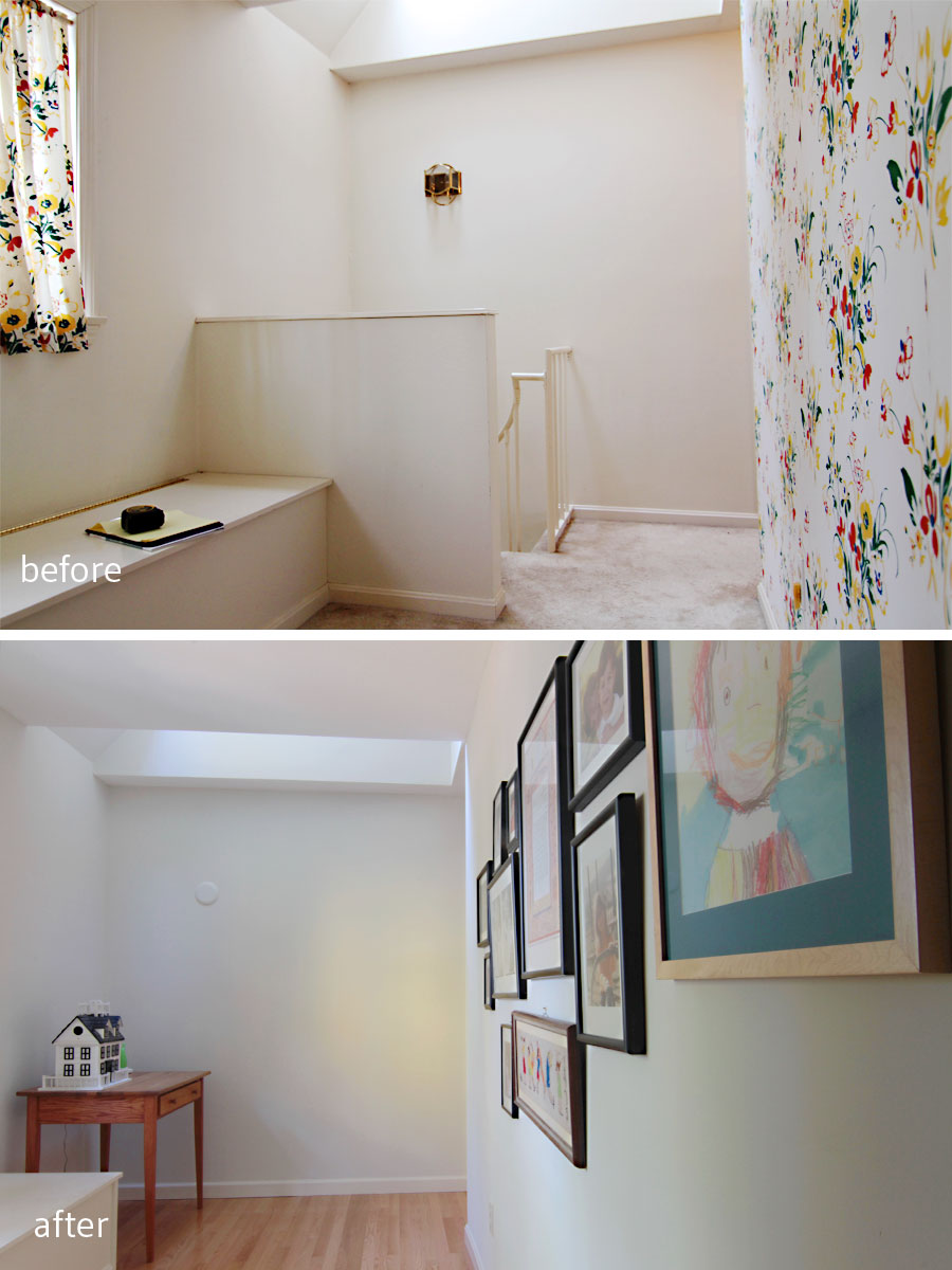
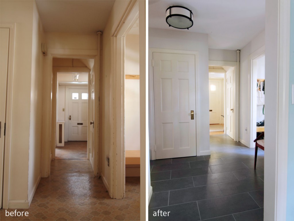
And the AFTER tour continues… When we last met, I shared with you most of the main floor living spaces for Project W. Today I’m going to share the dining room, foyer, and powder room. When I first walked through the house with Mrs W, we both had the same vision for the foyer: gray, almost concrete-looking rectangular tile that would feel modern, not too dark, yet be easy to care for with two kids and a sweet, but sloppy dog. It took some doing, and some negotiating, and some pretty strong-willed moments (high five, Mrs W!), but we found our tile, and were able to achieve the exact look we imagined. Sometimes less is more, but sometimes you have to invest in a bit more to get more. At any rate, we ended up with a wonderful update to this formerly vinyl-floored space.
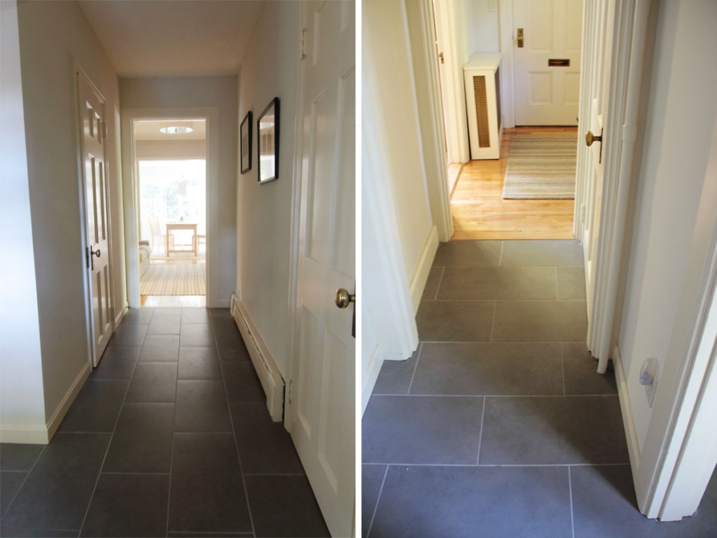
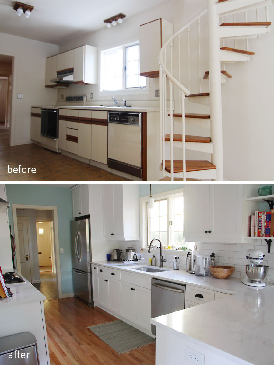
This area (left) was formerly the original kitchen (!), but had been adapted to include a powder room as well as transitions to the rest of the house. So we treated the entire space as an extended mudroom.

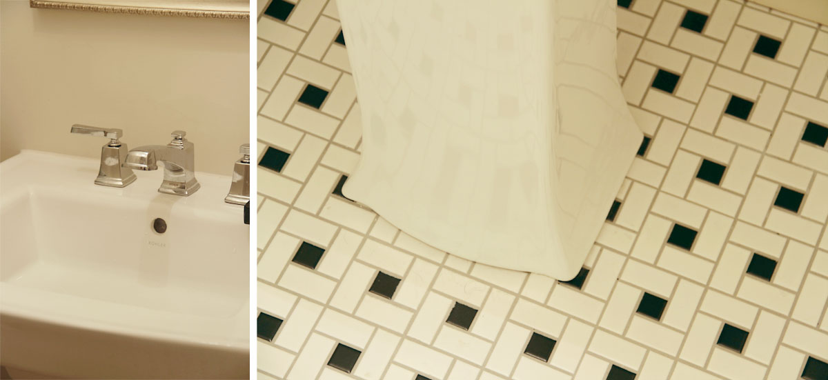
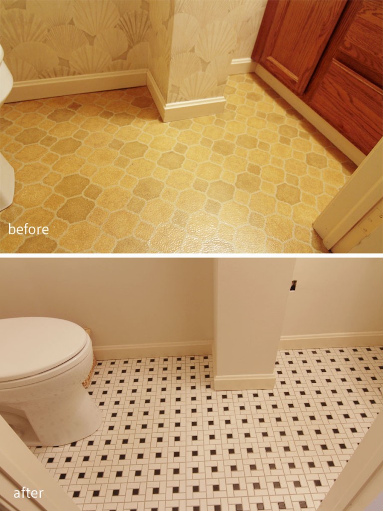
The powder room got a black and white mosaic tile, and the ceramic grey tile provides a low-maintanence transition point for the wood floors, tile, and exterior. (Sneak peek of the kitchen, still to come!)
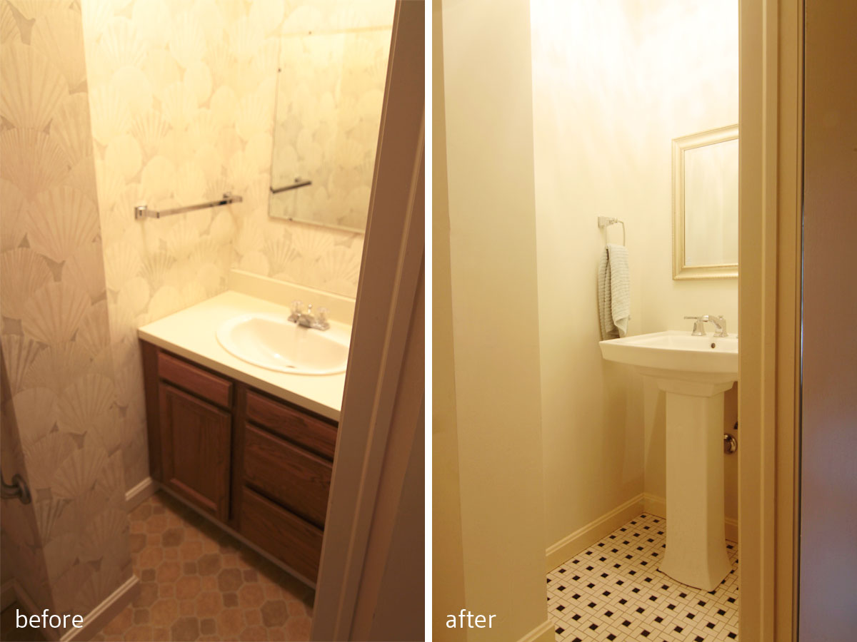
Just off the side entry – the mudroom area – is a powder room. Now, this space used to house the original kitchen; in fact, the old house stopped along the wall separating the new kitchen and dining room from the game room and entry hall. So the bathroom that was put in was decidedly from its time (1982).
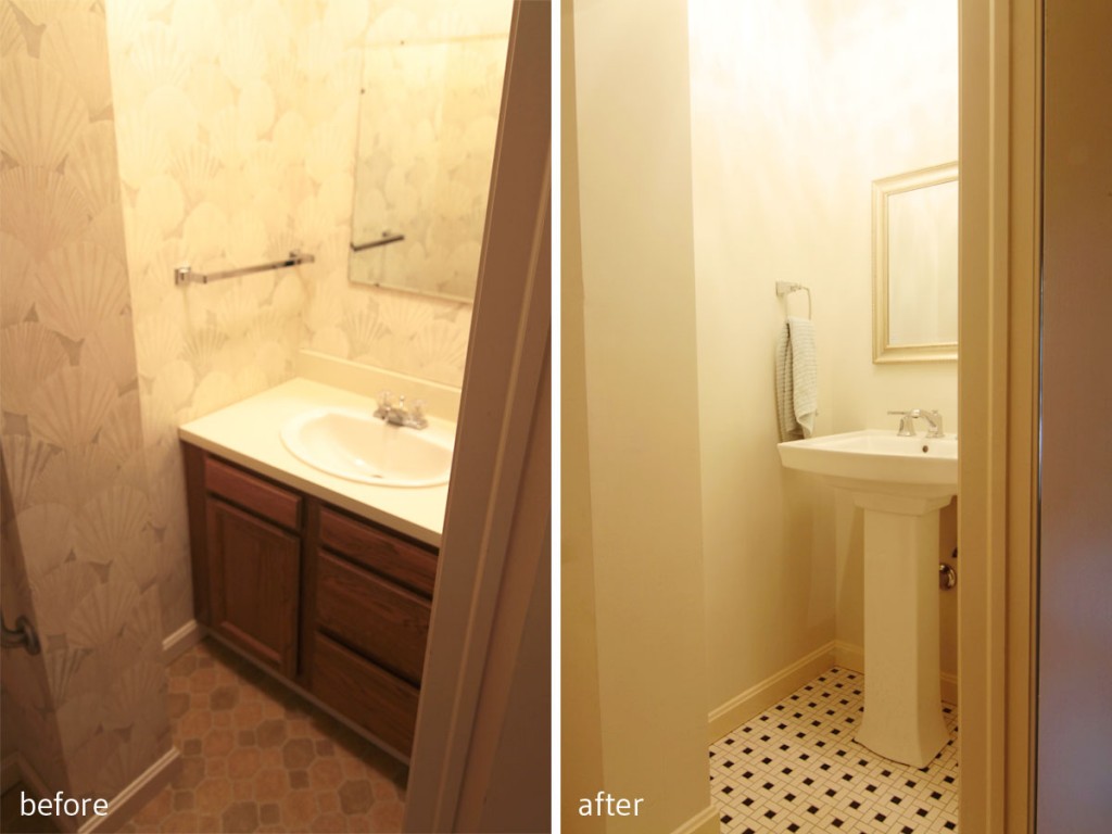
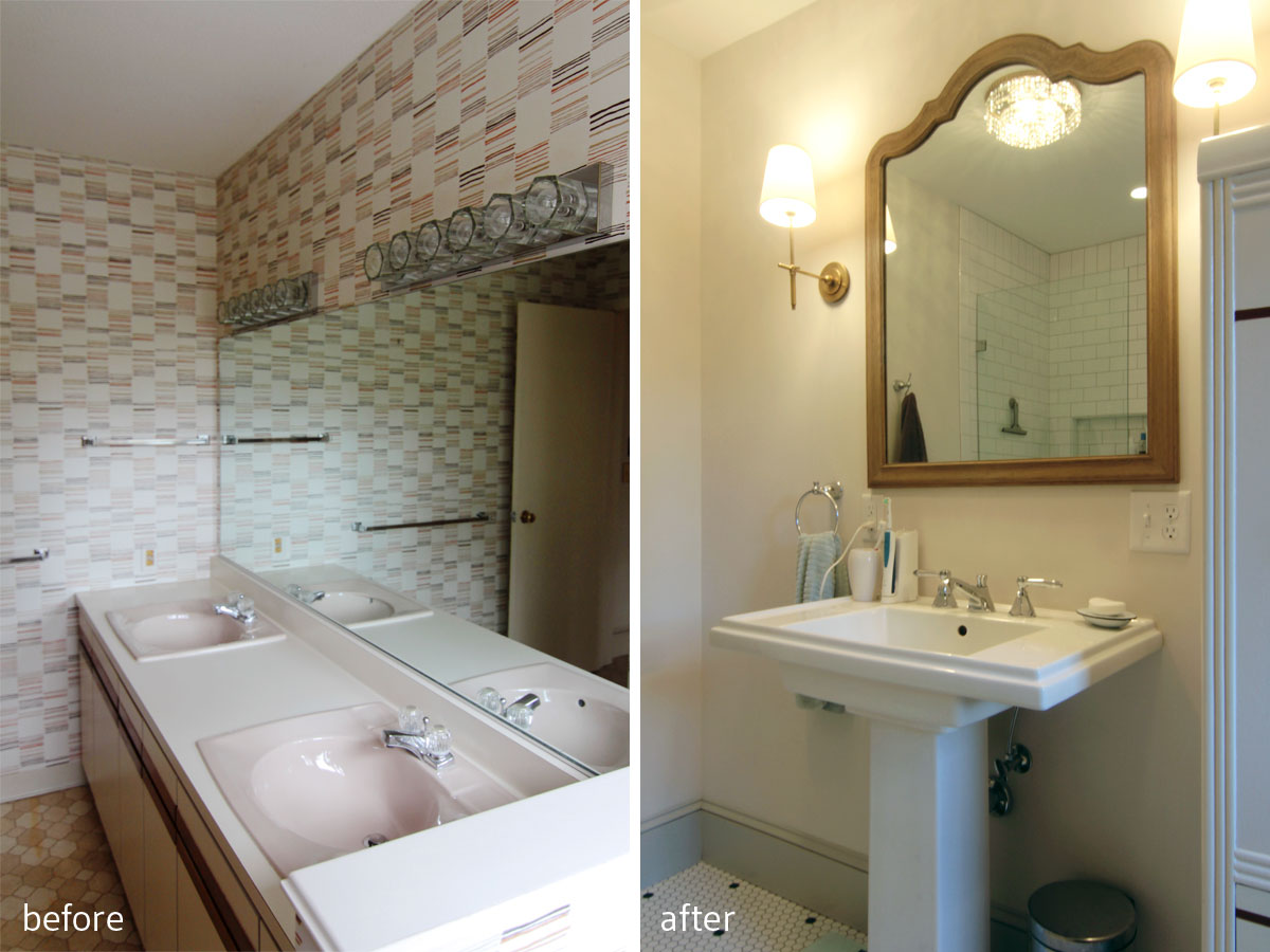
BEFORE: Tired vanity, wallpaper that had no appeal, and more linoleum. Yuck. AFTER: Pedestal sink and mosaic tile speak the home’s origins, while making the small and slightly awkward space feel more spacious. We also moved in one of the crystalline lights from and adjacent room to add some glamour. No reason a small room can’t be fabulous, and work within a budget.
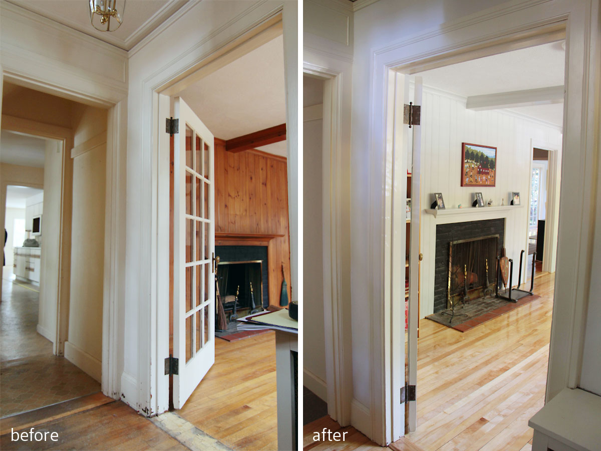
I wanted to reclaim the character as we did with the master bathroom design, but knew that we couldn’t really spend too much to do so. We had to work with the space as it was for the budget’s sake, and we had to use materials that could withstand lots of traffic. We ended up finding a really reasonably priced ceramic mosaic tile that picked up on the black and white theme we used in the master (I love it when spaces in antique homes, like kitchens and baths, seem like they could have been installed during the house’s original build), which really helped to reinforce that 1920s feel we were after.
BEFORE: Ugh, I mean, really. AFTER: Much, much better. Ahhh.

Details: The faucet and sink have a square shape that references the mosaic tile. There had been an original mirror (square) hanging here that I had planned to rehang, but, well, let’s hope Mr W doesn’t really get 7 years’ bad luck.

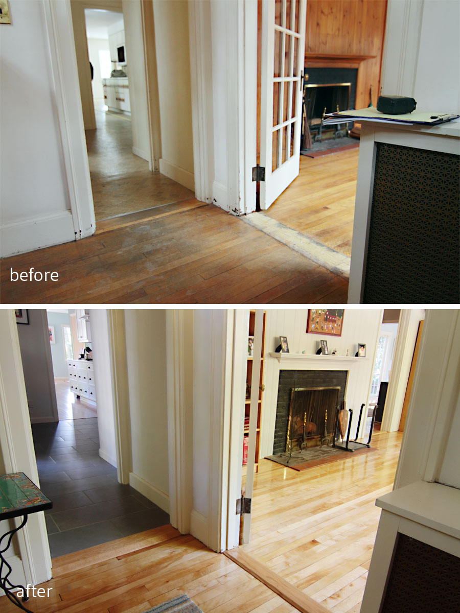
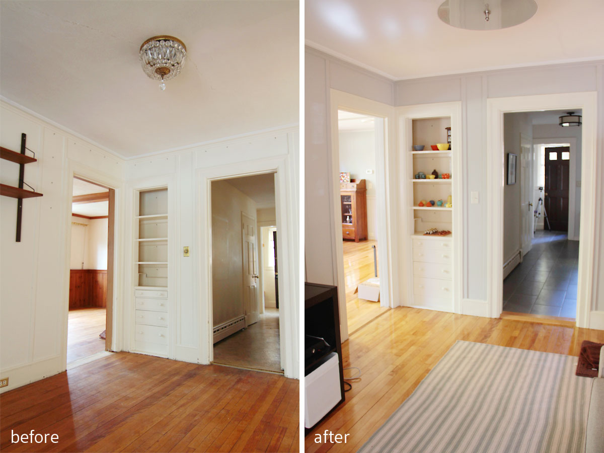
Details: The mudroom/hallway as it transitions into the game room; the game room looking into the dining room (which is where the ‘new’ addition begins).
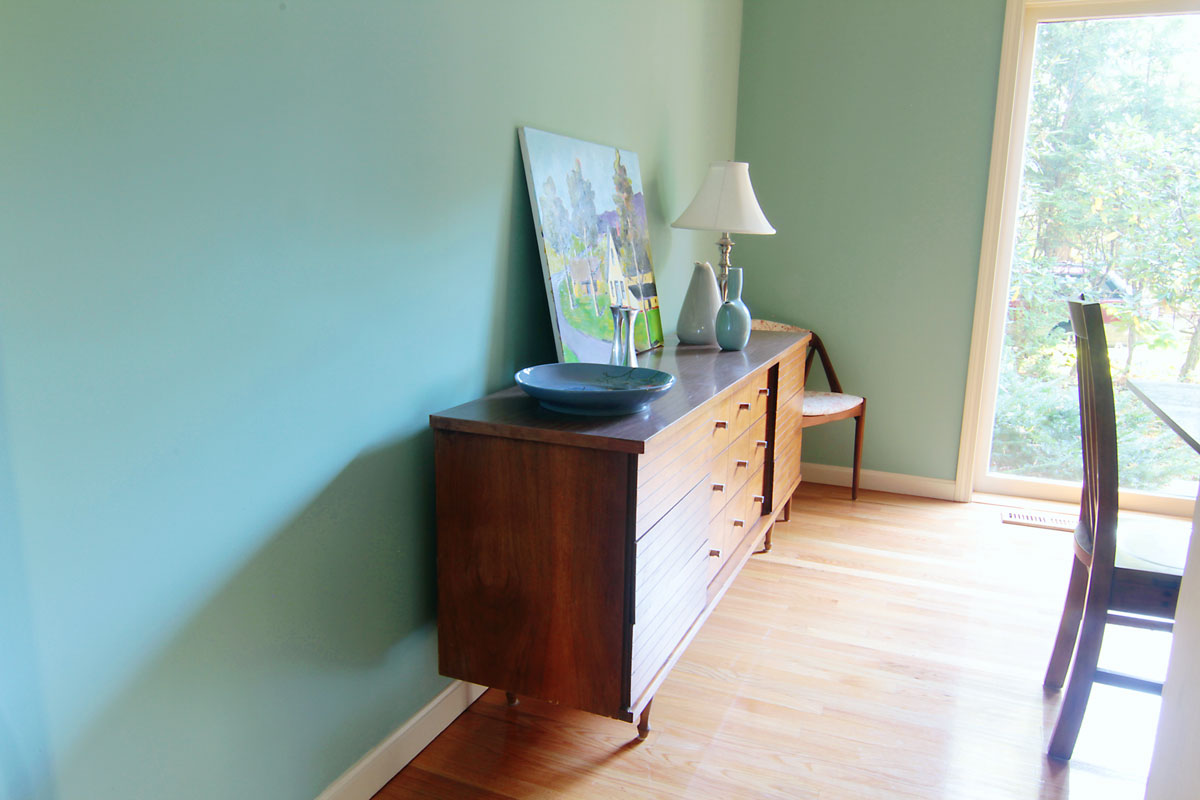
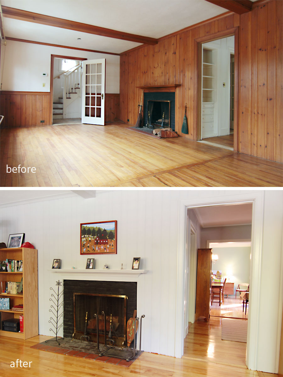
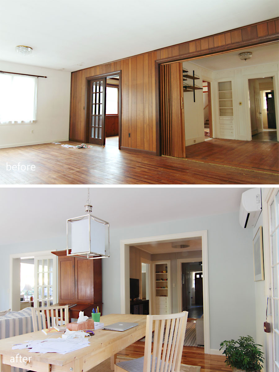
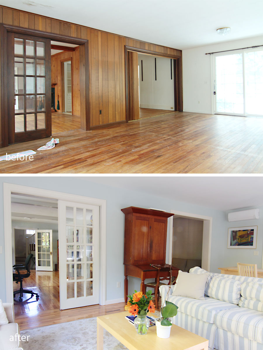
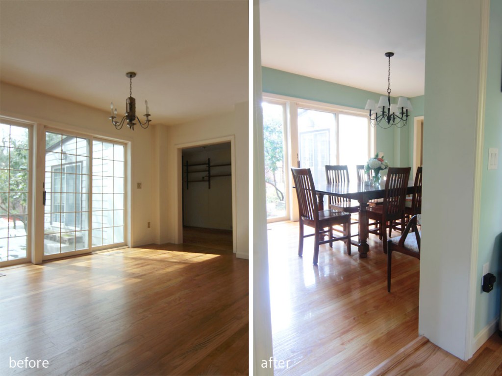
Having connected the powder room to the house’s architecture, I wanted to let the dining room really connect to the homeowners’ love of mid-century design. I knew they had some cherry and rosewood pieces that would look really nice atop their newly finished oak hardwoods, but that they needed a wall color that could support all of that rich, warm wood. Probably the most contentious battle with regard to the color palette happened regarding the dining room walls – SW Hazel – which virtually every woman loved and every man loathed. In the end, though, my clients agreed that the initial scheme was what they loved, and they stuck with my suggestion. I love the color. This room floods with light in the afternoon, and can really stand a rich hue on the wall. They are also avid art collectors, and I knew that an art wall would eventually really sing atop this rich but modern hue.
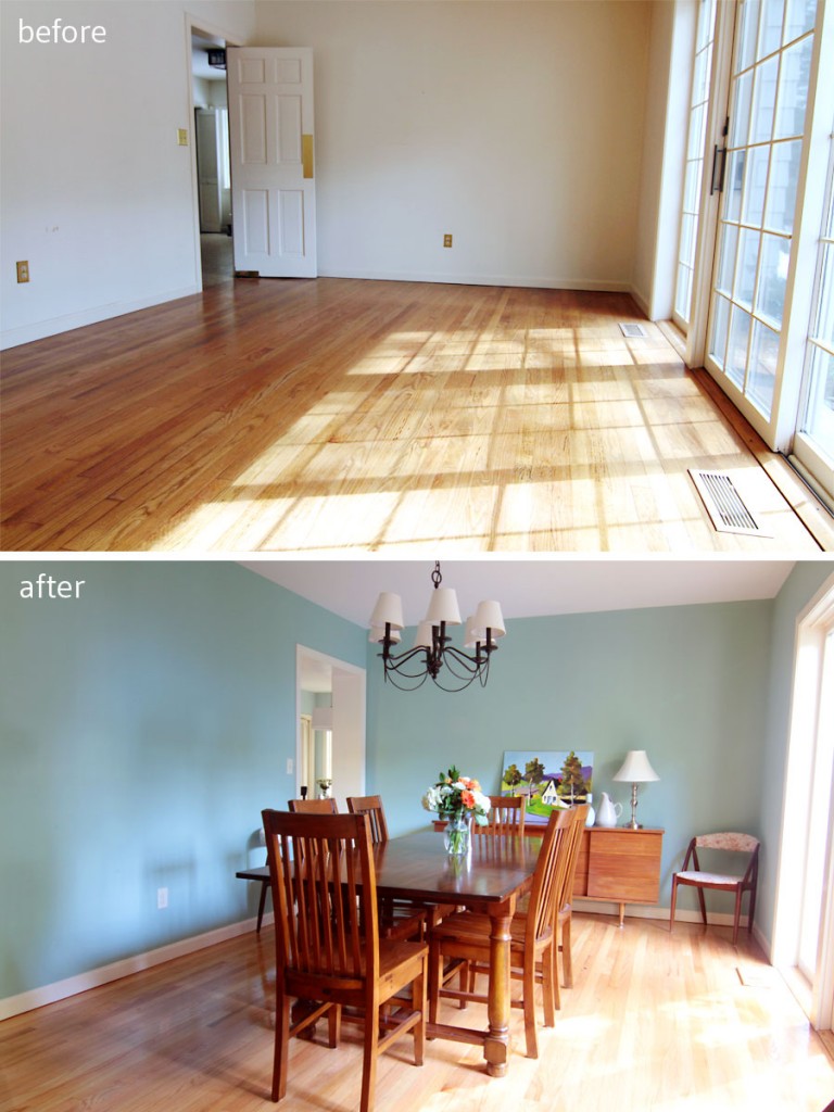
BEFORE: This room was bright, but had no personality. AFTER: A modern wall color mixes well with the homeowners’ warm wood mid-century and mission style furnishings.

This wall color (Hazel by SW) was hotly contested. Almost every single male hated it, while every single female loved it. Weird. Color is totally, I mean completely, personal.

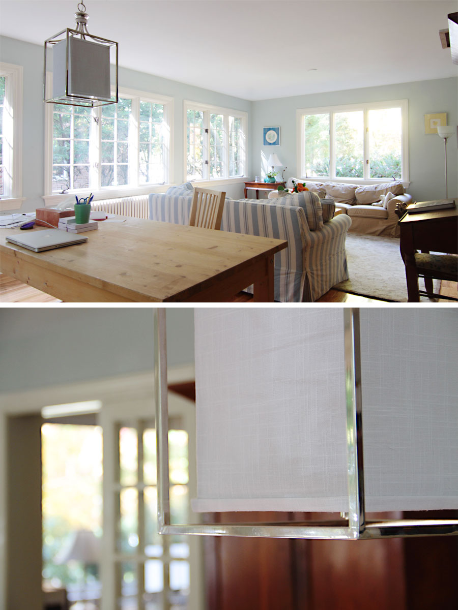
Details: Mrs W let me rummage around her accessories to find sweet trinkets to display. The light fixture is a budget-friendly Pottery Barn find – another hotly contested search – and the cabinet in the background is antique.
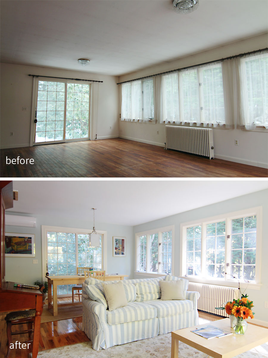
The entire first floor connects visually from room to room, zone to zone, and I think we really created a soft, watery, and flowing palette that is peaceful and soothing. I know that the clients’ soft furnishings, curtains, pillows, rugs, etc., will shift as time goes on, but the harder, more permanent things – tile, flooring, lighting – will enhance whatever additions they make.
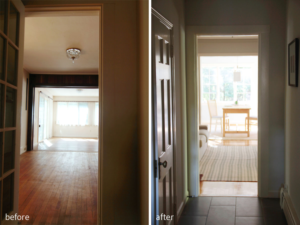
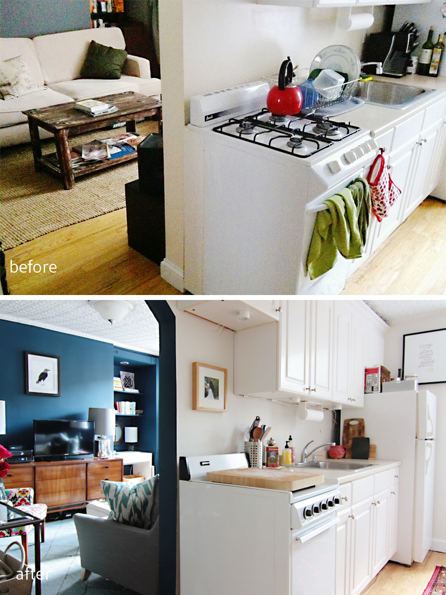
BEFORE: Beautiful light, and access to the exterior were this room’s best features. AFTER: Sliders lead out to a breakfast patio (which will get updated eventually), but who would want to dine al fresco when it’s so pleasant indoors? The doorway from the kitchen was widened to mimic the generous opening on the game room side of the space to make it feel as if there might have been french doors at one point.

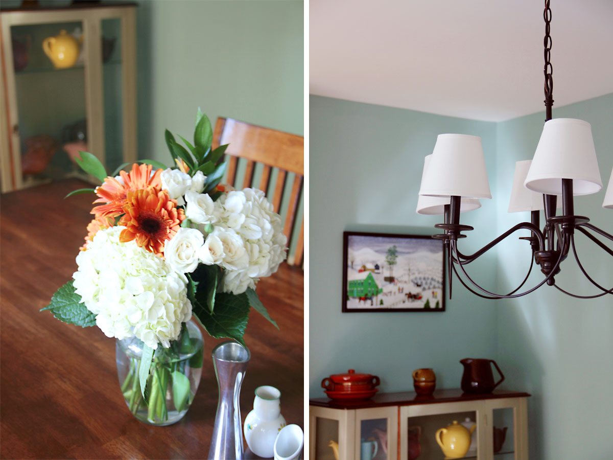
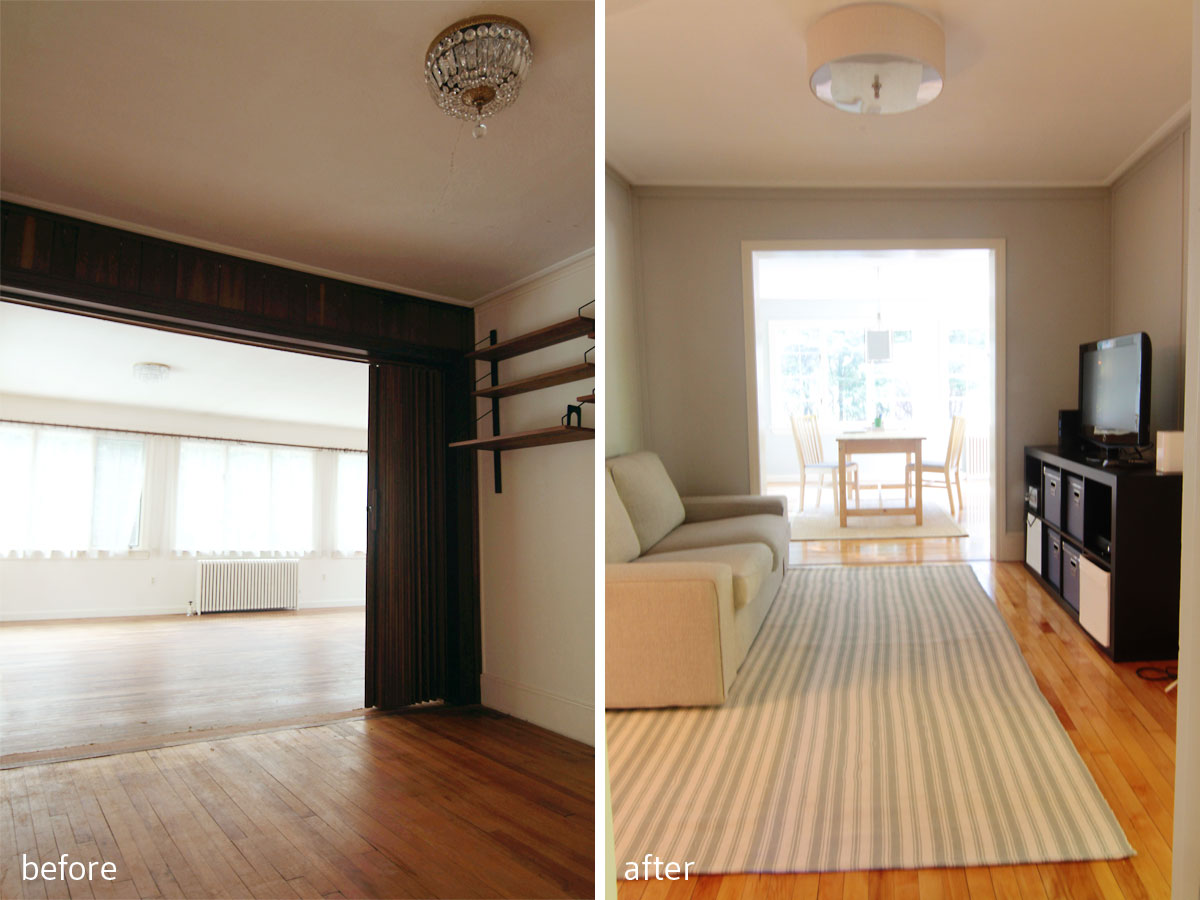
BEFORE: This little soffit created an awkward bump out. AFTER: That nook created a perfect spot for Mrs W’s china cabinet, and created an opportunity for an art nook. Eventually these walls will be covered in art, as the homeowners have tons of beautiful pieces. Who wouldn’t want to be invited over for a lingering dinner?
I still have one last space to share with you. Stay tuned!
xoxo