*Lyrics from I Miss Your Bones by Hospitality. This is a single, but they have a new album coming out in January. I think I’ll wait to order it (not pre-order it) until I can hear it all. I struggled to find a song for this post – sometimes finding these lyrical inspirations isn’t as easy as it should be – but this one felt just right (plus, their new album is called Trouble, which is fitting here). Especially since this part of the Project W house tour is all about good bones. House bones. Bones. If you say it too many times it starts to sound silly. Anyway, moving on.
Remember my beloved Project W? Want to see some more?

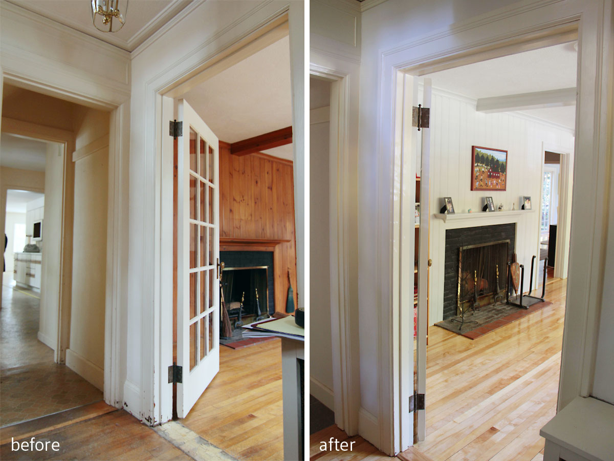
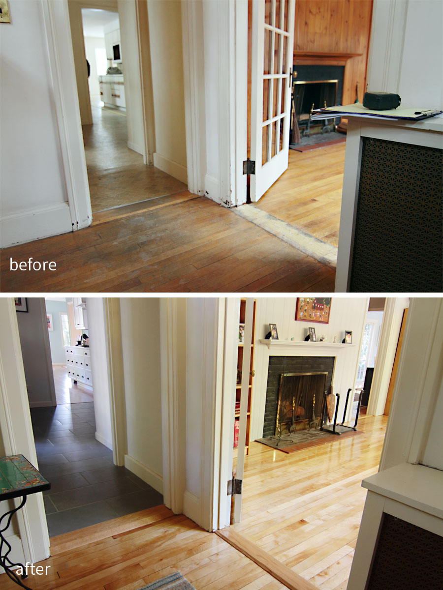
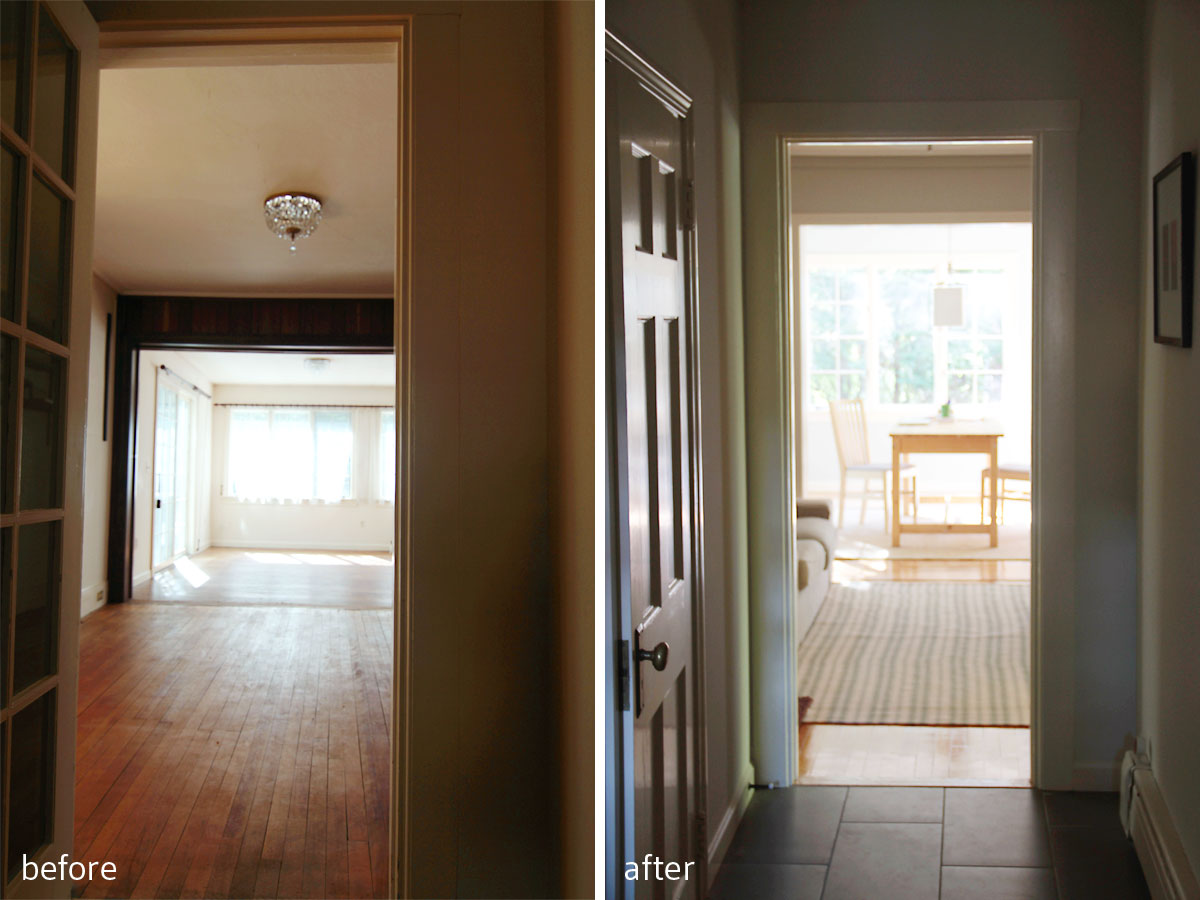
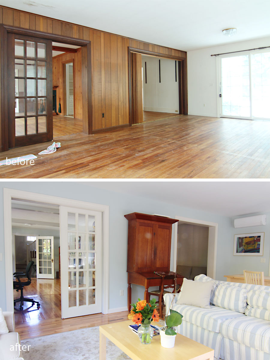
BEFORE: Flooring was in rough shape, original knotty pine panelling, pretty dated feel. AFTER: Brightened up paneling in Repose Gray, refinished flooring, updated entry.
The next part of the Project W renovation (the AFTER tour) that I want to share with you is the main floor: specifically the library, sun room, and game room. (Now, a small disclaimer: it is virtually impossible to show you only portions of the main floor without sneaking peeks at other room/areas which I will share in greater depth at a later date. Otherwise this post would be 80+ pictures long, and ain’t nobody got time for that. Consider your interest piqued.) This is really where each family member got to carve out space for just themselves.
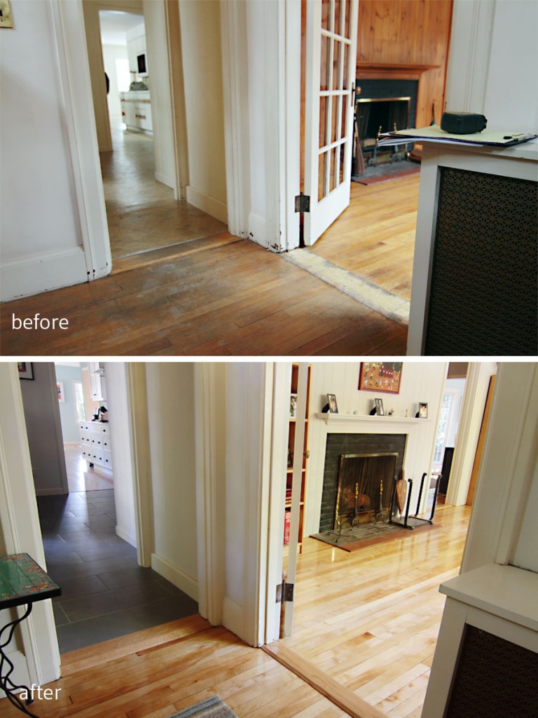
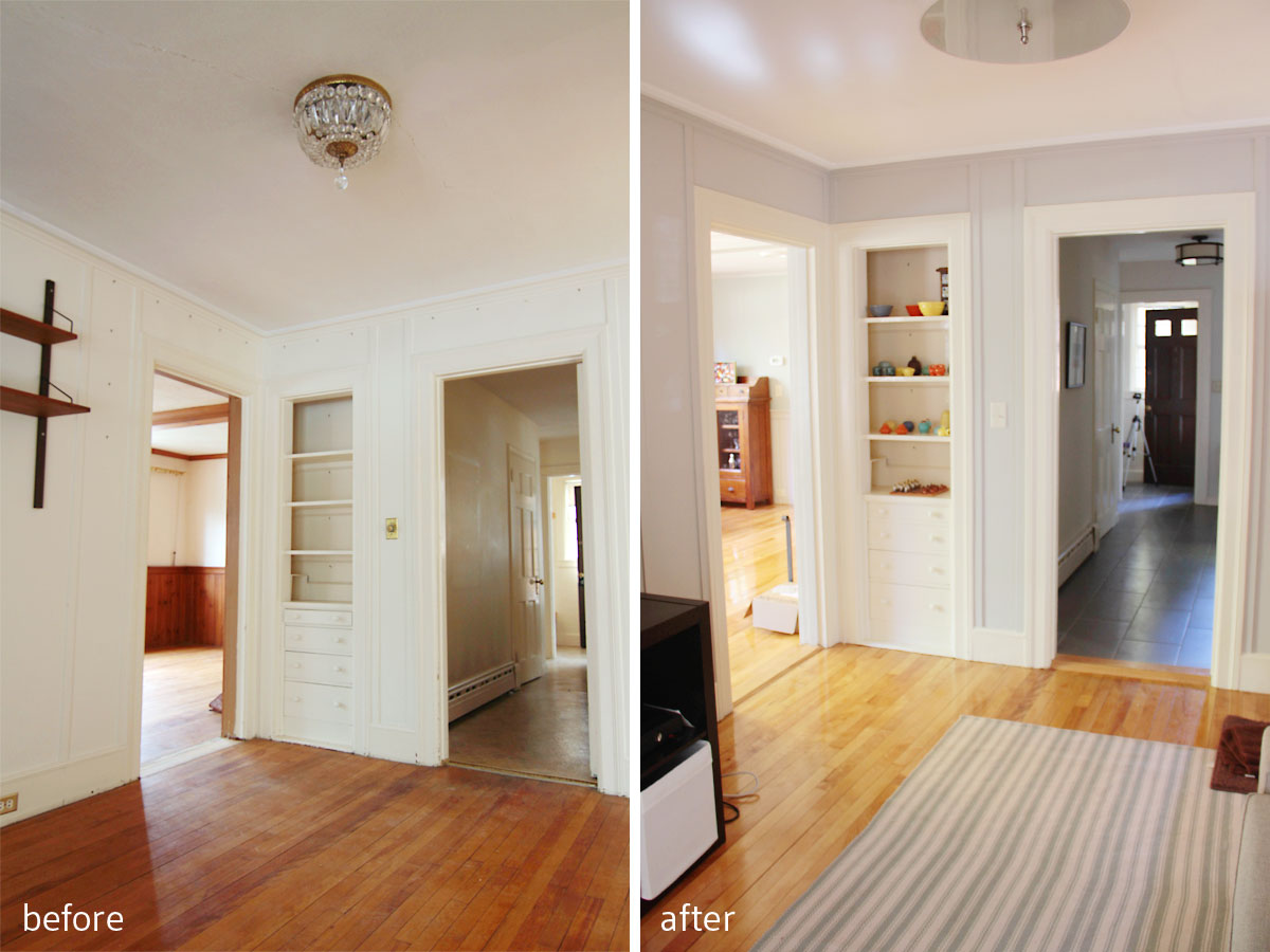
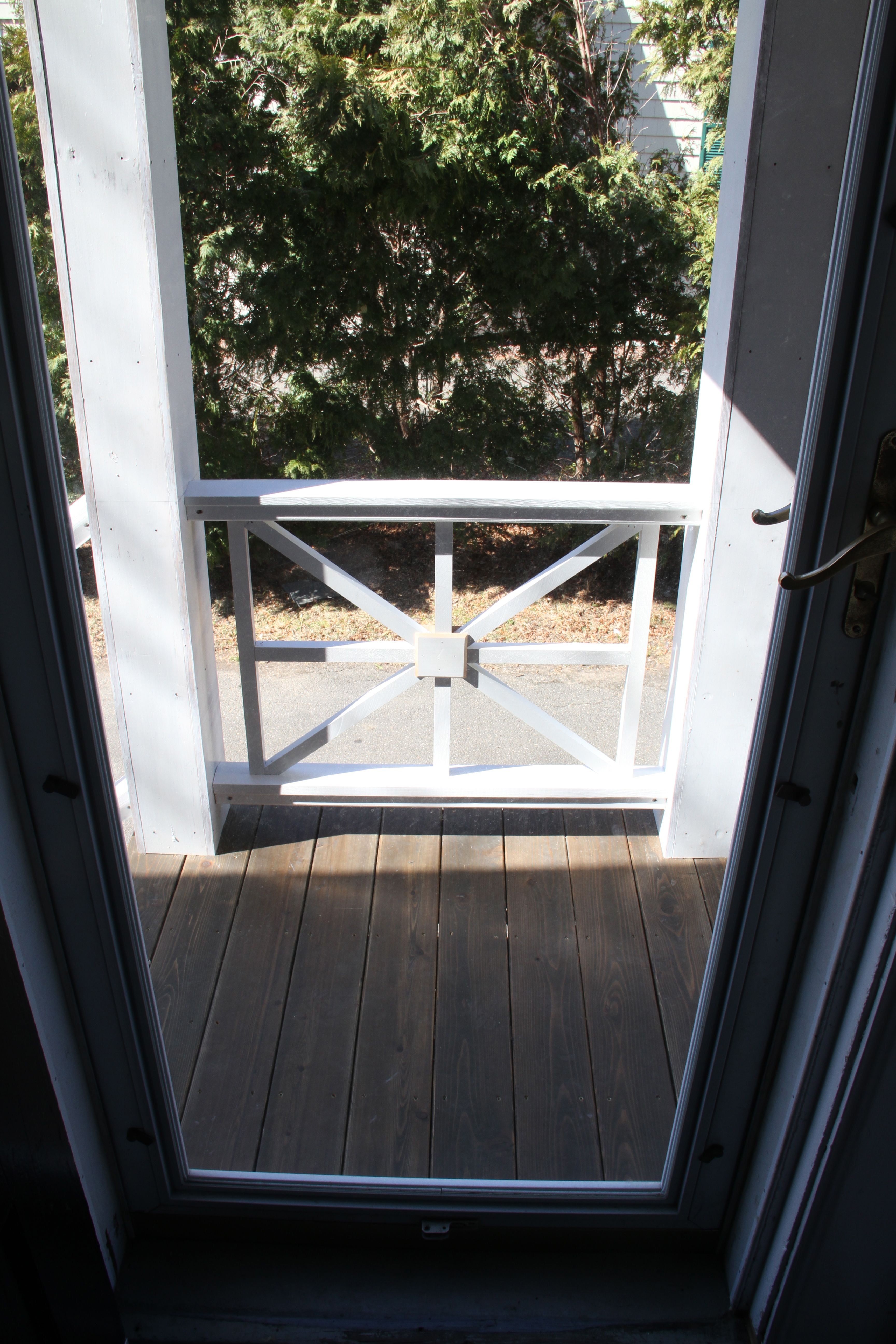
BEFORE: This was the first area you would see upon entering from the main entrance. AFTER: Durable tile (I’ll get to that in a later post), original flooring refreshed, fresh color scheme. Welcome. (Kitchen and mudroom/entry sneak peek!)
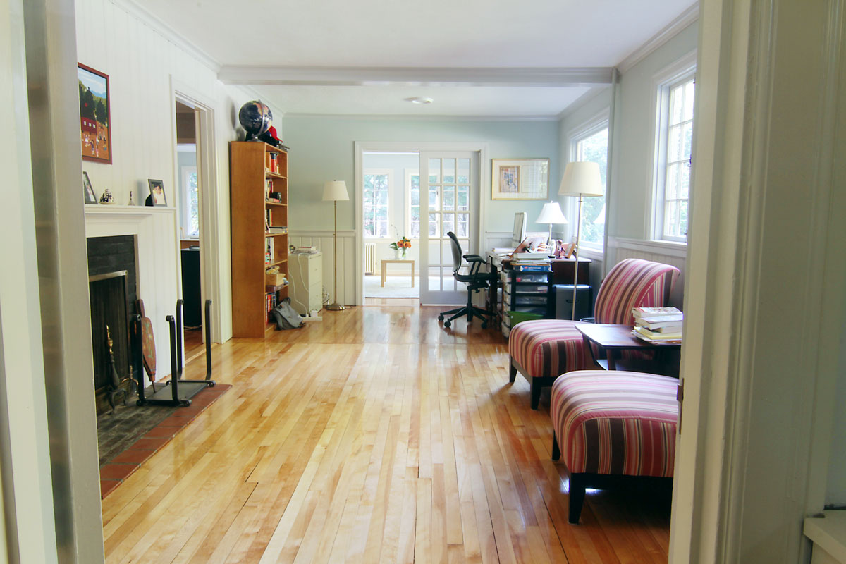
Mr W got half of the library as an office, and Mr and Mrs W will share a cozy seating area by the working fireplace.

This is the library, the area that Mr and Mrs W will use as a primarily adult space. It’s handsome, yet bright and airy. I hope it gets cold enough for a fire soon.
You see, when the house was originally built, before the giant addition in the early 80s, the library was the only living room (and we think the desk area was a 3-season porch), the sunroom was non-existent, and the game room was the former dining room. In fact, the powder room, and hallway connecting the (now tiled) side entry to the front entry (and beyond) was the original kitchen. All that is to say that the house pretty much doubled in size in 1982, and this family of four didn’t quite know what to do with so much glorious space.
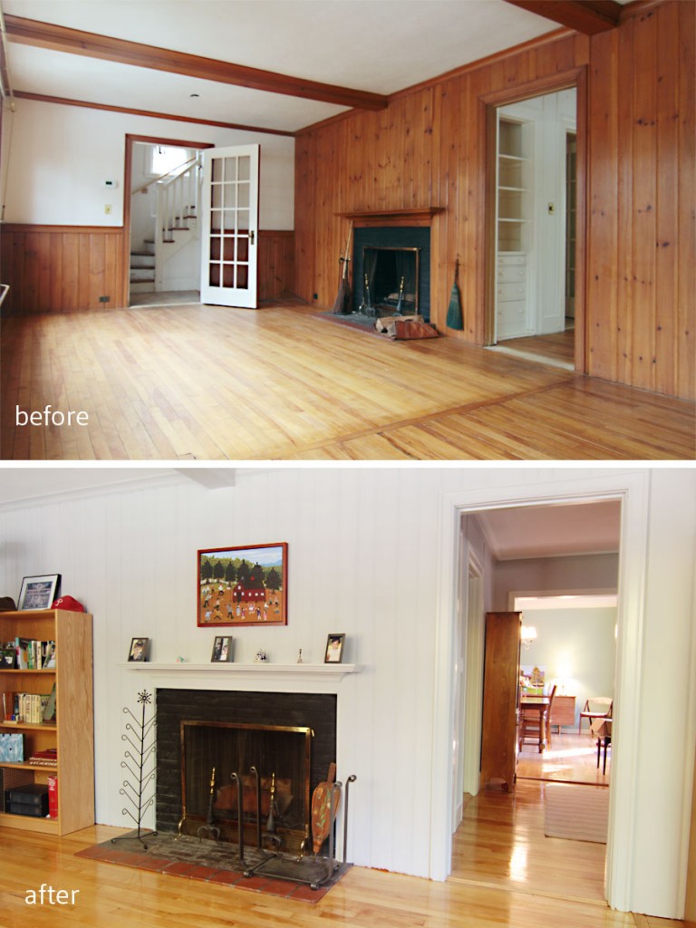
BEFORE: This room was the formal living space once upon a time. AFTER: Now a cozy office and library, the Ws can tuck in with a fire, a sip of adult elixir, and enjoy the reinvented space. (Dining room sneak peek!)
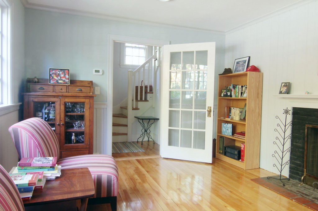
This corner houses a bar, indicating fully that the kids should steer clear of this area. Adults only, please.
With plenty of room to spread out, yet lots of zones for family interaction my clients got the best of both worlds: the connection of open plan living with the necessary privacy of homes that were planned with appropriate separations. I firmly believe that in the future, all of these Great-Room-styled homes will fall away, and there will be a return to separate rooms. Anyone who has ever lived with, or been a part of a large family knows that as much as you can love each other, getting away from each other is as equally precious. I think I was able to help the homeowners delineate spaces for specific family activities so that there is plenty of togetherness as well as comfortable, and much required, distance.
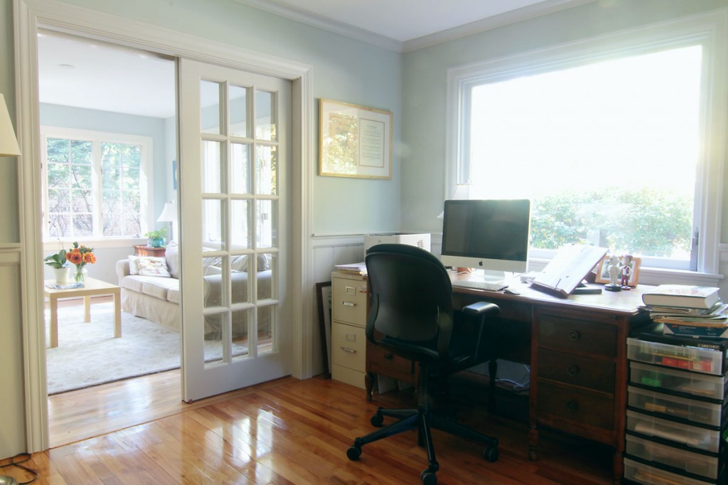
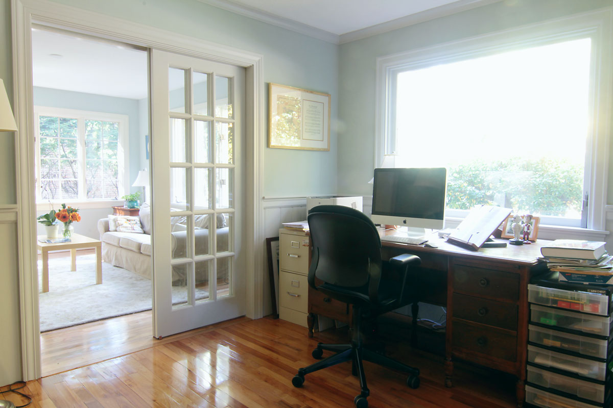
Mr W’s former office was dark and cut off from the rest of the house. In the new home, he can enjoy a great view, while being centrally located. Now he can be properly distracted by all the lovely things and people around him. Wall color: Comfort Gray. Trim color: Repose Gray.
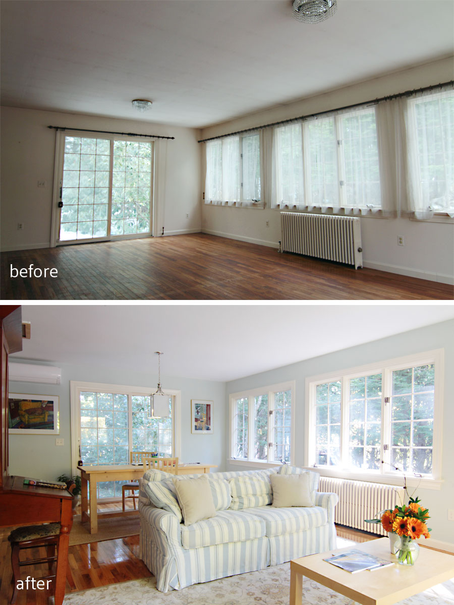
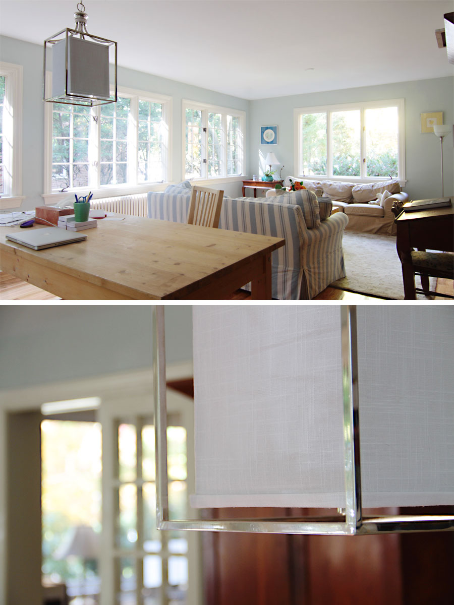
Mrs W got the sunroom – a media-free zone – for reading, entertaining and relaxing, while the kids got a section of the same room for homework, and quiet projects.
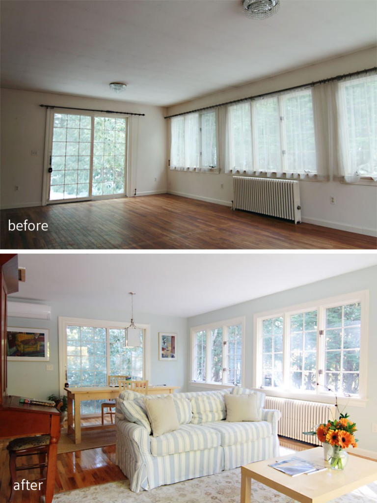
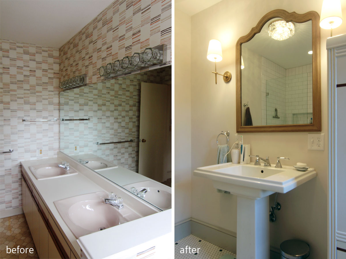
BEFORE: You can see the lights that inspired the master bathroom design hanging here. Waste not, want not, as we New Englanders say. AFTER: This room is for quiet studying, reading, entertaining sans electronics, and just generally enjoying three walls of windows with dappled sunlight streaming through. It’s pretty great.

I mean, just look at the sunlight. And the actual light hanging above the kids’ study table. Wall color: Sea Salt.
The kids also got an entire room just for their video game console, but in fairness it is the smallest room in the house, and has no doors, which means lots of parental supervision (much to their chagrin).

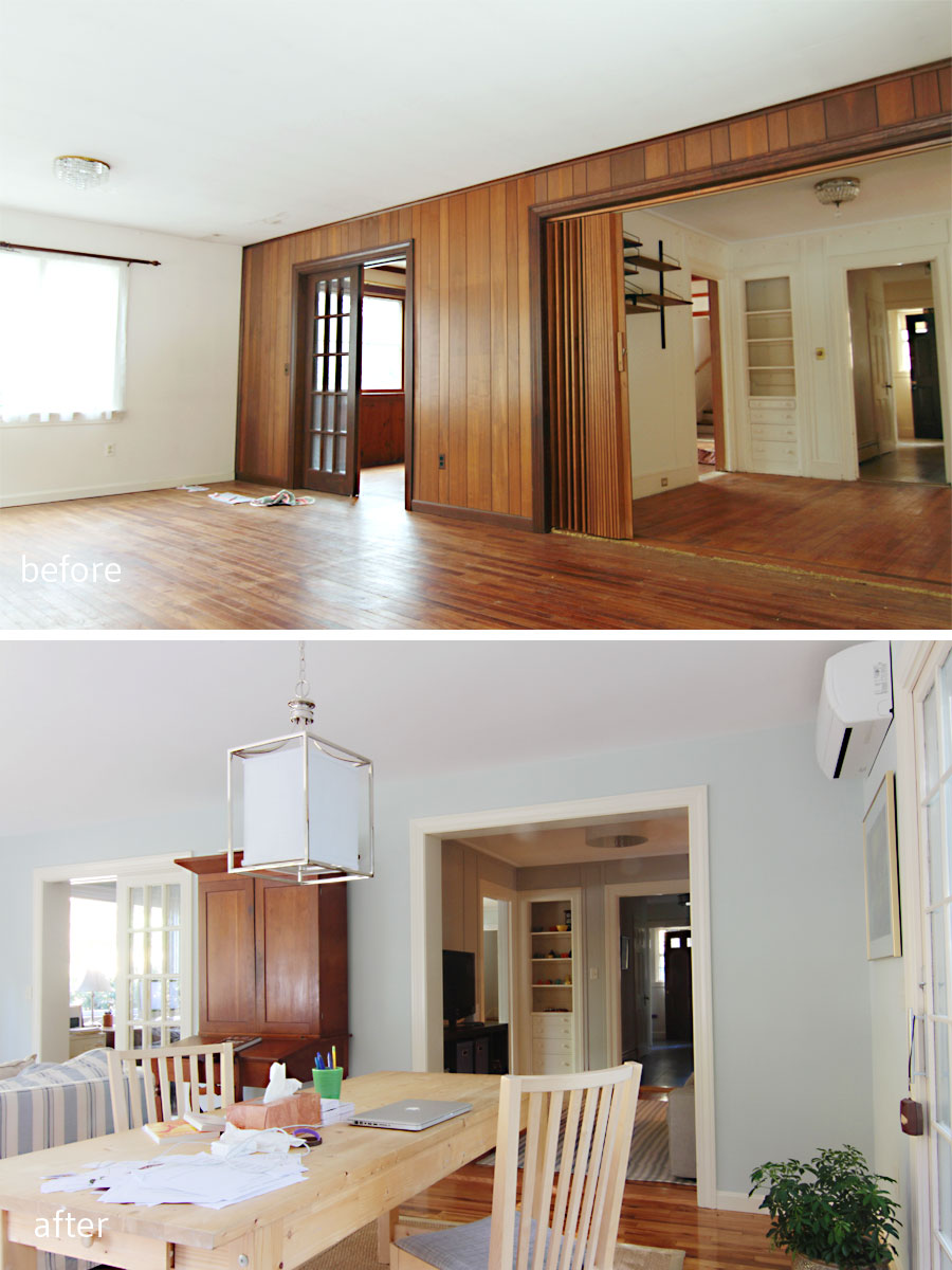
BEFORE: The not original (and not wood) panelling hid what was once an exterior wall. The accordion doors were also not original and were pretty gross. AFTER: By narrowing the entry way between the kids’ game room (former dining room) and the sun room (former exterior) we left room for future addition of French doors. Then this sun room can double as a guest room when the kids are grown and visit with their own offspring (don’t cry Mrs W, they’ll always be your babies).

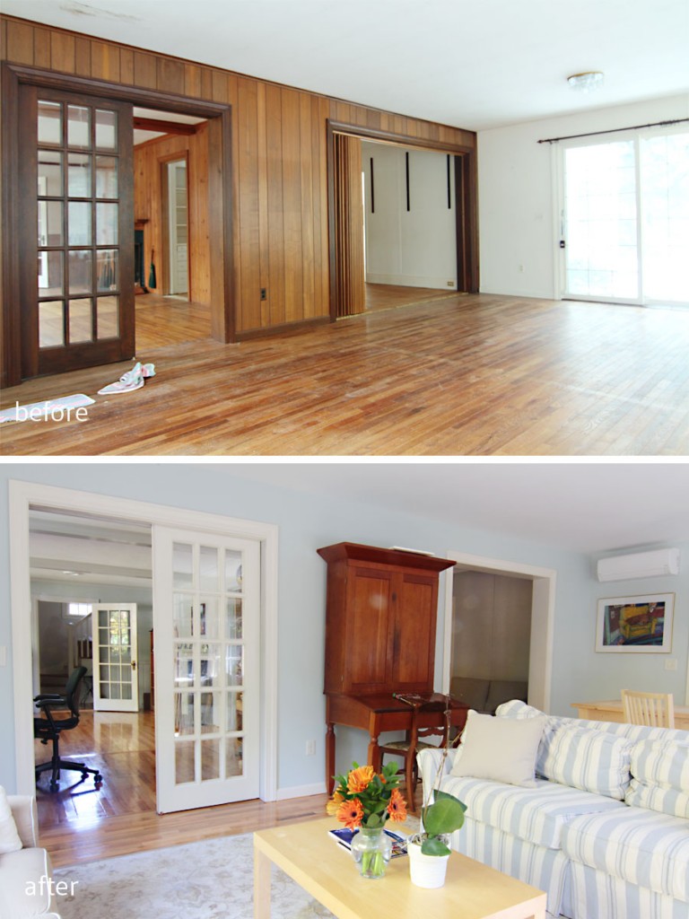
BEFORE: This room was the original dining room of the house, and even still had the built-in china hutch. AFTER: We kept the hutch (duh) but painted out the vertical strapping on the walls to make the room feel a bit more modern. The four doorways/passageways in this room a perfect spot for the kids’ gaming system. Parental supervision ensured. (Mud room/side entry sneak peek!)

BEFORE: A view to the sunroom through the former dining room. AFTER: Now a sunlit and welcoming spot for homework, and a welcoming spot for playing video games for the kids. After the homework is done, naturally.
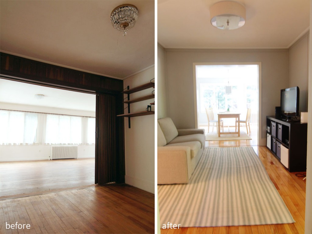
BEFORE: You can see a better angle of the accordion door and cheap paneling (added in the 80s with the addition). AFTER: By reducing the opening, the space has more of a room-like proportion, and is just big enough to seat some gaming teens and tweens. Wall color: Repose Gray.
This home really had a great set of bones. All I had to do was help the clients choose colors, fixtures, plan out how to place their furnishings and lay out their zones, and they did the rest, injecting so much home into this house that it felt inviting from day one. Eventually they’ll get to the window dressing part (which we all know costs a small fortune), but for now they get uninterrupted views of a gorgeous neighborhood, dappled sunlight from hundred year-old trees, and lots of space to call home.
BEFORE: This room was in rough shape, with a leak that had dripped through the ceiling, and some not so thoughtful decor decisions. AFTER: Now this is the room to beat, bright, welcoming, and soothing. I just know there will be love, life and laughter in here for years to come.
xoxo