*Lyrics from These Foolish Things as sung by Sam Cooke. I heard this song on my Pandora station (Ella Fitzgerald, et al) the other week while cooking, and jotted it down for the blog. When I went searching for a song for this post, this one matched what I was writing about regarding color palettes. Things happen, and they remind us of other things, and these (foolish) things can get permanently emotionally attached to colors. Well, anyway, read on, play on.
Our former home’s palette – smokey lavender, gray, sand, white, and marine blue – was inspired by the landscaping that we put in, and our desire to connect the interior to the ‘Nantucket’ style of the exterior architecture.
For many moons I’ve believed that the most beautiful and cohesive homes have a unified paint palette. Now, this is not to say that each room must match, or be party to a theme per say (ok, in fact, no themes at all, please – stick to moods), but that the spaces that open onto one another should have harmony, and should relate to one another in some way, so that when you move through the home you feel at ease. For me it’s easiest to approach this idea by beginning the design process by choosing a palette that is connected, and brings together the emotional feeling of the entire home – the people, the architecture, the furnishings, the mood that we want to evoke, the emotions that we have about colors (and saturation levels of colors) – and sticking to it.
This is an incredibly personal process. Not unlike naming your child, everyone else under the sun will seem to have negative associations with a color you like (“my cousin was once bullied by a Crimson,” or “I never did like my tenth grade teacher Mrs. Dragonfly Blue”), or will carry their own personal feelings of positivity toward colors you might sort of hate (“oh, isn’t that a darling shade of yellow… reminds me of a boyfriend I once had named Goldenrod”). Anyway, you get the idea: you can’t please everyone, so you might as well please yourself.
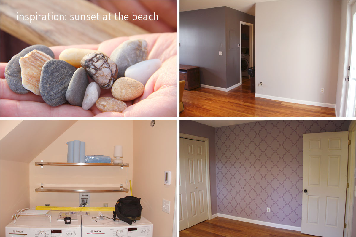
My mom’s color palette was inspired in part by a vacation sunset on the Cape. We wanted to capture the mood: the relaxation, the openness of sky, and the myriad of blush to lilac tones that exist in a great sunset.
Recently my sister-in-law and her husband (I never can remember if that makes him my straight up brother-in-law, or if there’s a more accurate term? anywho…) and their tiny daughter moved into their first place, a condo in San Diego, California. They’re new to home-ownership and are not ones to squander pennies on painting (and then subsequently repainting) rental units, so they’ve asked us (and by ‘us’ I mean Jeff and me) for advice on picking colors. Since we don’t live nearby, and since we haven’t seen the place, we’ve only had pictures, descriptions, Pinterest, and Skype to help us out with seeing what they have to work with, and what they want to achieve. I’ve been visiting paint shops (probably about time I got myself a fan deck, huh?), mulling over my favorite colors, and thinking back on the whole-house palette concept that has helped me out on more than a few projects.
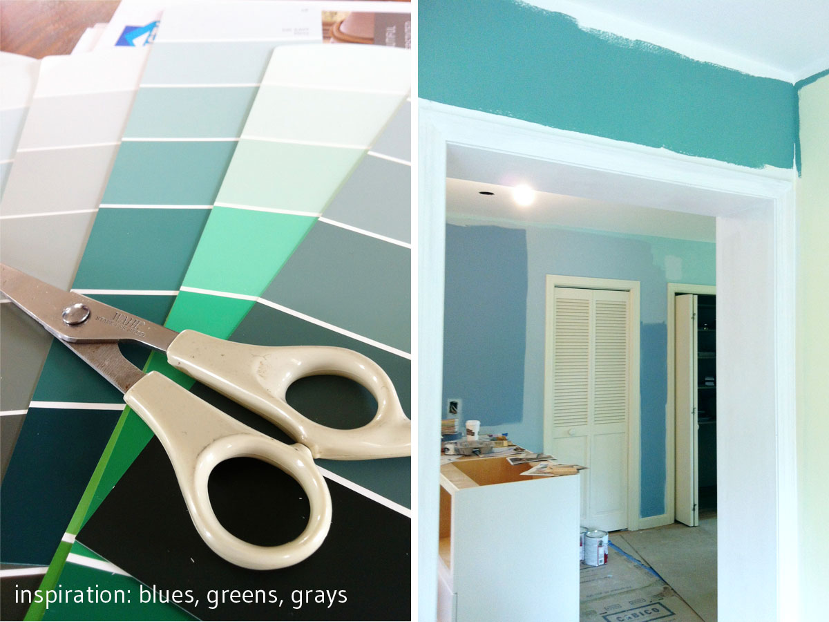
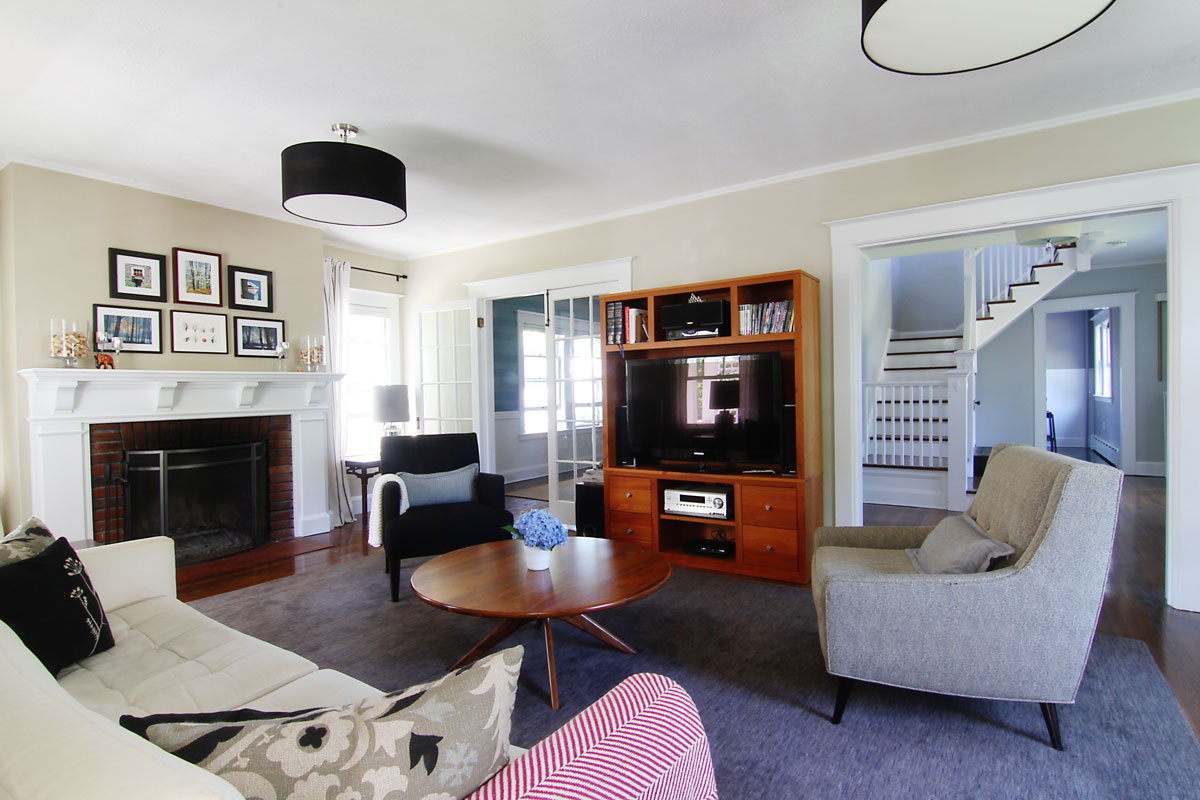
For my clients on Project W, I arrived at a palette of misty blues and greens to reflect the clients’ love of calm, serene, and watery colors. Dissenting opinions nearly derailed the home’s cohesive palette, when slate blues, yellows and even a red (!) were suggested (by non-clients, and not by me) as alternatives. Serenity prevailed and the original scheme provided guidance for adjusting colors that weren’t exactly what the clients had pictured.
I think that starting with the entire vision for the house from a color standpoint is really helpful in solidifying your own vision for your space, and for identifying the emotions that you have about a place (and specific colors), and how you want to feel in that space. Of course that also means negotiating with spouses, or other inhabitants and frequent guests (or sometimes with painters and builders when they don’t trust you, even though they totally should), which can be tricky. But, once you get past that, and agree on a mood, choosing everything that will go in it is much easier. Once you have identified the things you don’t want, it’s easier to choose amongst the things you do want.
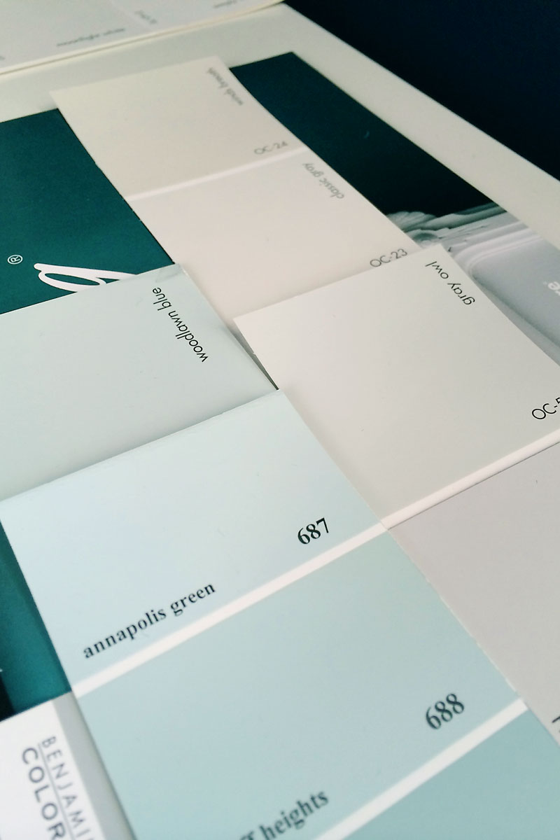
For my sister-in-law, she wanted soft, barely there colors, with a nod toward classic beach colors (she lives in San Diego, after all). On the list are Gray Owl, Classic Gray, Annapolis Green, and Stonington Gray.
Color is intitmate, and absolutely subjective. We did an exercise in design school where we went around the room and wrote down how we felt about certain colors. Naturally we all had different associations, positive and negative, for every single color you could imagine. This is why the colors that you pick should be colors that you love, even if Johnny and Susie got mugged by Olive Drab on their way home from the Mustard concert. You don’t live with Johnny, Susie, Olive or the Mustard band. (And if you do, I’m sorry. No disrespect.)
Find your voice, find your vision, and trust yourself. Trust yourself.
xoxo