*Lyrics from Heavy Feet by Local Natives. I listened to their newest album, Hummingbird, on repeat for three days straight, and then I took a break so I wouldn’t ruin it for myself. You all know I love them. This song is why. Plus, read on, and you’ll see why these words resonated for this post.
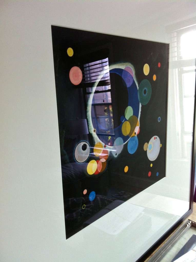
You see, a few Christmases ago, my younger sister gave me a print of a Kandinsky painting she spied that reminded her of my love for blurry dots. I actually and sincerely love that side-effect of having poor distance vision, that blurring of all the edges and background that happens in movies, the way that light turns into semi-transparent glowing orbs that sparkle and move when you blink. It’s really just poor vision, but I find it beautiful (and one of the reasons I don’t want Lasik). It took us years – quite literally two actual years – to muster up the effort to go and have it professionally framed. It was an odd size, and also a really high quality print – no cheap frame would do. But, once we did have it framed, we decided it would be the major inspiration point for our color scheme and vibe at The Pied.
The print, when framed, ended up about 32×32, so we knew that in the petite bosom of the living area, it would take prime focus. So we wanted to compliment it, as well as add things that created tension. I took from the blurry dots a circular (curvy) motif that I repeated in other elements throughout the space. I also expanded on the geometric motif (circles are geometry, after all) by layering in angles and triangles to balance out the softness of the curved lines, and to create some tension and interest. Plus, the vast variety of colors in the painting let us know we could pretty much just pick any we liked for a backdrop and the room would work.
What we ended up with – and this is by no means the end yet – was an eclectic mash-up of patterns and styles that all connect back to the original theme. Somedays I don’t believe I’ve gotten the puzzle correct – like a sudoku without an answer key, I must rely only on my own judgement and logic to know when/if I’m right. There are bold geometrics, wacky florals, staid solids in textures like linen and cotton, as well as angular and curvilinear shapes in the furniture. While I’m not certain that we’ve completely gotten the right balance yet, I think we have a good basis to start.
But now, well, yeah, and we’re moving again. I suppose that should have ended more like this!! Remember on instagram when I was all, ‘should we or shouldn’t we’?
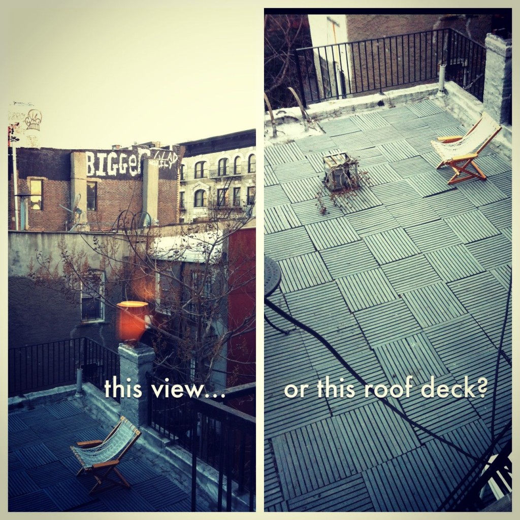
When I asked on instagram if we should move, while you had your concerns, you all agreed that outdoor space was to be cherished.
Yeah, well, we did! Because we should. (Outdoor space in NYC? No brainer. Plus, we’re only moving one flight down. No moving trucks, no severe hassle, just an afternoon of sweat, possibly blood, definite tears.) So, while I’m tempted to try to start a design scheme all over again after we move downstairs, there are a few items that will definitely make the long journey with us.
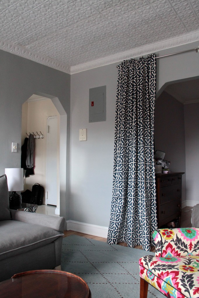
The curtains: we made them, they're lined, we're keeping 'em, though we may actually hang them on the windows this time.
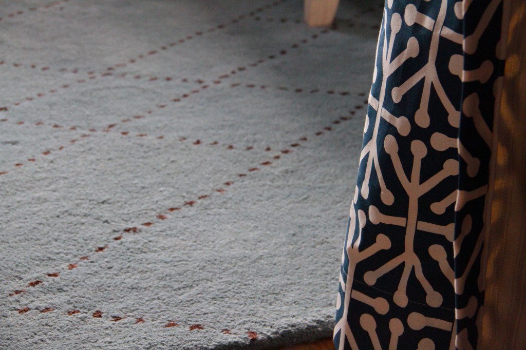
The curtains – handmade by me (with help from the husband), these things are too costly to replace. The fabric was only $7/yd, but after two panels that are 1-1/2 fullness, and lined with more fabric at the same cost, the total investment is up there (not to mention the time it took to actually sew them). Plus, the color in the background matches very closely to the color that we painted the wall. The pattern mixes the sharp geometry with the circular motif, and, while the scale of the pattern might be a tiny bit too big, the function and overall look of the curtains will help repeat the idea that we started with.
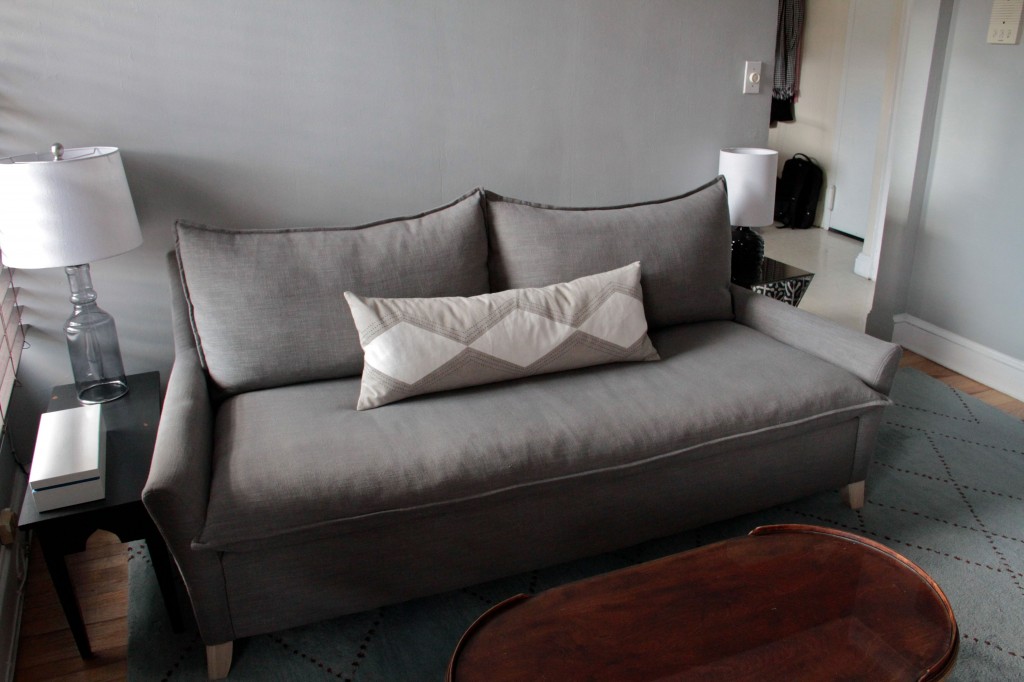
The sofa: it's held up pretty well, long enough to sleep on, and deep enough to lounge on. Pretty, comfy, neutral, we're keeping it.
The sofa – obviously, you have learned by now that our hallways are quite narrow. After not being able to get our bed upstairs (it didn’t go up even one flight) we feel even luckier that we were able to get a sofa in the apartment at all. Based on price and measurements, there were scant choices that we could both agree on, and that were stocked in colors that we could live with (and have delivered quickly). This one from west elm fit the bill, and has even served as temporary lodgings for my little sister. In other words, it’s pretty comfortable, and we’re keeping it.
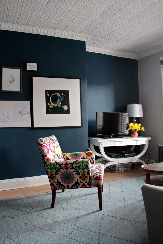
The chair, art, and console: we're keeping them. That wall color is a maybe, even though we adore it.
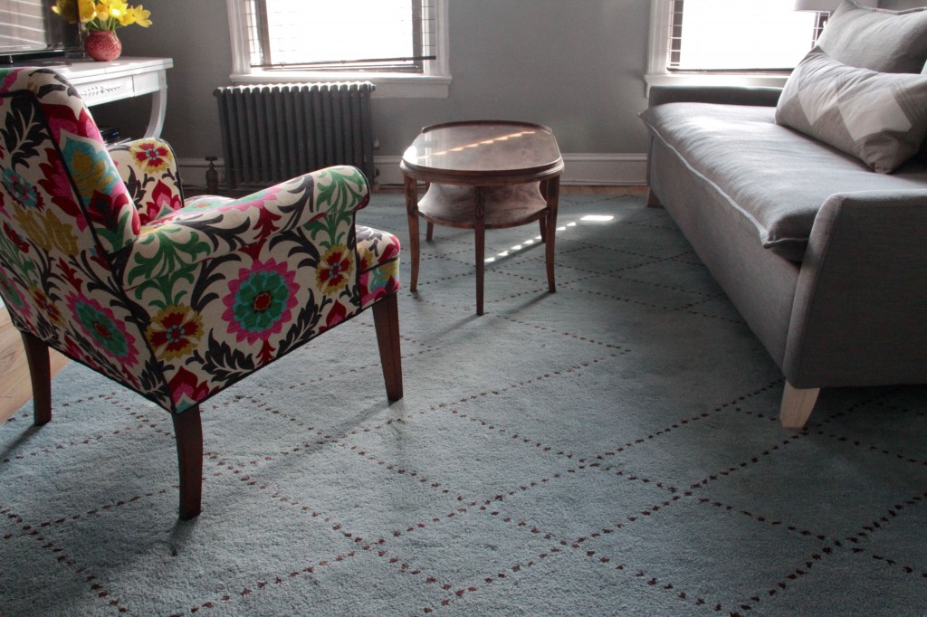
The chair – well, I’m still having a bit of upholsterer’s remorse. Not about the workmanship – Jeff at PVU did a fantastic job – but about the fabric. It’s rather bold (which was a stretch for me), but the pattern does follow the geometric linearity that we set forth to repeat. Add to that the colorful nature, and the slightly tailored, but still curvy vintage shape, and you’ve got everything pointing back to the art, and our original intent. Some days I absolutely love it. Other days, well, I feel foolish. Still, we’re keeping it. Plus, it fits through the doors.
The console – a vintage find here in Brooklyn, started out slightly banged up, and a warm, toffee-colored wood tone. Pleasant enough, but perhaps too dark. And, since the finish on the top was pretty marred, we figured, let’s celebrate its curves and put a crisp white curvy console beneath the boxy TV, and in front of the saturated wall. Occasional buyer’s remorse on this one, too. It should have been cheaper, and I should have paid to have it sprayed. Still, it’s working out pretty well for what we wanted to use it for.
The rug – a rugsusa.com find, this was our biggest risk when we first started furnishing the space. We couldn’t agree on anything that we could look at in person (there were a few west elm numbers that were in the running – check out our pinterest board for proof), so we chanced it and ordered online, sight unseen. When we first looked at it, we were disappointed. It seemed more teal-y online, and less powder blue. In person, it oftentimes pulls a lovely soft aqua color. Still, we had anticipated a richer flooring option. But, it stays. For now.
The art, mirrors, and lamps – naturally, the original jumping off point will not only stay with us as we move, but will also be featured as it is in our current place. The rest of the mirrors will be tossed up in the air and land (completely unbroken, naturally) in different places, I expect. The lamps will be swip-swapped around, but essentially it’s all staying.
The new place has a slightly different feel, and layout changes that will challenge us to come up with a workable floorplan. (When we get something worth showing off, you know I’ll let you know.) We already have two vintage bedside tables to add to the space (you may have seen glimpses on instagram). And we may or may not keep the same paint scheme. But this time, I aim to paint the kitchen. Suck on that, soul-sucking dirty yellow.
xoxo
What is the name of the wall color behind the Kandinsky print? It’s wonderful.
It’s Gentleman’s Gray by Benjamin Moore in Aura flat/matte. It looks divine at night, too.
Mozel tov! So many going-ons for you now. Outdoor space is the best and its gotta be difficult to go from big yard to no yard. As much as moving’s such a pain in the ass, its fun to design new spaces to live in. I can imagine the most intimate of outdoor dinner parties on that balcony…summer night, candles, city sounds and you cooking up a storm. The best. PS, please insta-picture said outdoor party.;)
Thanks, Linds! I can call you Linds, right? Besides, you’ll make your way to NYC one day, yes? For drinks on the deck? It’s crazy, but I’m hoping it’ll be so worth it in the long run. And summer is really on the horizon now. I mean, right after spring, which is totally on the horizon. Snow schmo.
That patio is amazing. I’m seriously jealous. A firehouse with technically no yard space (we’re buying the city owned lot next to it) just doesn’t compare. Do you have any plans for the outdoor space yet?
Thanks, Heather! We’re not sure if the furniture that’s there now will stay or not, but we hope to move our hammock, chairs and possibly grill from our big house (which will go back on the market soon!) here, and take it from there. At the very least, we’ll throw down an outdoor carpet and set up a seating area, likely add some plants and herbs in pots, and hopefully suss out the electricity situation (our flat has very few outlets, and I’m guessing that the outside space is lacking any). And, we hope to straighten up the floor tiles – that mismatched pattern is driving me crazy, though I’m not sure those tiles are easily movable (in theory they should be, but, well, one can never say with a rental). It’ll be an adventure, that’s for sure. Not only are the hallways narrow, but the window that everything would have to come through is quite small. Eeek! We’ll see how it goes!
Your place is so lovely. I dig the fabric on tat chair, it’s nice to have something unexpected! Moving really sucks but good thing it’s really close by:)
Thanks, Hollie! Love your new blog, too!
I just love your ceiling. The furniture is wonderful too, but the ceiling just really struck me. It goes so well with the rest of the room. What a beautiful home you have!
Thanks, Eva! I wish I could take credit for it, but it’s an original part of the building. It is lovely though!
Congrats on the move!!! An outdoor space is a once in a lifetime opportunity in NYC! Glad you went for it and I’m definitely a bit jealous!!! Can’t wait to see what you do with it.
Thanks, Lauren! It feels like a special opportunity for a New York rental. So happy to have the chance!