*Lyrics from Five Years Time by Noah & The Whale. I don’t really know why I chose this song for today – I had a note about using it for this reveal in my phone. Maybe it’s because I don’t expect to be living here in 5 years’ time, nor do I expect to like all the same things that I do now. Hell, I don’t even think I’d recognize my former self from 5 or 10 years ago. Let’s just say I’m a transition-er, in transition, with transitory leanings, and eagerness to roll along. Shall we?
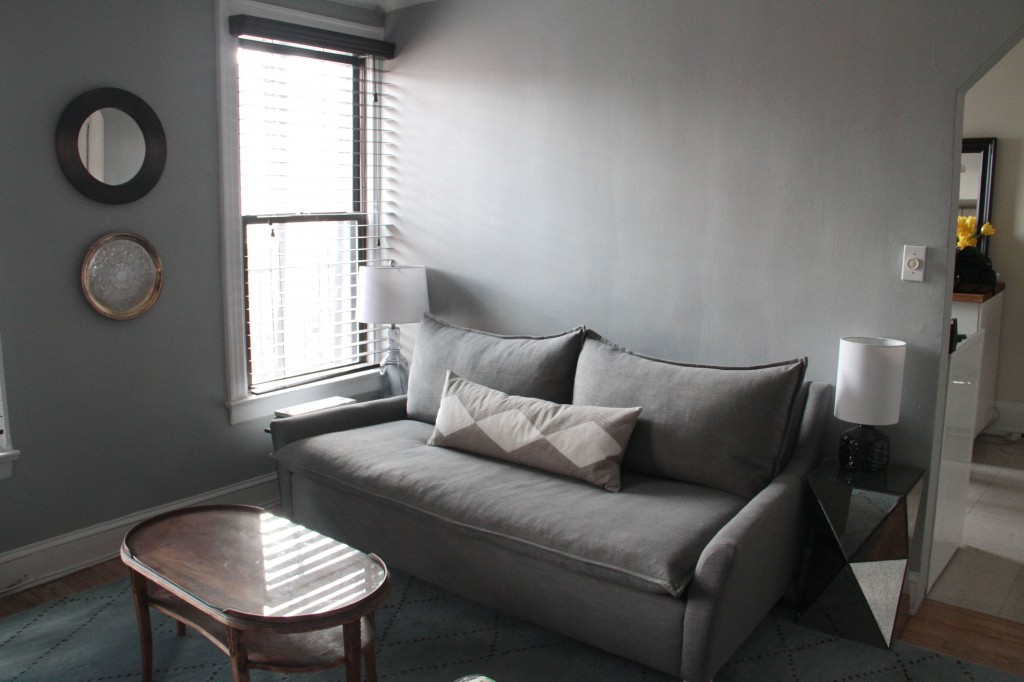
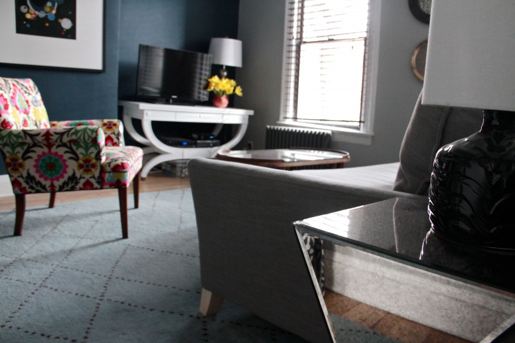
One glance around our pied-a-terre and you’d think we were the vainest bunch around. There are mirrors in every room, including an additional mirror in the bathroom (that means there are two in there), and a mirrored end table that makes the idea of drinking martinis in this space seem that much more glamorous. But, the mirrors aren’t all about looking at ourselves (though that extra one in the bathroom certainly is). They’re about bouncing light around, and making this teeny space feel bigger, brighter, and by extension, more livable for longer.
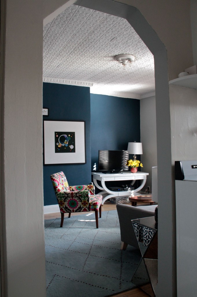
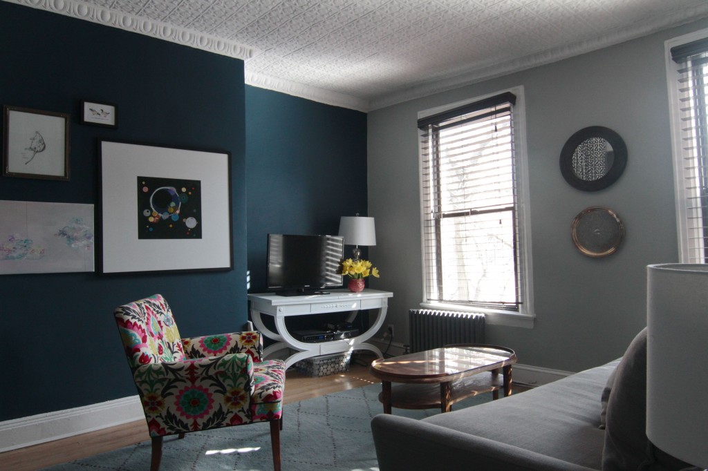
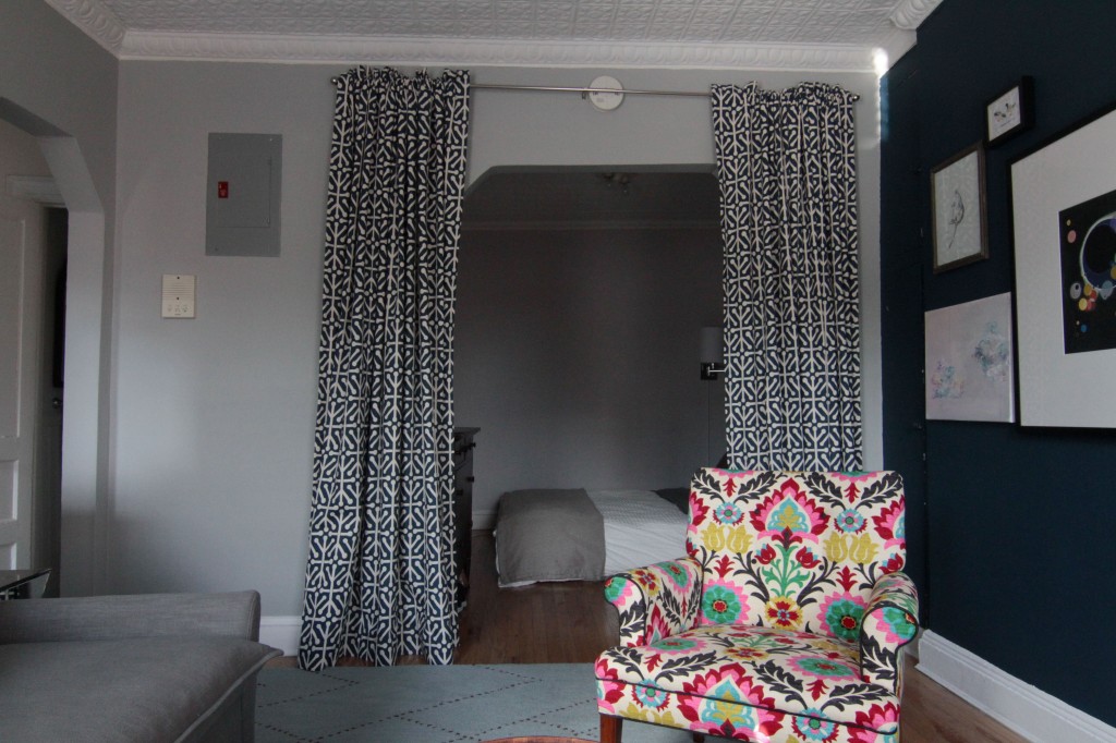
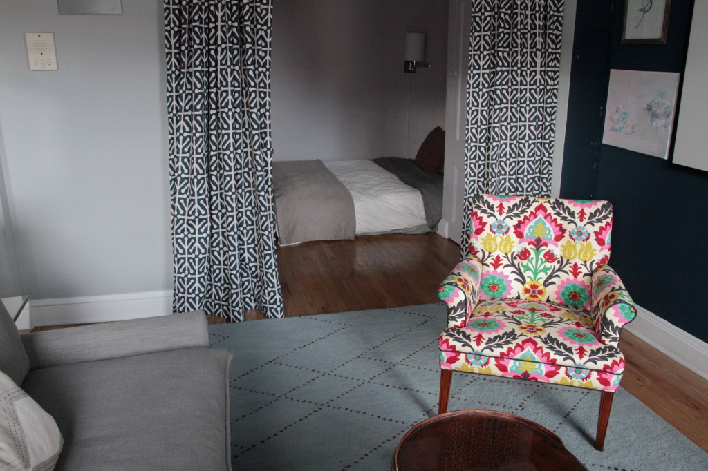
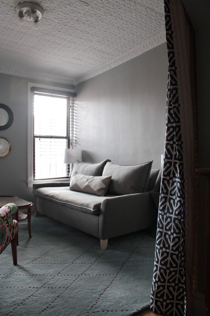
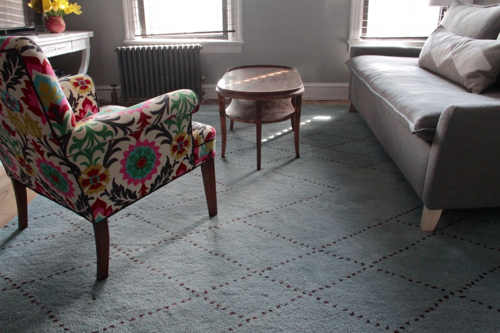
You see, when we first approached the paint options for the space, we knew we needed to eradicate the pale cream/dirty yellow completely (or as completely as we could – the kitchen still sports that soul-killing color, but we distract ourselves with delicious foods and tantalizing wines). So, we chose a deep tealy-blue – Gentleman’s Gray by BM – for one wall in the living room. (The other walls in the living room are Coventry Gray also by BM. Funnily enough we had chosen another gray, but the clerk made a mistake. We didn’t notice until after we had begun to paint, so we just went with it. Happy accident? Ok, sure.) We wanted the room to feel cozy, but not small, and to highlight the architectural details that were worth noticing – the crisp white painted tin ceiling and crown, the high baseboard moldings – while minimizing the ones that were more awkward – the chimney breast bump out, and the strange little locker storage areas next to it. We wanted to expand the wall to make it feel broad, tall, and rich. Though naturally all that depth came at a price, and that price was light.
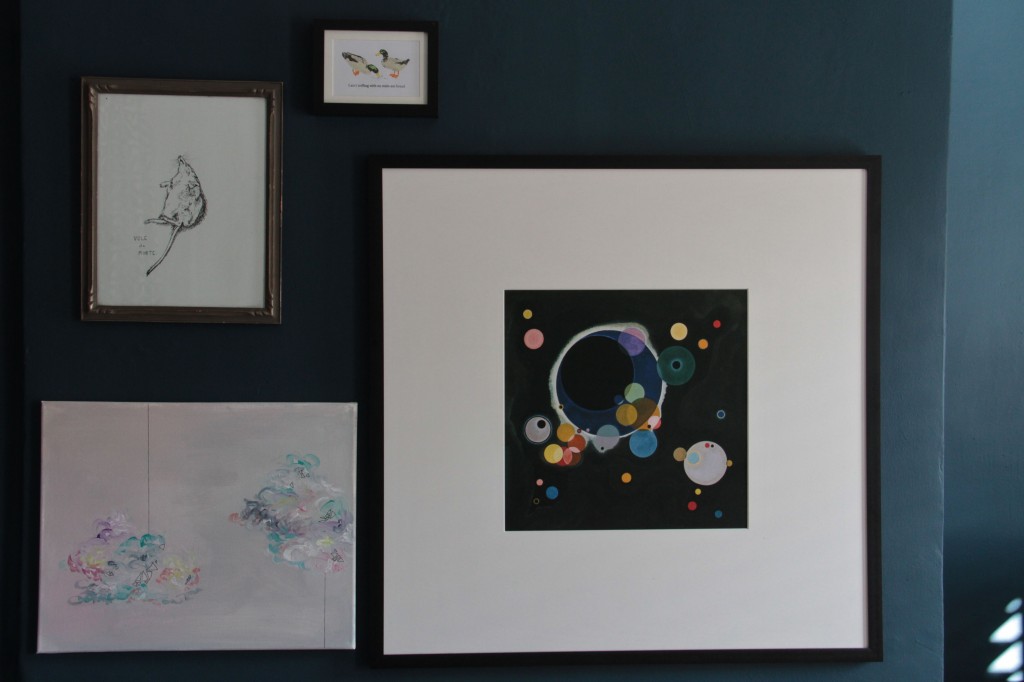
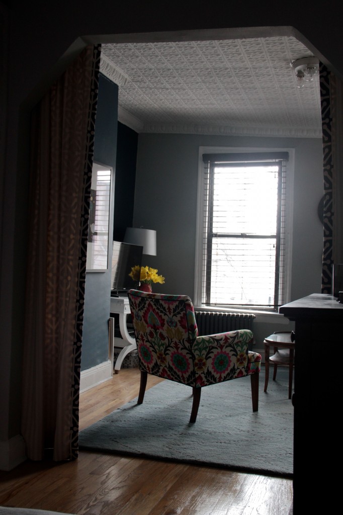
So, we added mirrors. And lamps (though we are insanely limited in terms of electricity sources here) where we could. We embraced the moody pigment and decided to hang a gallery of framed art to brighten up our view. We did our best to enhance every bit of light we do get (and it does get rather bright in the early part of the day, as the windows face easterly), and mirrors were a great way to do it. I do admit, though, to being routinely taken aback by my sudden reflection whipping by my peripheral vision as I pass through one space to the next. All in all, though, the mirrors give the walls a distance that breathes life into the space. Like a breath of air exists between you and the edge of the room, and that breath of air is all you need to catch yourself from any impending cabin fever, or claustrophobia. It’s kind of magical. No wonder Narcissus was so obsessed. Reflections are good, when used correctly.
You’ve already seen the kitchen, with the full-length IKEA mirror mounted horizontally, so now for the rest of the space. All 220 square feet of it. Enjoy!

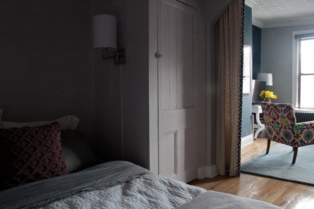
Looks beautiful! Totally jealous of your cave bedroom!!
Thanks, Katie! It’s a nesty cave, and it’s very cozy!