*Lyrics from the Hey Now (Don’t Dream It’s Over) remake as sung by Lolo (aka: Lauren Pritchard). I heard this song in the movie I Give It A Year (the movie is NOT worth seeing, btw) and really liked the quality that her voice gave to this older song. I can’t find the song available for purchase, but it’s listenable on last fm. Her voice is really something special.
So, a short while ago, my sister’s non-profit company found some office space to rent. They had been without a dedicated space for much of the holiday season, and had been on a desperate hunt for a better situation. The move means shorter commute times for my sister, and a more centrally located spot for her and her boss, and it’s located in a more bustling area of the city. The only problem/challenge is that it’s a shared space, and their co-tentant is already in place.
Luckily, the co-tenant, an event planner, is very open to sharing (it’s a reality in NYC for many small businesses), and was very happy to have some input from someone (me) who might just have a few ideas on how to best meet everyone’s needs, while maintaining a stylish and affordable office. Easy, right?
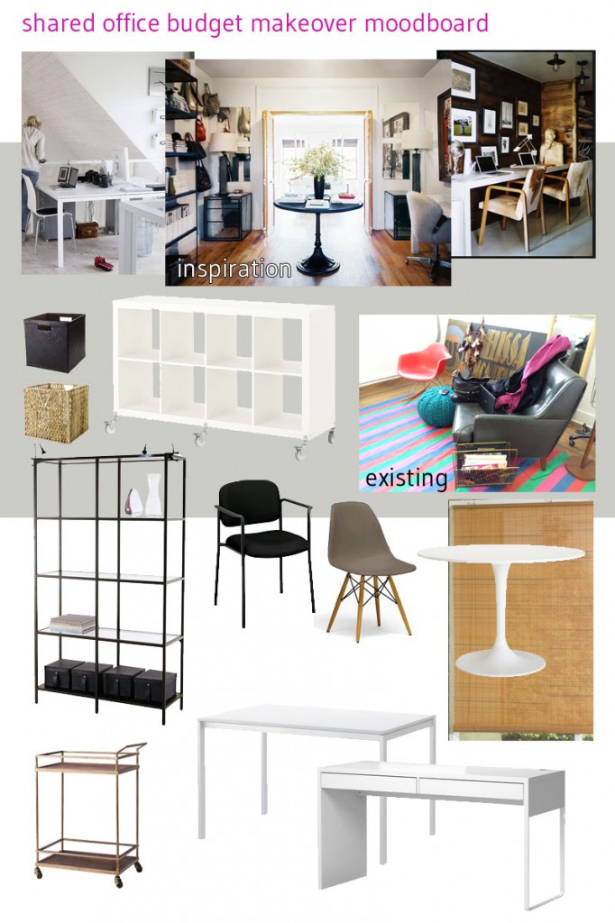
Enter: IKEA. Seriously, despite all of the misses that they make, and the hassle/effort of having to build things yourself, this is one of the best resources for cheap, durable and attractive office furniture. (That is, if you’re willing to think about everything they make as office appropriate. Don’t overlook dining tables as desk spaces, bedroom armoires as storage units, and kitchenware as office supply caddies.) With an eye toward spending as little as possible — non-profit + self-employed small business owner = budget? what budget? — and with a nod to the things they already had (including plenty of chic accessories), I whipped up a little moodboard for them to get inspired by.
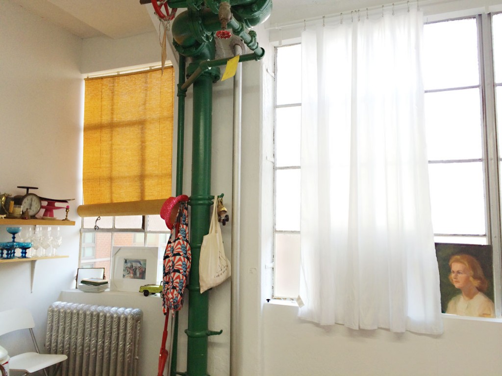
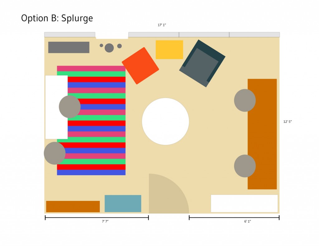
I also sketched up some potential floor plans (with some expert help from my computer savvy husband). Objectives: desk space for three; meeting space for clients for both the event/wedding planning AND volunteer training; seating area (existing) for clients or staff alike; and, visual harmony/limited clutter. While I know they would all love it if they had more money to spend, or more space to use, they’re all happy to make the best of bright, sunlit, clean office that even sports a herringbone floor.
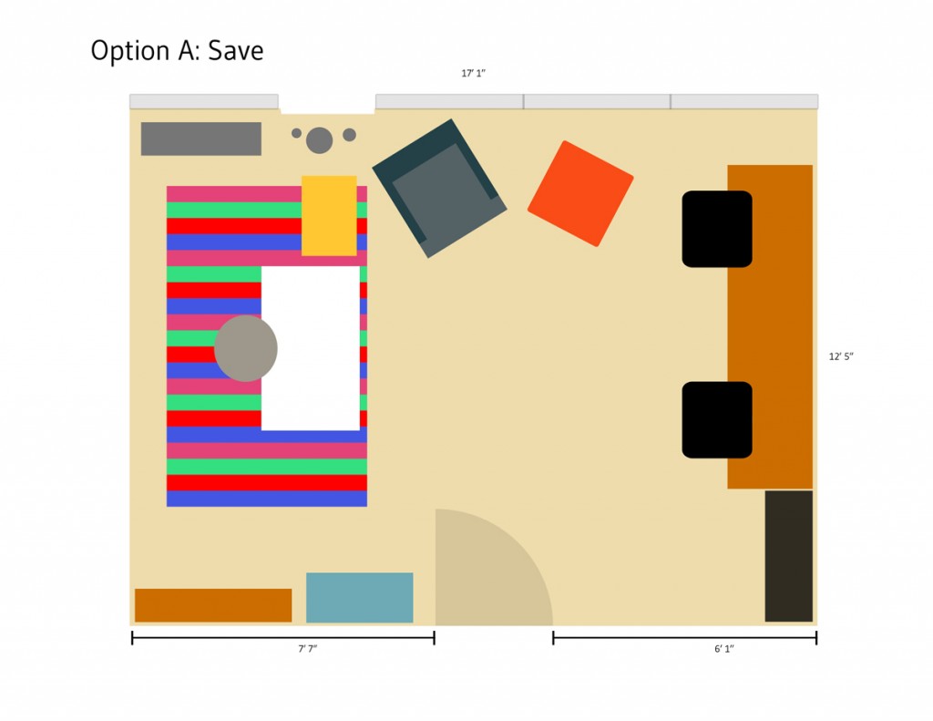
This floor plan intended to save the most on the budget, and use the existing items to their best advantage.
I included two options for them to mull over. Each plan tries to make the best use of the space they have, while allowing for things to serve as double-duty. Since meeting with non-staff/clients will be a minimal event (several times per month, but not necessarily daily), I focused on making sure they had space for their day-to-day items, while allowing them access to any files/paperwork they might need. And, since I know my sister pretty well, I tried to anticipate her need to have tidiness as an option. Everyone appreciates a clean work surface, so having spaces for messes (read: piles) to go is a must. And, I know the space will evolve with time, so I tried not to fill up the entire room with stuff. Air, and light is important which is why I fought for the seating area to stay (one of the three didn’t think it was necessary, and I’ll let you have one guess as to who it was {it might have been the only male who will be using the space}).
In the end, I think we have a solid plan. I hope to help them ‘install’ the space over the next few weeks, perhaps with a few runs to Target and HomeGoods to round out the accessories, lighting, and soft touches. Once we get a finished look, I’ll share the transformation.
My first real “job” in NYC, and it feels so good to start to make some connections. Woo hoo!
xoxo
