And so it begins. Again. Ok, for those of you just joining us, this is a chronicle of the DIY (design it yourself – we leave most of the heavy “do-ing” to the professionals) antics of me and my hubby as we set about improving our 1920’s house. We’ve just completed the kitchen, master bath, guest bath and bedrooms (though I have more decorative touches to add to those rooms soon), and are about to set forth conquering the dreaded family bath.
We call it the family bath since that’s who uses it most: our family and friends who stay with us when visiting for holiday affairs, or just to get away from their citified lives. We call it dreaded because it’s a logistical nightmare, and one that’s sure to test our budgetary limits. So, I thought I’d take you guys right on through the process, sort of from the beginning to the end. The actual beginning was about 4 years ago when we bought the house, but the drawings and purchasing only just happened, so I can share the process with you.
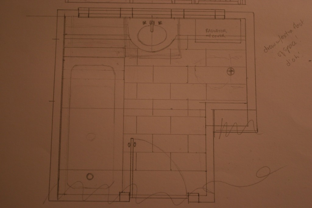
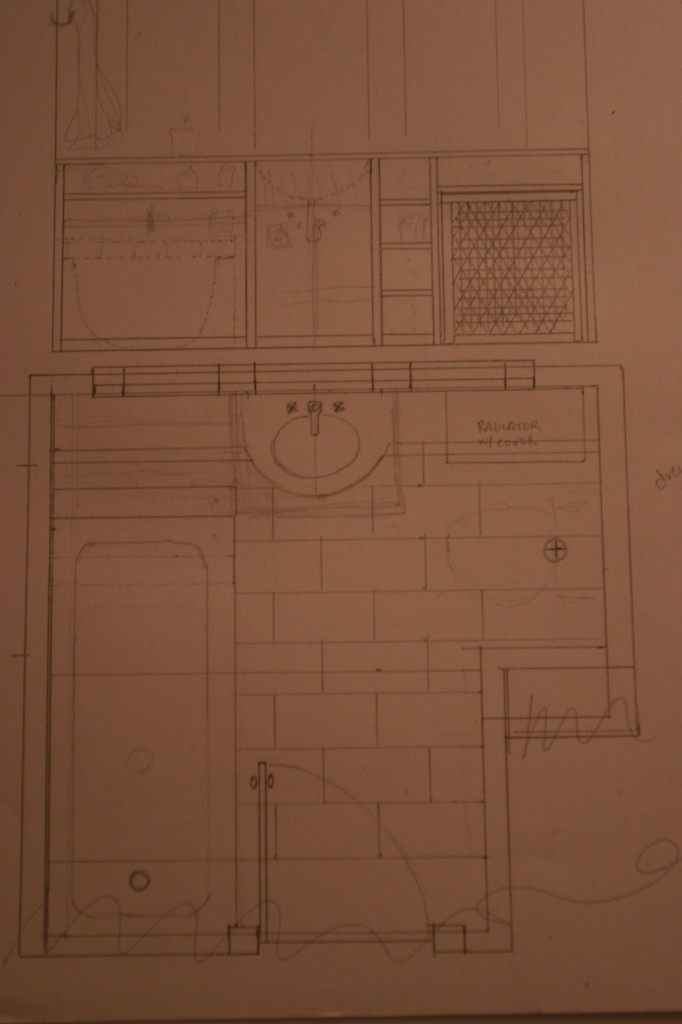
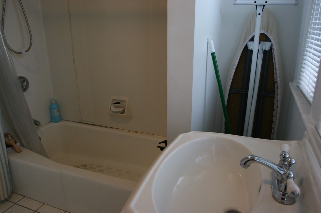
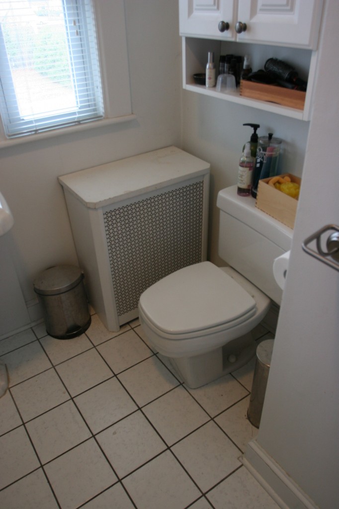
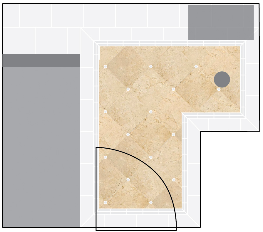
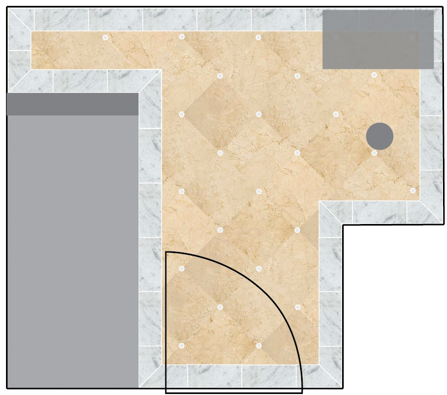
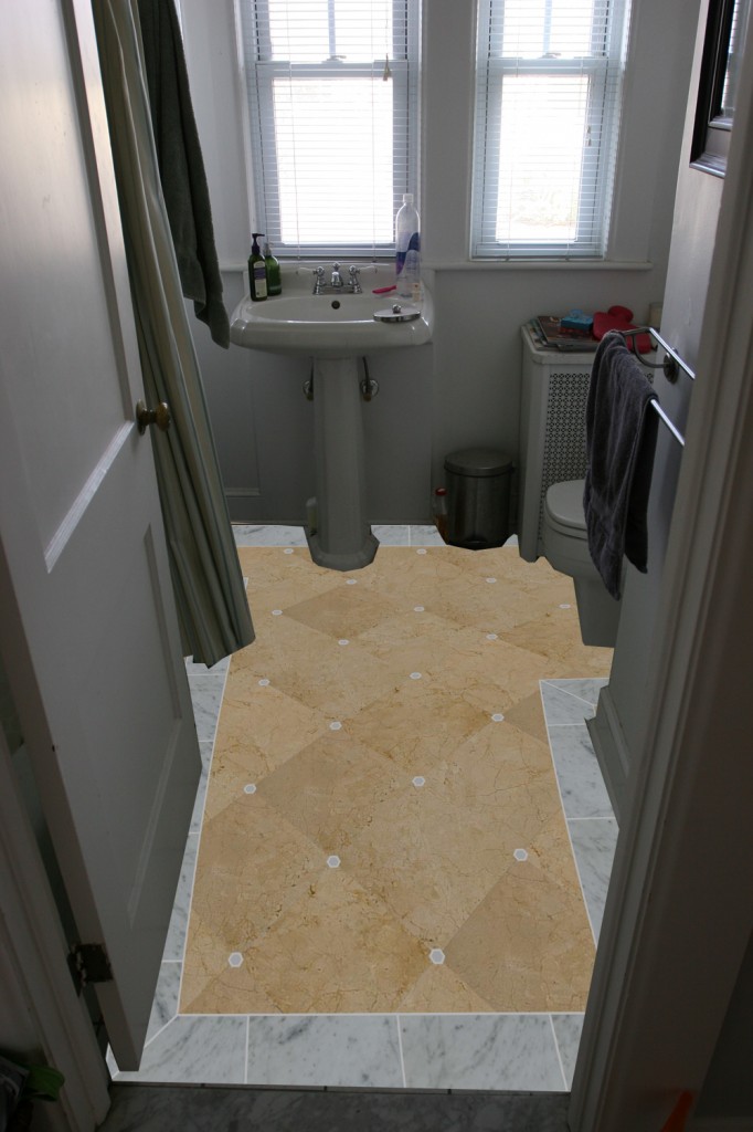
First, the space plan. It’s set up so that the tub is along one wall, the sink tucks up underneath the windows, and the toilet is in a little alcove area. (We sort of mimicked the toilet/sink layout for our half bath.) Space is tight, awkward and the plumbing is way too expensive to move. So, we’re stuck with it. Though we had alternate ideas (that involved sealing off doors, moving the entrance to the bathroom, as well as plumbing), we decided in the end that making it work as-is was the right thing to do. The fixtures will stay in their current locations, but the finishes, the functionality and the efficiency will (hopefully) be much improved.
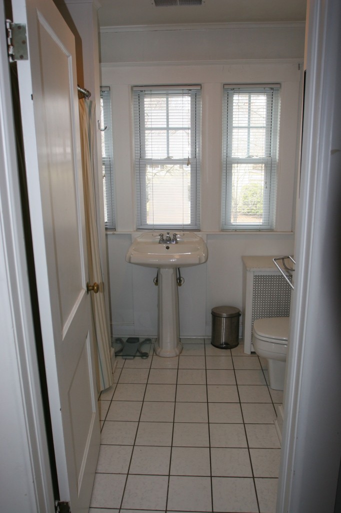
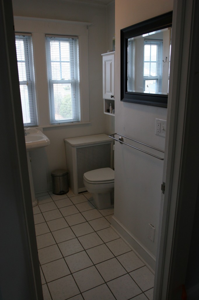
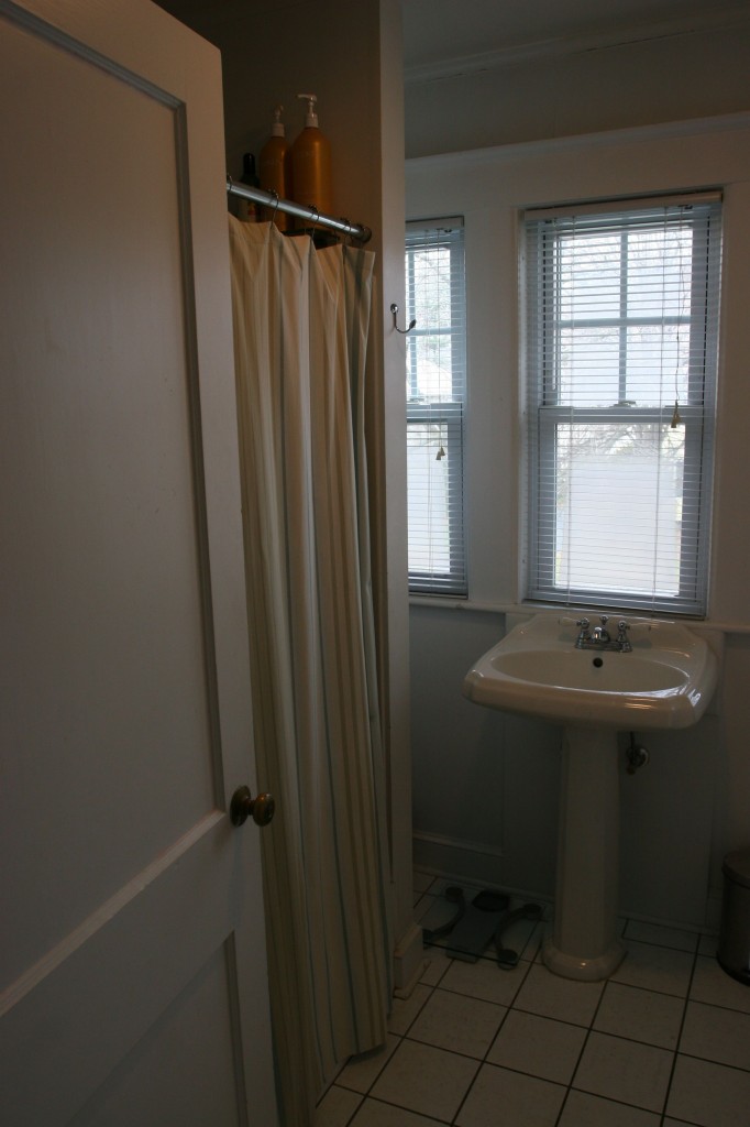
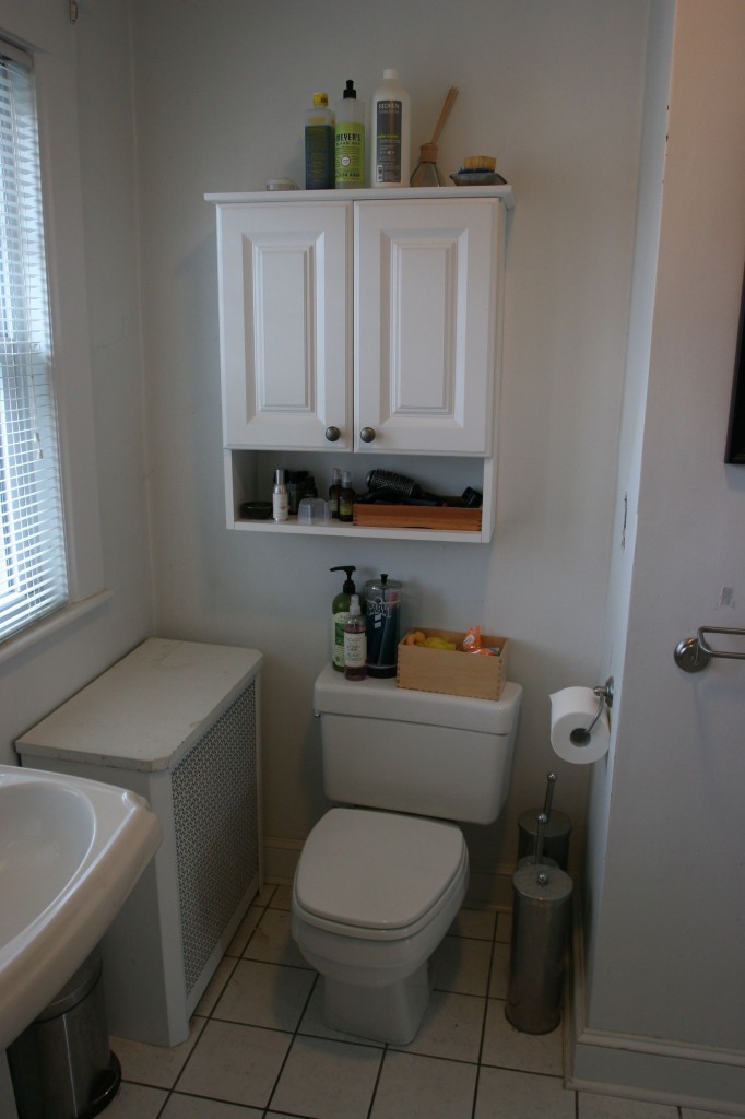
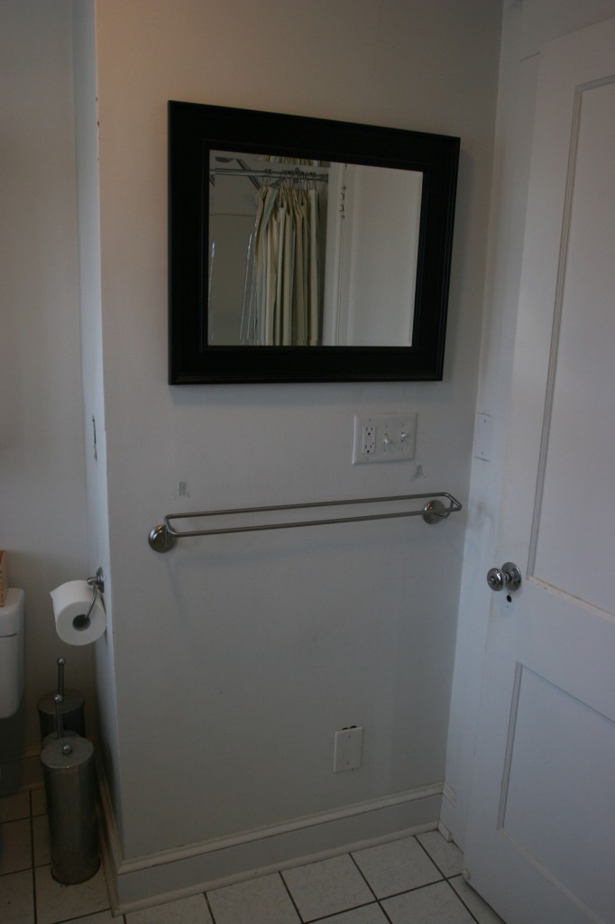
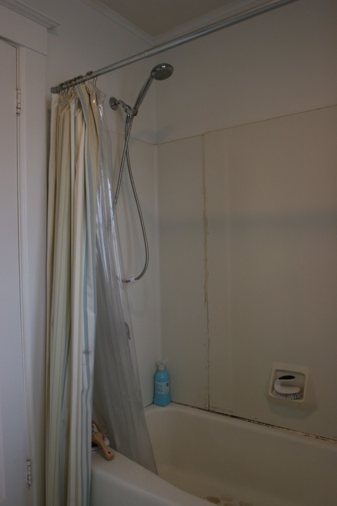
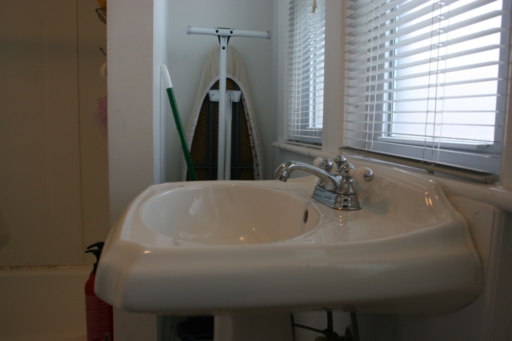
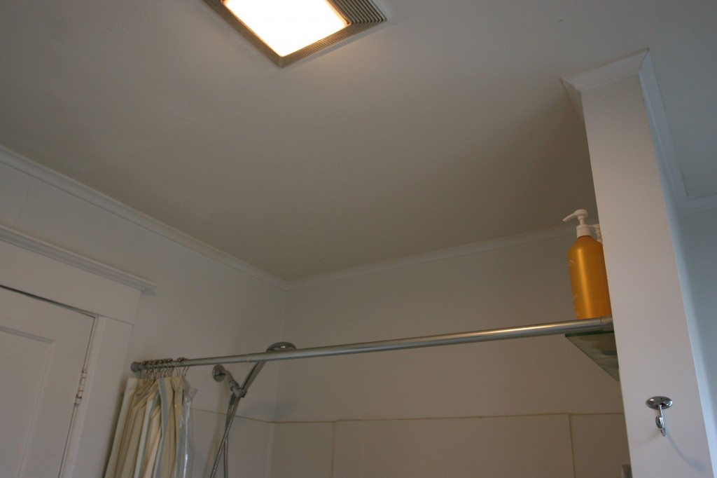
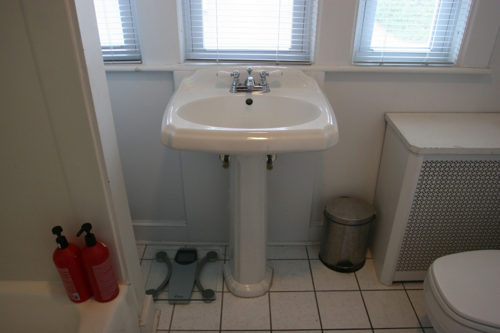
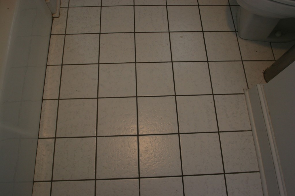
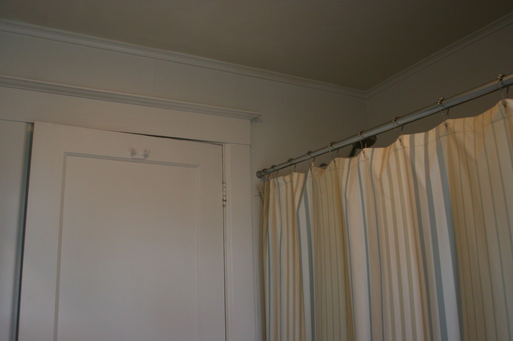
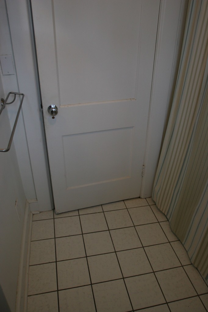
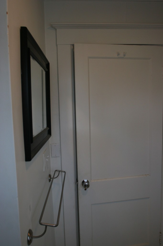
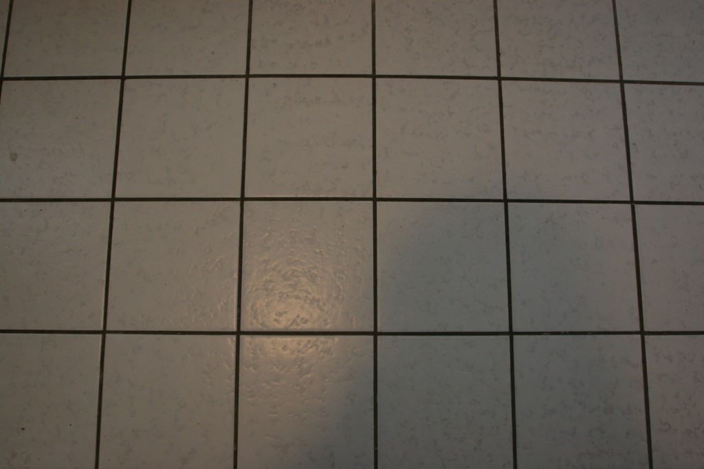
The fixtures. Let’s just say that the room has a distinctly late 1980’s feel about it, including the mega-tanked toilet (that runs if you don’t put the handle back where you found it), and the super shallow mini-tub (that barely fits a child, let alone an adult). The pedestal sink is bearable, but there’s absolutely no counter space, unless you count the top of the radiator cover as a counter; it certainly doubles as one. The floors are in fine shape, but are capital-F ugly, including the Tron-esque grid pattern and grout that has turned into some sort of greasy, dark, almost black color. Not the sanitary, luxurious, family friendly space we envision.
The process. Well, we already have a team of highly skilled, totally upstanding dudes on speed-dial, so the hard part is taken care of. All we had to do was design it, purchase everything we need (including things we know nothing about, like plumbing valves), do the drawings, and schedule it around everyone’s personal lives and the weather. Piece of cake, right? With all of the plumbing details ordered (sans perhaps a chrome P-trap, and possibly new, prettier water shut-off handles), the tile sitting patiently in the basement (sans flooring tile, which we still need to pick up), and the drawings just sitting there daring me to start demolition, we’re in good shape for our end of month start date. But so much of design is planning, organizing and forethought that I thought including that part of the process this time would be interesting to you all.
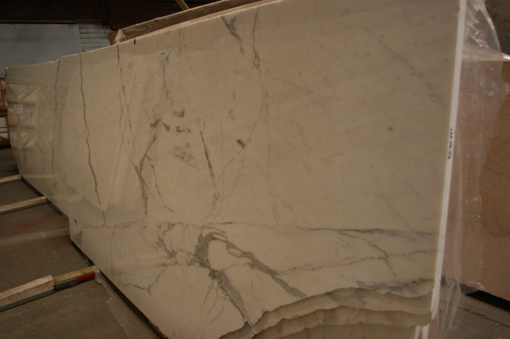
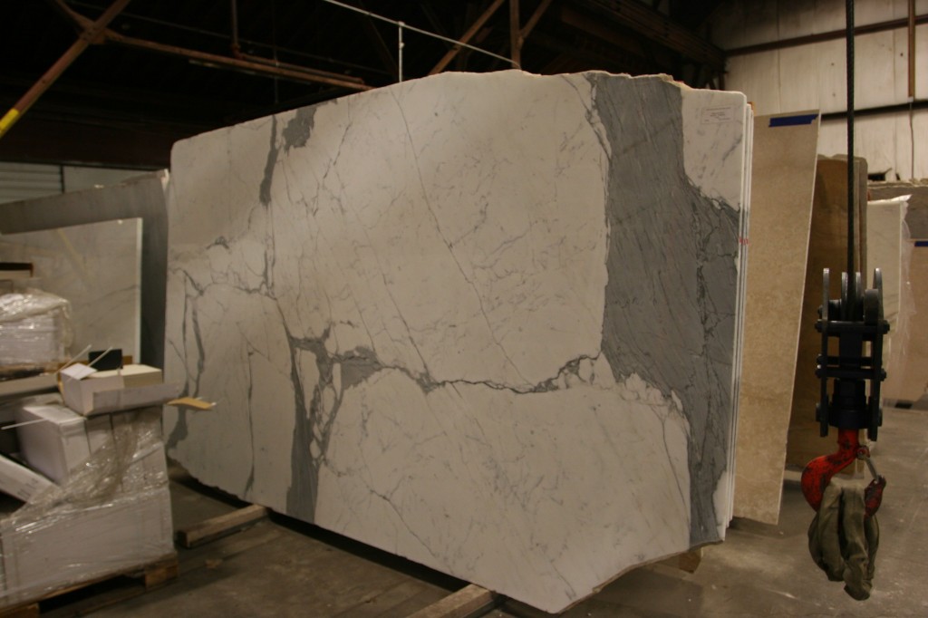
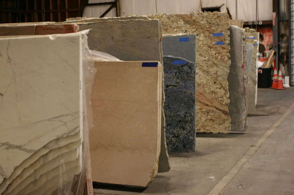
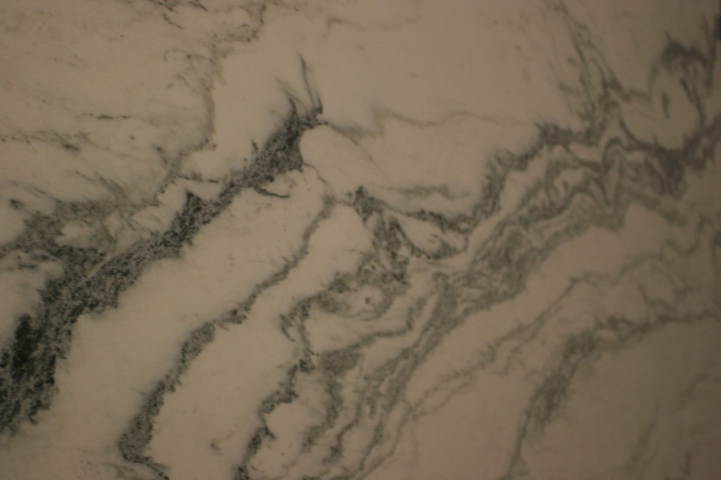
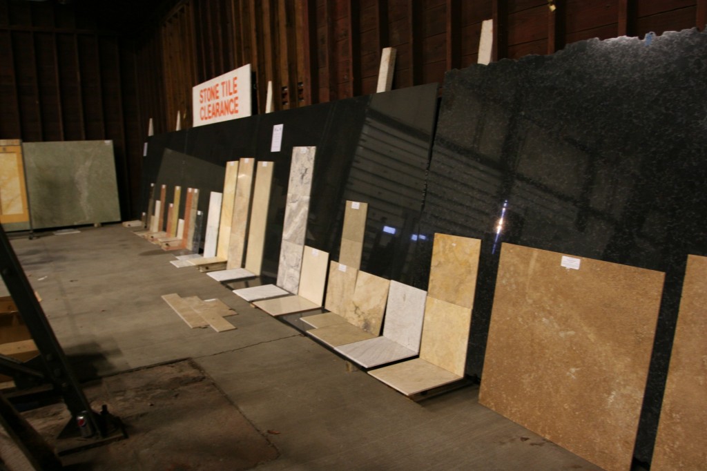
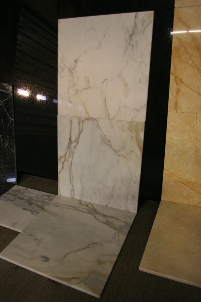
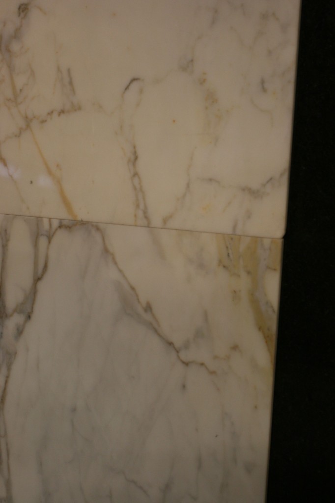
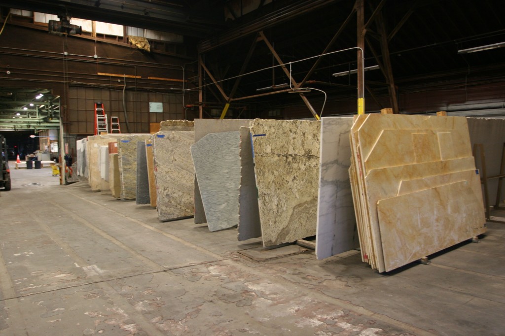
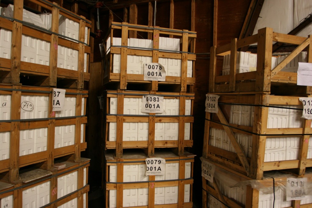
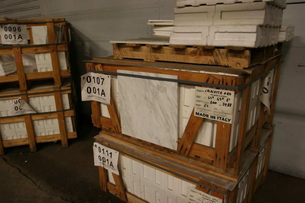
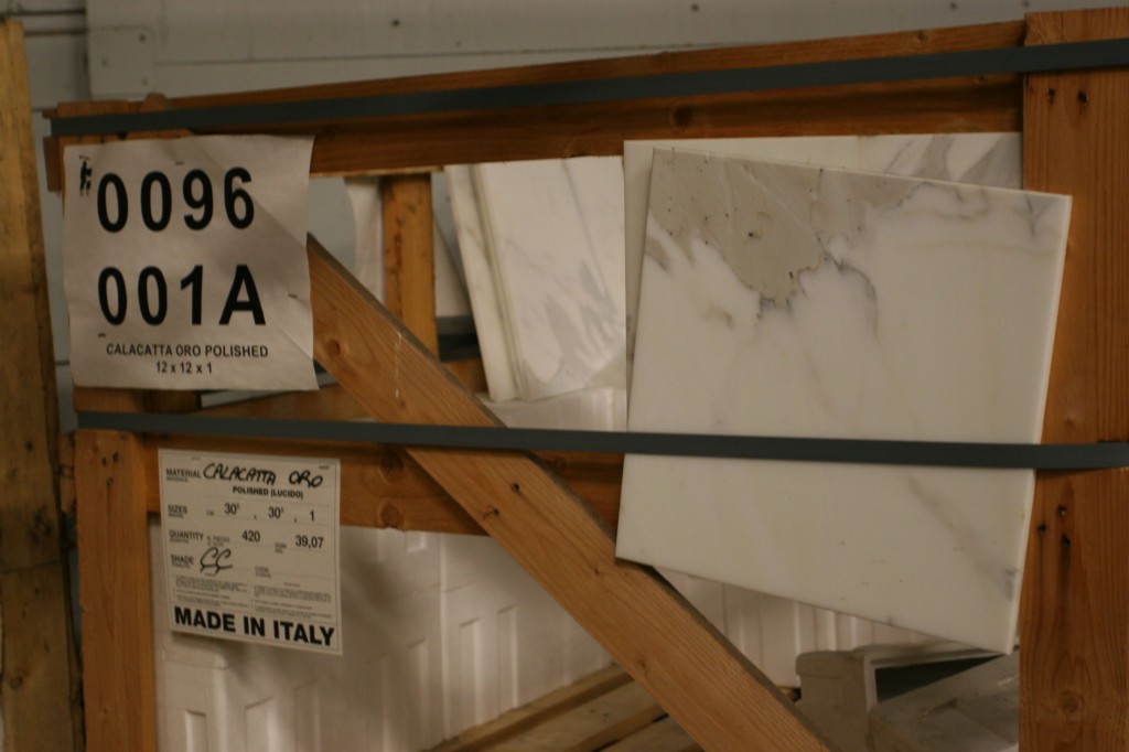
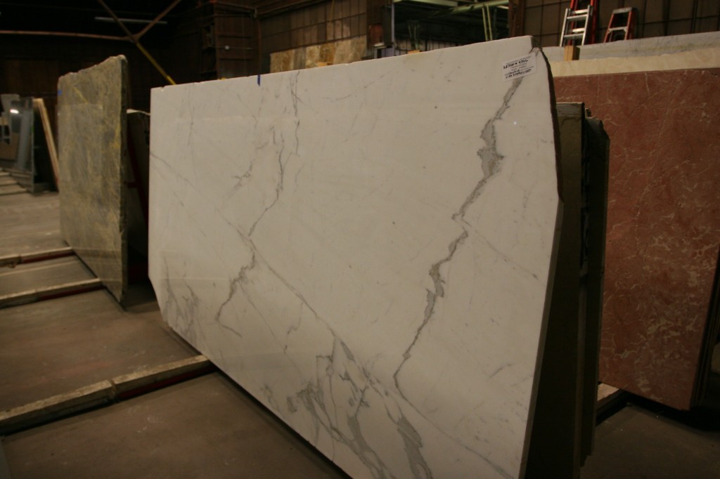
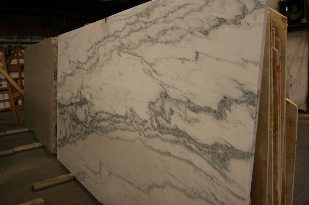
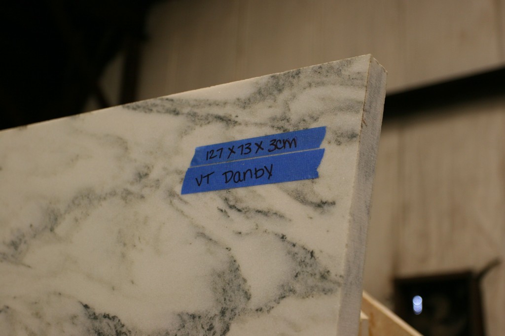
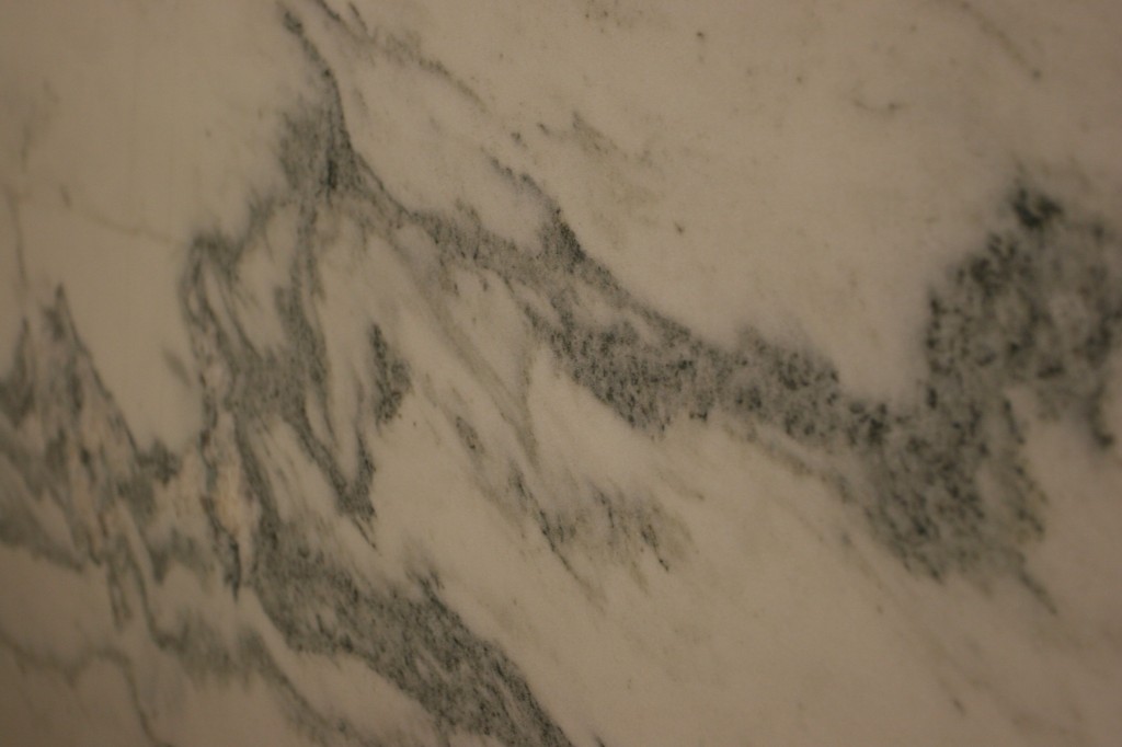
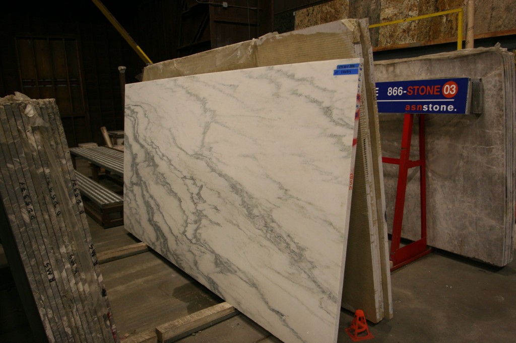
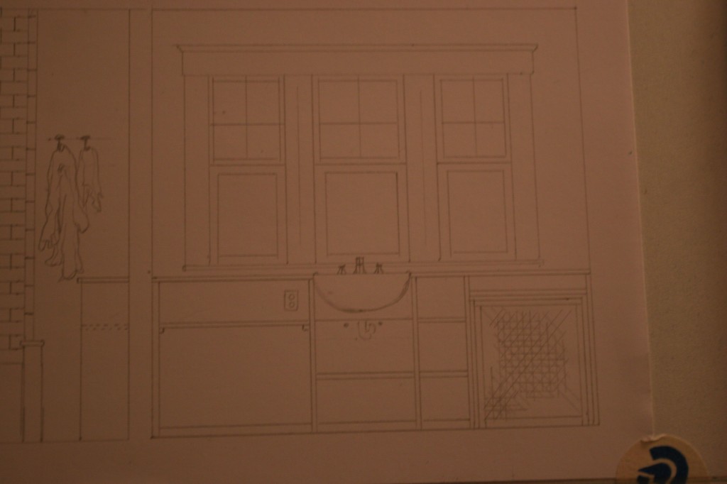
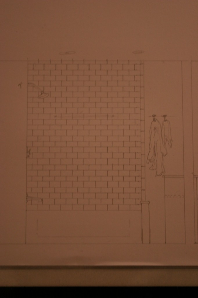
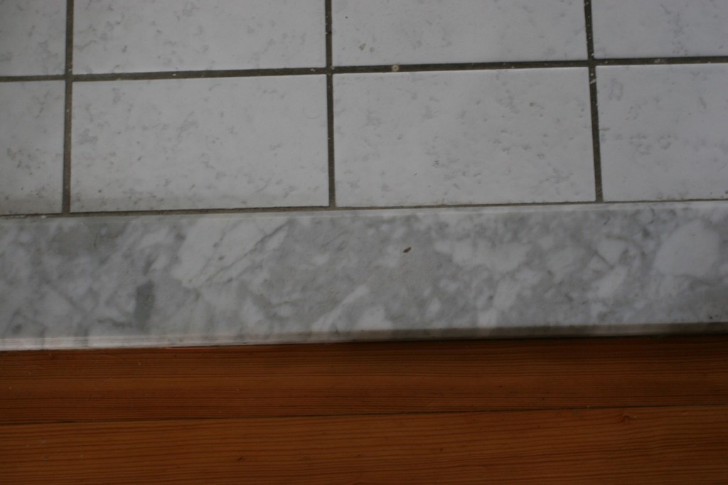
So, some initial drawings, computer mock-ups, before shots and some stone vendor location shots for you to peruse. Enjoy!
*Lyrics from The Morning Benders “Promises.”
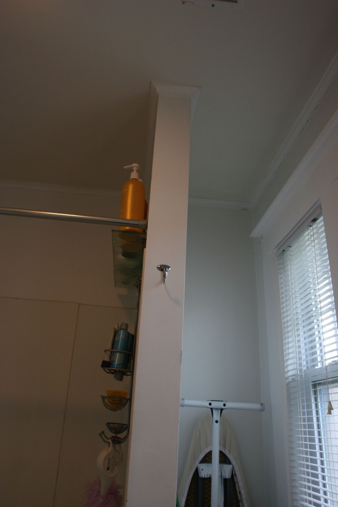
I’m mostly commenting on Jeff’s sweet mockups (and not the fact that you said “moldy caulk” *tee hee*): You could always cut that wall in half to let in more light. I don’t know if it’d be worth keeping the lower space open for storage (since you can’t really reach it) or just covering it up (thus creating some shelf space on top).
I’m throwing that idea out there.
Thanks for the comments, Puke! As you can see in the tiny drawings, we are shortening the pony wall to create some sort of shelving/storage. It remains to be seen whether or not it will make more sense to simply block off the underneath area, or if we’ll be able to use it as storage in some capacity.