*Lyrics from Mean Streets by Tennis from their new EP Small Sounds. It’s no secret that I love this band, but this mini album is excellent. I dare you not to get this song in your head for several happy days.
I know you’re all still geeking out over the amazing, awesome, inspiring transformations from the One Room Challenge, but do you remember me teasing that I’d soon have pictures to share from my clients’ Project W house? Well, first room, here you go. This is a major BEFORE & AFTER post. Get ready.
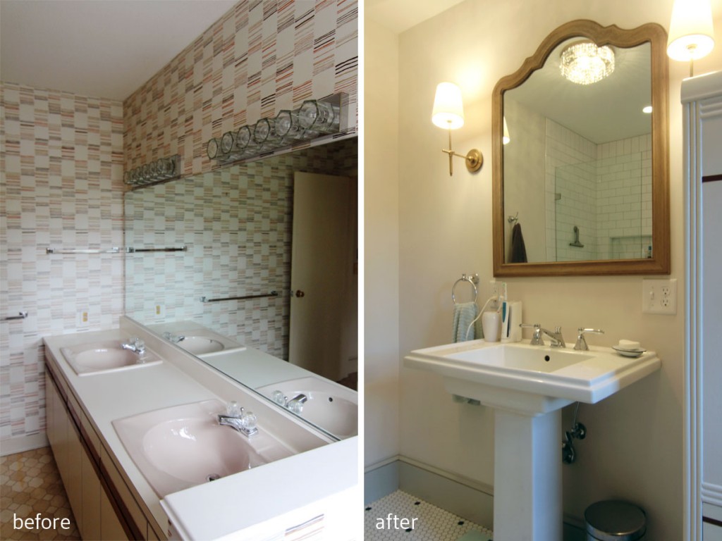
BEFORE: Some serious alterations needed to be made. AFTER: A more architecturally appropriate bathroom emerged.
It seems like so long ago that I first met with my clients on Project W, and first glimpsed at their terrible, wonderful, overwhelmingly dated raw material of a house that was to become their dream home. It seems like another life ago, not only because so much time has passed (and so much has happened), but because their home has completely transformed. You know those makeover shows where people don’t recognize a loved one, or think they’re in someone else’s home? Yeah, their house is kind of like that.
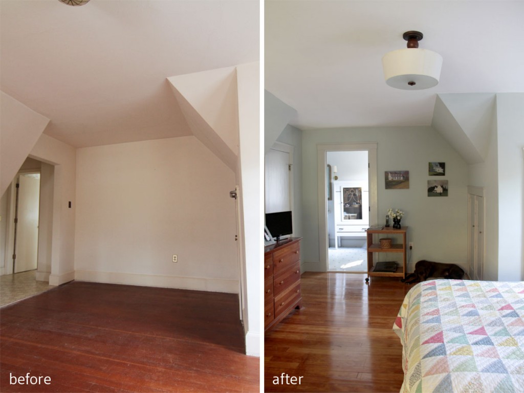
BEFORE: You had to walk underneath that eave to get into the master bathroom. AFTER: We repositioned the entrance to the bathroom, converted the awkward former entry into a large closet, while maintaining a period-appropriate vibe.
The first space I’m going to share with you is their master bedroom and bathroom. When we first arrived at the house, this space was awkwardly laid out, with a clunky master bathroom addition tucked into a place that really made no sense. Seriously, you had to walk under a low-hanging eave to reach the door to the master bath only to be confronted with a tight and cluttered space. There were ugly finish materials, a confounding layout, and budgetary issues to deal with, but my plan was simple: make the bathroom feel like it could have been original to the home.
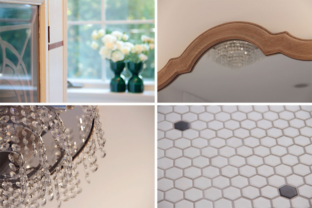
I wanted the feeling of the bathroom to be vintage, but still work with modern life. Ceramic hex tile harkens back to a time gone by, and the mix of chrome, glass, brass, and mirror add elegance to this formerly drab space.
I started by trying to figure out a way to repurpose some (not original, but certainly vintage) ceiling lights from another room in the house to the master bath. I wanted to save as much of their budget as I could, and lighting (as we all know) isn’t cheap. Using the crystal and brass and mirror fixtures as a jumping off point, I set about encouraging them to reclaim a vintage look for this formerly awkward space to help make the 1980s addition feel more authentic to the 1920s architecture of the home.
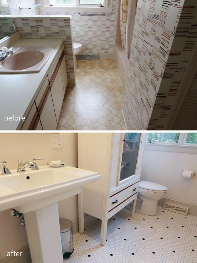
BEFORE: The pony wall provided a weird bit of “privacy” in a hard to get to space. AFTER: By moving the door to where the tub had been we were able to make the bathroom easier to use.
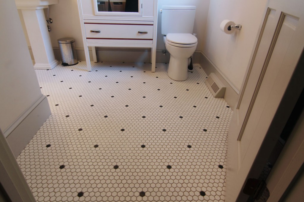
With a mix of brass, chrome, black, white, gray, and wood tones, I think we achieved what we set out to do: make a functional space that is beautiful, easy to care for, and that will stand the test of time. (Or at least not be as horrible as the pink/beige/linoleum/laminate disaster that was here before. Shudder.) Because the room size really couldn’t grow, we reduced the double sink for a single, making for more open space, and a allowing for some vintage furniture items to blend into the design scheme. It’s also a space that can adapt over time. Change out some towels, linens, and curtains, and you have a whole new feel.
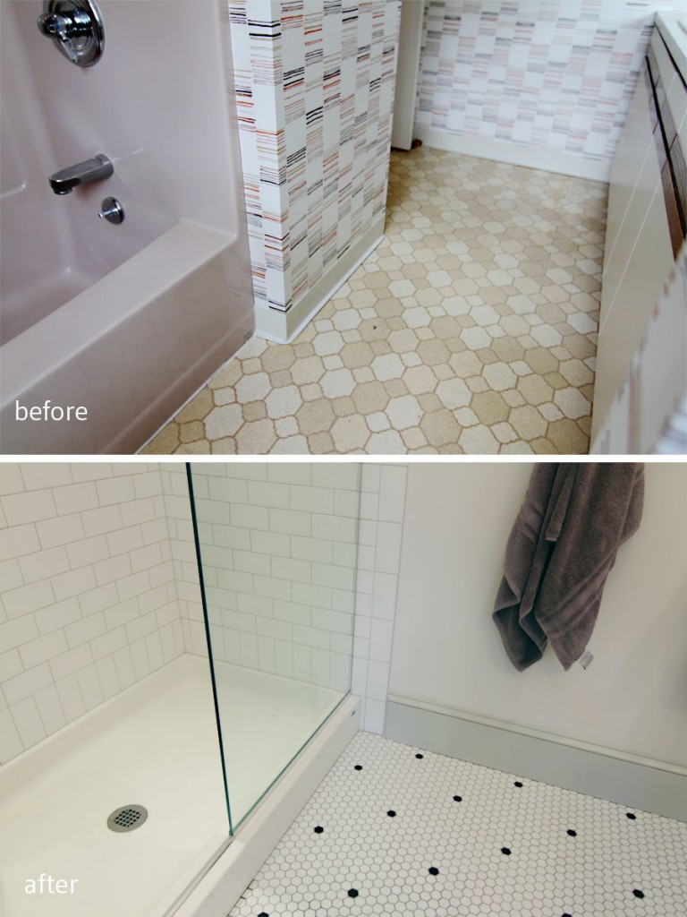
BEFORE: Awkward tub position and horrible doorway hidden underneath a sloping eave made this gross space even less functional. AFTER: Our homeowners wanted a shower only, so we retained the wet-wall placement, but slid the basin toward the back of the room. We kept the finishes simple in hex and subway tile with a medium gray grout.
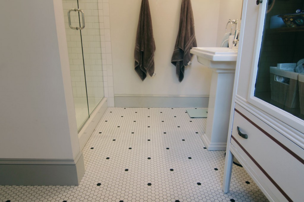
More floor space means that it’s easier for two people to get ready at the same time. The homeowners never used their double sink in their old house, so we opted for space over spending money on materials that would go unused.
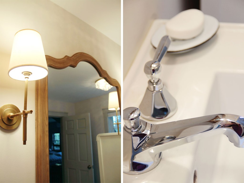
Brass fixtures will age with time, while chrome on the vanity is easy to maintain, and adds to a vintage modern look. Wall color in Toque White (SW 7003).
The adjacent master bedroom was painted in soft blue-green (Rainwashed by Sherwin Williams SW 6211) with gray trim (Repose Gray SW 7015), as a nice compliment to my clients’ love of mid-century design, as well as their original fir flooring that they had lovingly refinished. Overall the master suite is eclectic, has the character of an older home, but with the comforts of modern living. The perfect retreat for two hard-working parents.
xoxo

Kati… this is amazing! Your site looks fantastic! All kinds of great things happening over here. Feeling very inspired. Fantastic work!
Thank you so much, Erin! Your artistic voice is in my brain, and your work has helped me to listen to my own voice, too. Mwah! xoxo
Wowzers! Major improvement. Love what that vintage cab brings to the space. And the layout is waaaay better.
Thanks, Naomi! I’m certain that room will grow with time into an even more glamorous space.
Wow, love that bathroom!! The after layout is soooo much better! Just beautiful!!
Thanks, Katie! xoxo
Love the bathroom. It’s so clean and fresh. I remember seeing your inspiration post. It’s great to see the vision come to life.
Thanks, Heather! It was so fun seeing it transform into a fresh, and welcoming space.
Lovely, The bathroom is timeless – I adore those sconces & the floor.
Thanks, Hollie! Those sconces were a splurge for our budget, but so worth it.
Thanks for the link love. This master suite looks so inviting. I am in love with everything in that bathroom. Great job.
Thanks so much, Linda! Congratulations on another great ORC season. I love the feature – a fantastic way to find blogs, or just become inspired. It’s the heart of why I love to blog.