Category Archives: project W

So with my best, my very best, I set you free…*

*Lyrics from I Wish You Love as sung by Frank Sinatra (though the National Youth Jazz Orchestra performance is cheerful and delightful, and certainly worth watching on a day like today). I considered an alternate title – “I wish you shelter from the storm, a cozy fire to keep you warm” – especially because the entire Eastern portion of the US is being battered by yet another bracing, snow-filled, ice-capped, rained upon bit of winter goodness, but I thought the above excerpt was more fitting. I heard this song ages ago and jotted it down to use at the end of something. Today’s weather makes the timing even more apt. 

Le sigh. It’s over. This is the last installment of the Project W AFTER Tour (catch up here: master bedroom, kids’ rooms, main floor part one, and main floor part two). I am so proud and grateful that I got to have a hand in the complete transformation of this now gorgeous home. So, now, pictures! (Get ready, this is a long one…)

Bright, open, airy, efficient, classic. Hello, new kitchen.

Bright, open, airy, efficient, classic. Hello, new kitchen.

Boom. Project W kitchen. Do you remember it when it looked like this?

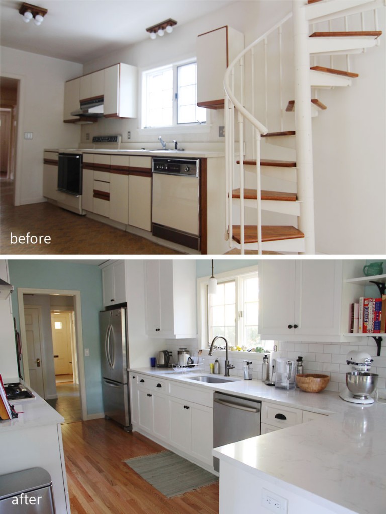
BEFORE: Dated is a kind way of putting what this kitchen looked like. AFTER: Better space planning really took this kitchen into a new world.

BEFORE: Dated is a kind way of putting what this kitchen looked like. AFTER: Better space planning really took this kitchen into a new world, and a new era.

Sort of major, right? When we toured the space, there was a giant spiral staircase – de rigueur in 1982 – that cut right through what I saw as perfectly usable kitchen real estate. When we first met, the clients – craving brightness, space, and fluidity – wanted to open up the wall between the kitchen and dining room, but I felt that they would lose too much storage space. The kitchen was a galley and, while efficient and completely appropriate to the home, it didn’t exactly ooze storage space. With a tween, a teen, and a big, hungry dog, I knew that losing those uppers would be a risk. read on…

Careful what you say, oh dear, it’s too late now…*

*Lyrics from Careful What You Say by Class Actress from their EP Journal of Ardency. This song resonated with me for this post because during the process of building/designing this home (and perhaps especially these last spaces), my relationship with my friend (the builder) was, to say it politely, strained. It’s inevitable to quarrel with those closest to you, and likely to happen again with someone else during my career/life. I’m sure it’s happened to you – with your spouse/partner, your client, your family – and I’m sure you hated it as much as I did. I loved this job, and was so completely grateful to have been able to be a part of it, but it took an emotional toll. And I guess I’m feeling a little nostalgic for the good times. (This winter feels really, really long this year.) Cheers to the happy times, to the promise of a new season, and of the hope for smoothing the scuffs and scratches that will just add patina to what I hope is a lifelong friendship.
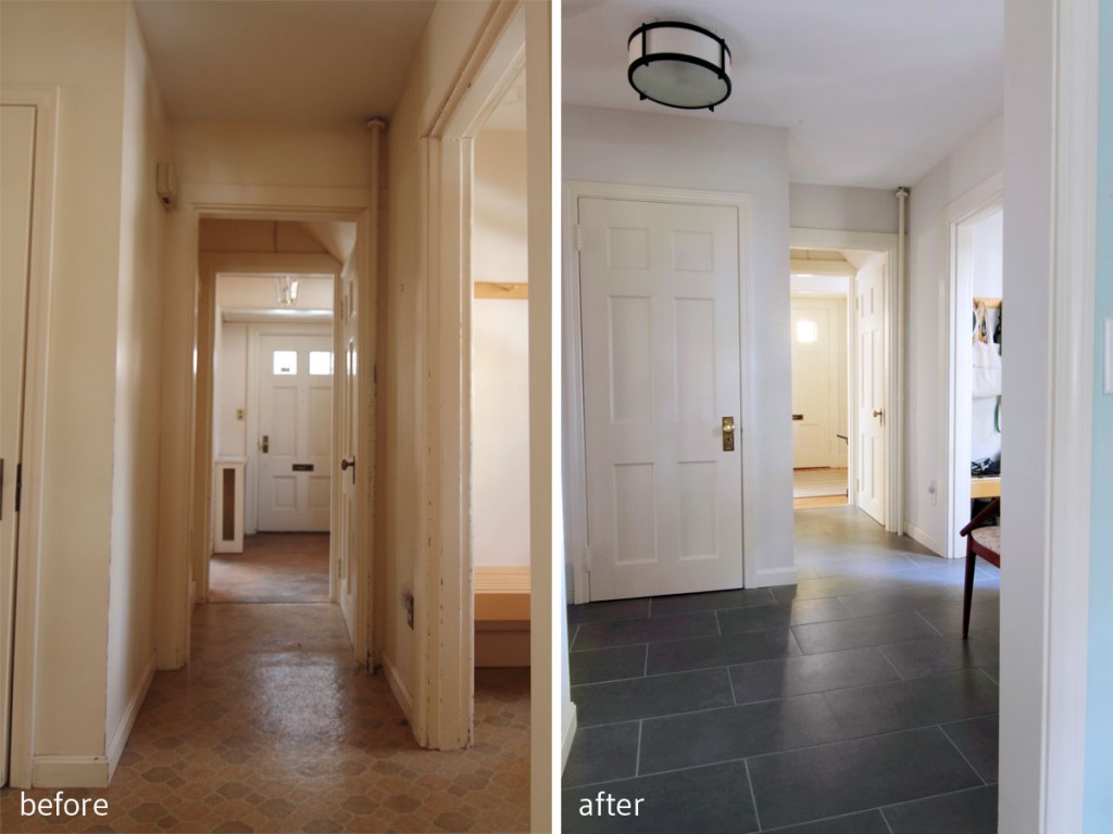
BEFORE: Linoleum, dingy paint, bad lighting. AFTER: Classic grey tile with modern rectangle shape, transitional fixtures, neutral walls.

BEFORE: Linoleum, dingy paint, bad lighting. AFTER: Classic grey tile with modern rectangle shape, transitional fixtures, neutral walls.

And the AFTER tour continues… When we last met, I shared with you most of the main floor living spaces for Project W. Today I’m going to share the dining room, foyer, and powder room. When I first walked through the house with Mrs W, we both had the same vision for the foyer: gray, almost concrete-looking rectangular tile that would feel modern, not too dark, yet be easy to care for with two kids and a sweet, but sloppy dog. It took some doing, and some negotiating, and some pretty strong-willed moments (high five, Mrs W!), but we found our tile, and were able to achieve the exact look we imagined. Sometimes less is more, but sometimes you have to invest in a bit more to get more. At any rate, we ended up with a wonderful update to this formerly vinyl-floored space.
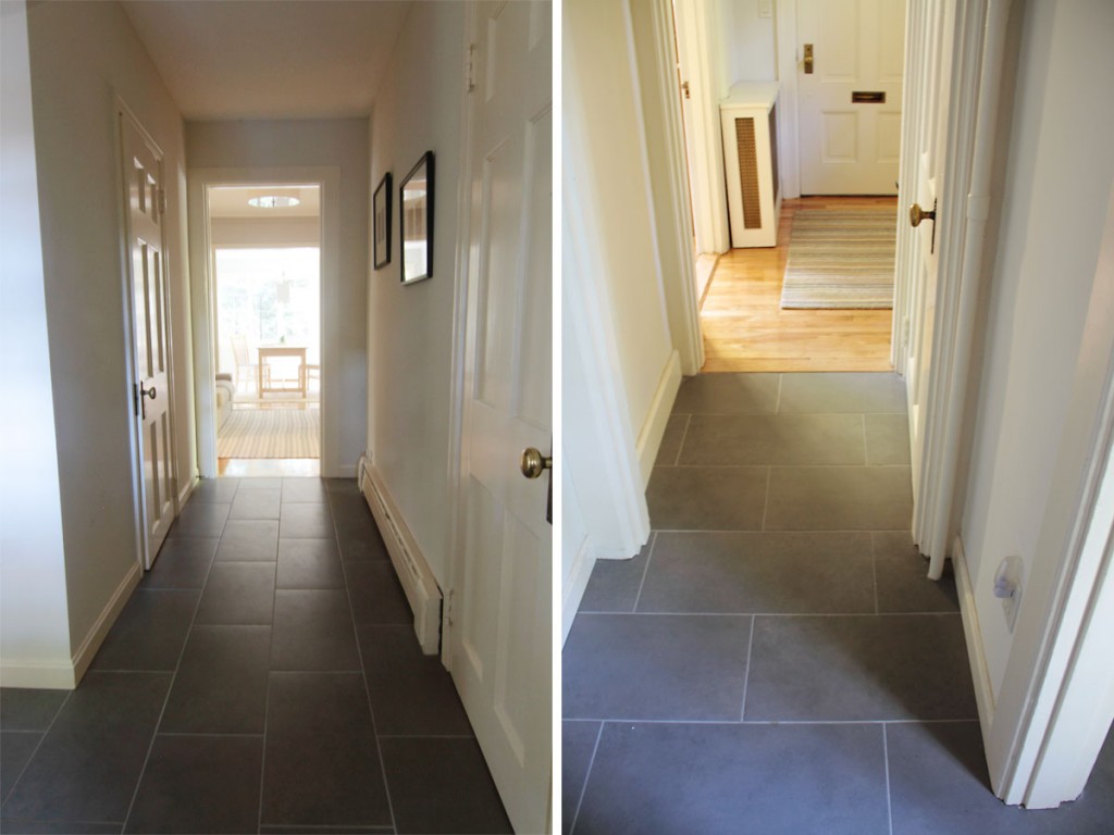
This area was formerly the original kitchen (!), but had been adapted to include a powder room as well as transitions to the rest of the house. So we treated it as a mudroom.

This area (left) was formerly the original kitchen (!), but had been adapted to include a powder room as well as transitions to the rest of the house. So we treated the entire space as an extended mudroom.
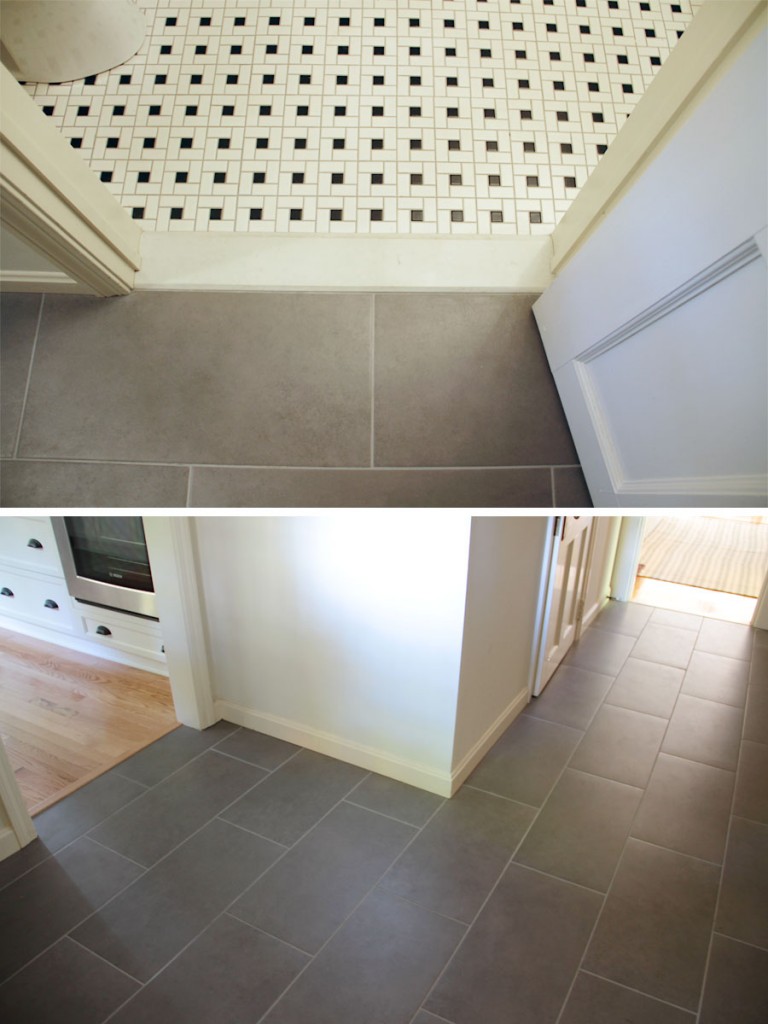
The powder room got another black and white mosaic tile, and the ceramic grey tile provides a low-maintanence transition point for the wood floors, tile, and exterior. (Sneak peek of the kitchen, still to come!)

The powder room got a black and white mosaic tile, and the ceramic grey tile provides a low-maintanence transition point for the wood floors, tile, and exterior. (Sneak peek of the kitchen, still to come!)

Just off the side entry – the mudroom area – is a powder room. Now, this space used to house the original kitchen; in fact, the old house stopped along the wall separating the new kitchen and dining room from the game room and entry hall. So the bathroom that was put in was decidedly from its time (1982).
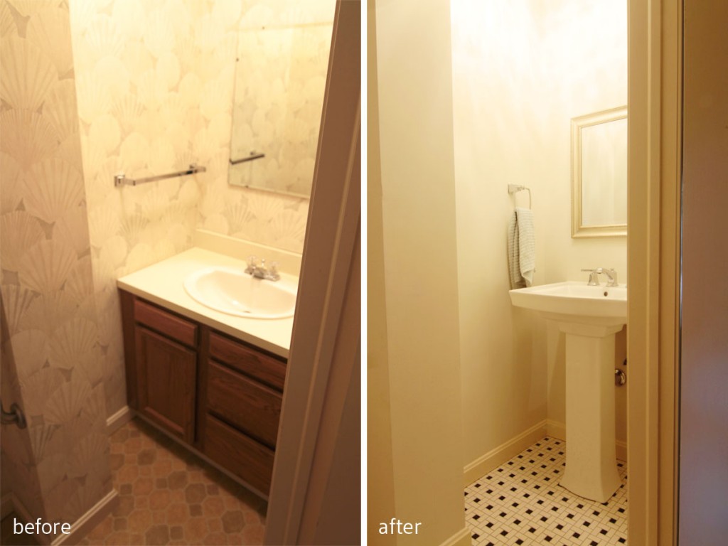
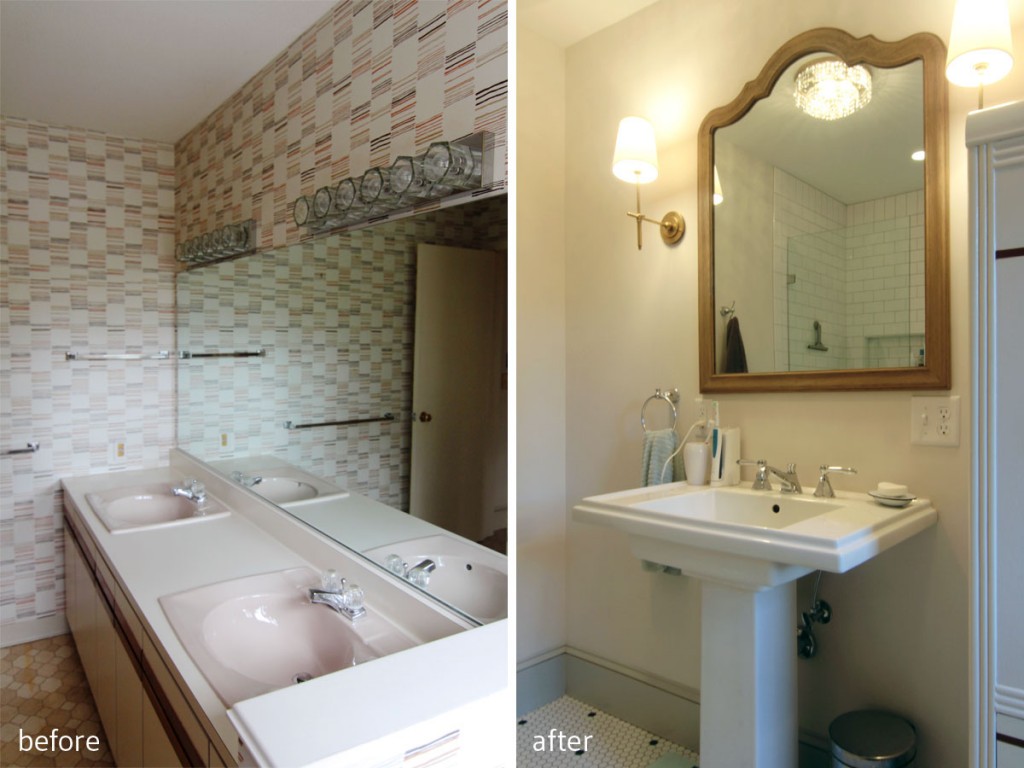
BEFORE: Tired vanity, wallpaper that had no appeal, and more linoleum. Yuck. AFTER: Pedestal sink and mosaic tile speak the home's origins, while making the small and slightly awkward space feel more spacious. We also moved in one of the crystalline lights from and adjacent room to add some glamour. No reason a small room can't be fabulous, and work within a budget.

BEFORE: Tired vanity, wallpaper that had no appeal, and more linoleum. Yuck. AFTER: Pedestal sink and mosaic tile speak the home’s origins, while making the small and slightly awkward space feel more spacious. We also moved in one of the crystalline lights from and adjacent room to add some glamour. No reason a small room can’t be fabulous, and work within a budget.

I wanted to reclaim the character as we did with the master bathroom design, but knew that we couldn’t really spend too much to do so. We had to work with the space as it was for the budget’s sake, and we had to use materials that could withstand lots of traffic. We ended up finding a really reasonably priced ceramic mosaic tile that picked up on the black and white theme we used in the master (I love it when spaces in antique homes, like kitchens and baths, seem like they could have been installed during the house’s original build), which really helped to reinforce that 1920s feel we were after.
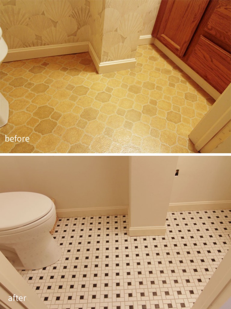
BEFORE: Ugh, I mean, really. AFTER: Much, much better. Ahhh.

BEFORE: Ugh, I mean, really. AFTER: Much, much better. Ahhh.

Details: The faucet and sink have a square shape that references the mosaic tile. There was an original mirror (square) that I had planned to hang here, but, well, let's hope Mr W doesn't really get 7 years' bad luck.

Details: The faucet and sink have a square shape that references the mosaic tile. There had been an original mirror (square) hanging here that I had planned to rehang, but, well, let’s hope Mr W doesn’t really get 7 years’ bad luck.
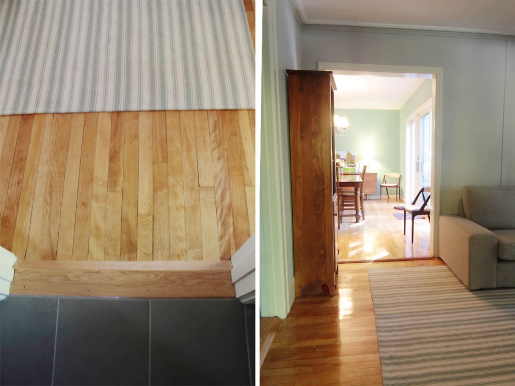
Details: The mudroom/hallway as it transitions into the game room; the game room looking into the dining room (which is where the 'new' addition begins).

Details: The mudroom/hallway as it transitions into the game room; the game room looking into the dining room (which is where the ‘new’ addition begins).

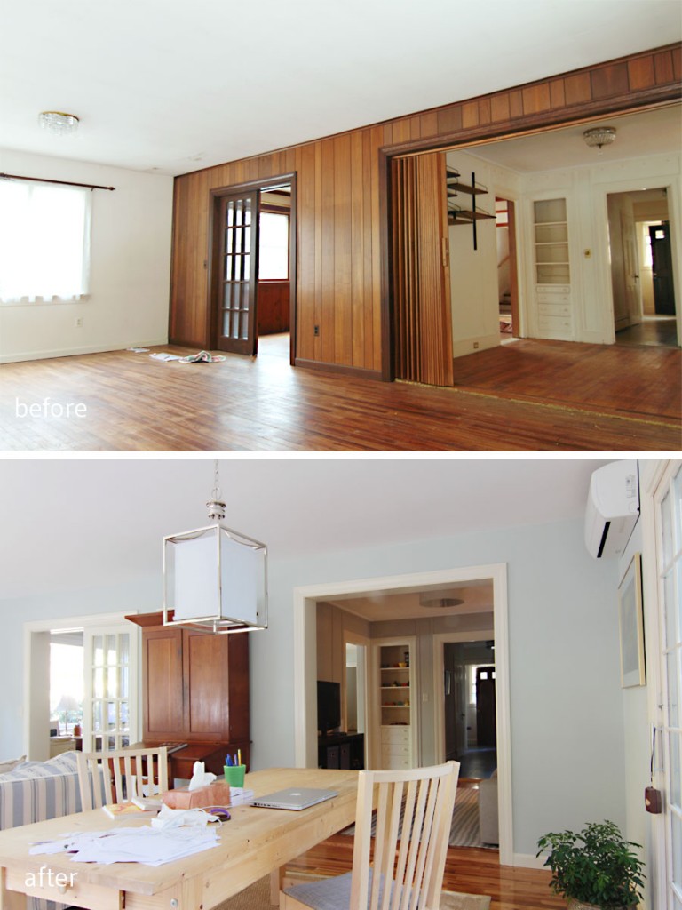
Having connected the powder room to the house’s architecture, I wanted to let the dining room really connect to the homeowners’ love of mid-century design. I knew they had some cherry and rosewood pieces that would look really nice atop their newly finished oak hardwoods, but that they needed a wall color that could support all of that rich, warm wood. Probably the most contentious battle with regard to the color palette happened regarding the dining room walls – SW Hazel – which virtually every woman loved and every man loathed. In the end, though, my clients agreed that the initial scheme was what they loved, and they stuck with my suggestion. I love the color. This room floods with light in the afternoon, and can really stand a rich hue on the wall. They are also avid art collectors, and I knew that an art wall would eventually really sing atop this rich but modern hue.
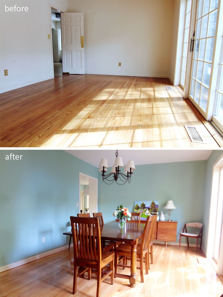
BEFORE: This room was bright, but had no personality. AFTER: A modern wall color mixes well with the homeowners' warm wood mid-century and mission style furnishings.

BEFORE: This room was bright, but had no personality. AFTER: A modern wall color mixes well with the homeowners’ warm wood mid-century and mission style furnishings.
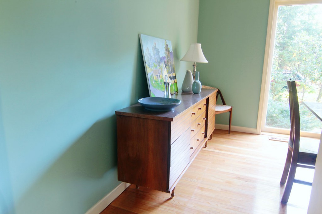
This wall color (Hazel by SW) was hotly contested. Every single male hated it, while every single female loved it. Weird. Color is totally personal.

This wall color (Hazel by SW) was hotly contested. Almost every single male hated it, while every single female loved it. Weird. Color is totally, I mean completely, personal.
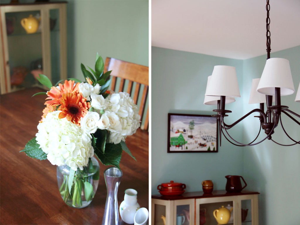
Details: Mrs W let me rummage around her accessories to find sweet trinkets to display. The light fixture is a budget-friendly Pottery Barn find - another hotly contested search - and the cabinet in the background is antique.

Details: Mrs W let me rummage around her accessories to find sweet trinkets to display. The light fixture is a budget-friendly Pottery Barn find – another hotly contested search – and the cabinet in the background is antique.

The entire first floor connects visually from room to room, zone to zone, and I think we really created a soft, watery, and flowing palette that is peaceful and soothing. I know that the clients’ soft furnishings, curtains, pillows, rugs, etc., will shift as time goes on, but the harder, more permanent things – tile, flooring, lighting – will enhance whatever additions they make.
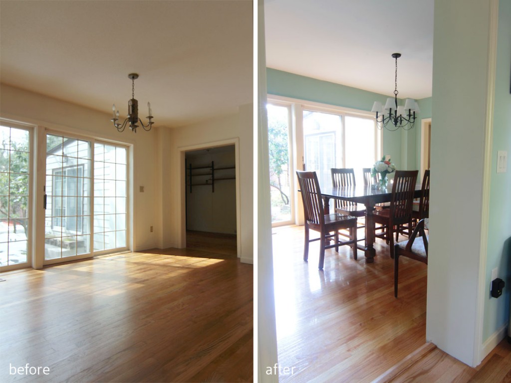
BEFORE: Beautiful light, and access to the exterior were this room's best features. AFTER: Sliders lead out to a breakfast patio (which will get updated eventually), but who would want to dine al fresco when it's so pleasant indoors? The doorway from the kitchen was widened to mimic the generous opening on the game room side of the space to make it feel as if there might have been french doors at one point.
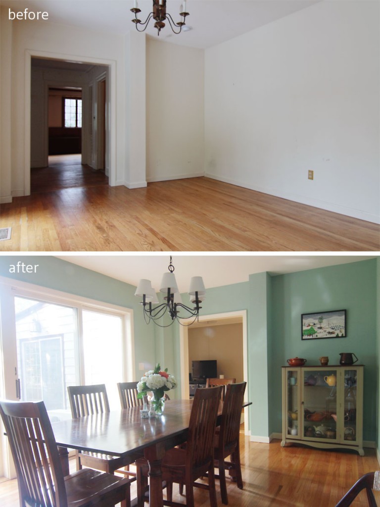
BEFORE: Beautiful light, and access to the exterior were this room’s best features. AFTER: Sliders lead out to a breakfast patio (which will get updated eventually), but who would want to dine al fresco when it’s so pleasant indoors? The doorway from the kitchen was widened to mimic the generous opening on the game room side of the space to make it feel as if there might have been french doors at one point.

BEFORE: This little soffit created an awkward bump out. AFTER: That nook created a perfect spot for Mrs W's china cabinet, and created an opportunity for an art nook. Eventually these walls will be covered in art, as the homeowners' have tons of beautiful pieces. Who wouldn't want to be invited over for a lingering dinner?

BEFORE: This little soffit created an awkward bump out. AFTER: That nook created a perfect spot for Mrs W’s china cabinet, and created an opportunity for an art nook. Eventually these walls will be covered in art, as the homeowners have tons of beautiful pieces. Who wouldn’t want to be invited over for a lingering dinner?

I still have one last space to share with you. Stay tuned!

xoxo
 

And maybe after, when I return, I get what I miss…*

*Lyrics from I Miss Your Bones by Hospitality. This is a single, but they have a new album coming out in January. I think I’ll wait to order it (not pre-order it) until I can hear it all. I struggled to find a song for this post – sometimes finding these lyrical inspirations isn’t as easy as it should be – but this one felt just right (plus, their new album is called Trouble, which is fitting here). Especially since this part of the Project W house tour is all about good bones. House bones. Bones. If you say it too many times it starts to sound silly. Anyway, moving on.

Remember my beloved Project W? Want to see some more?

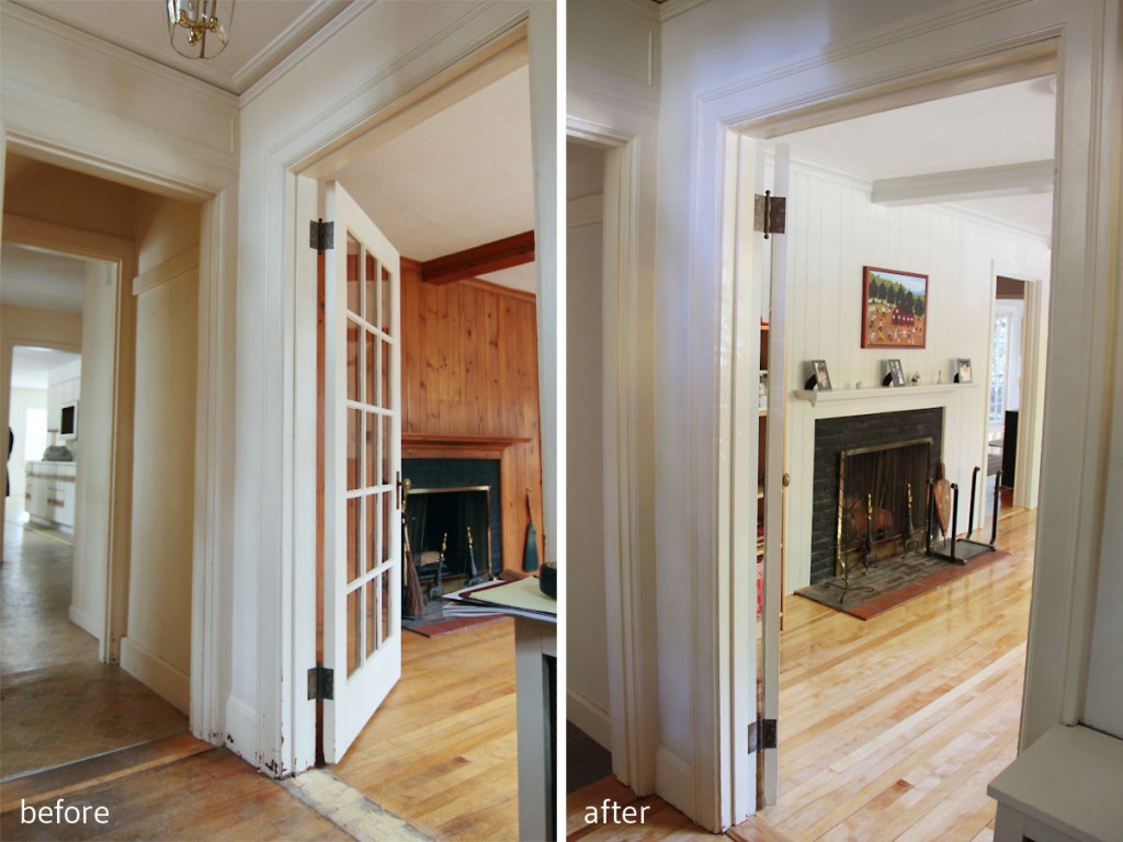
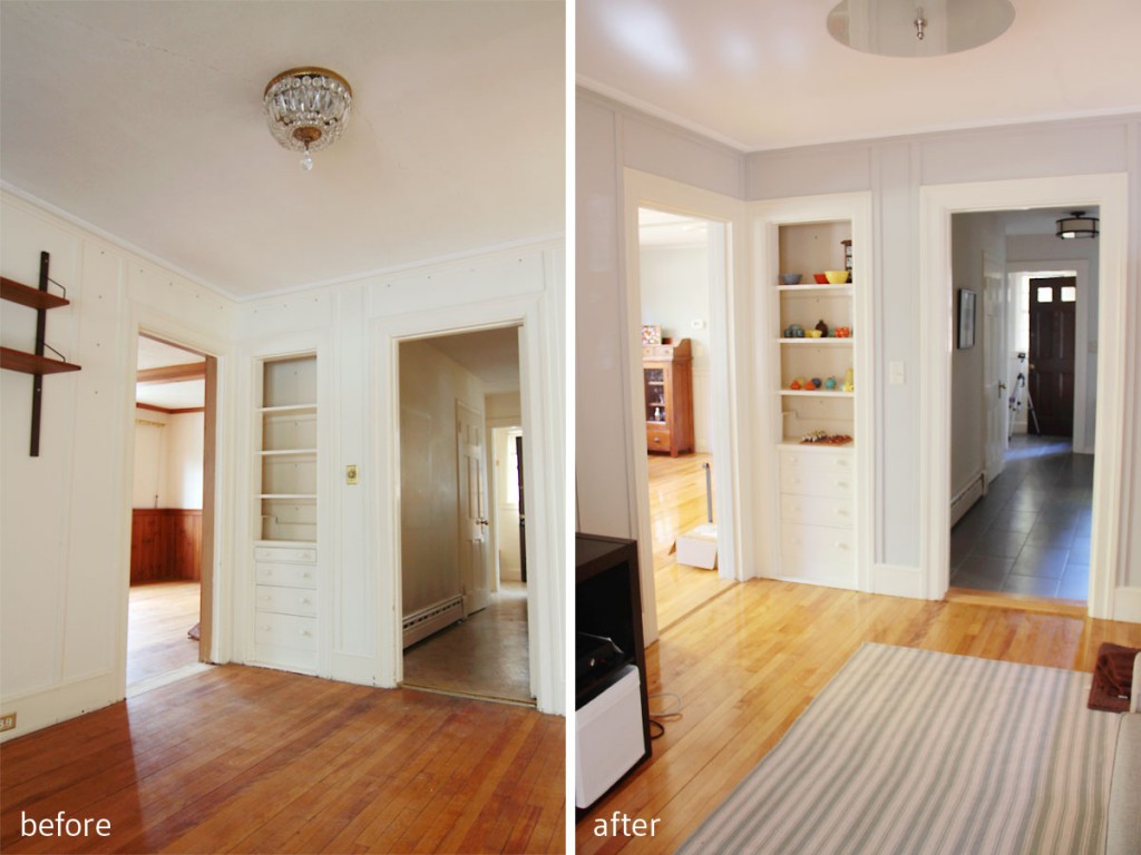
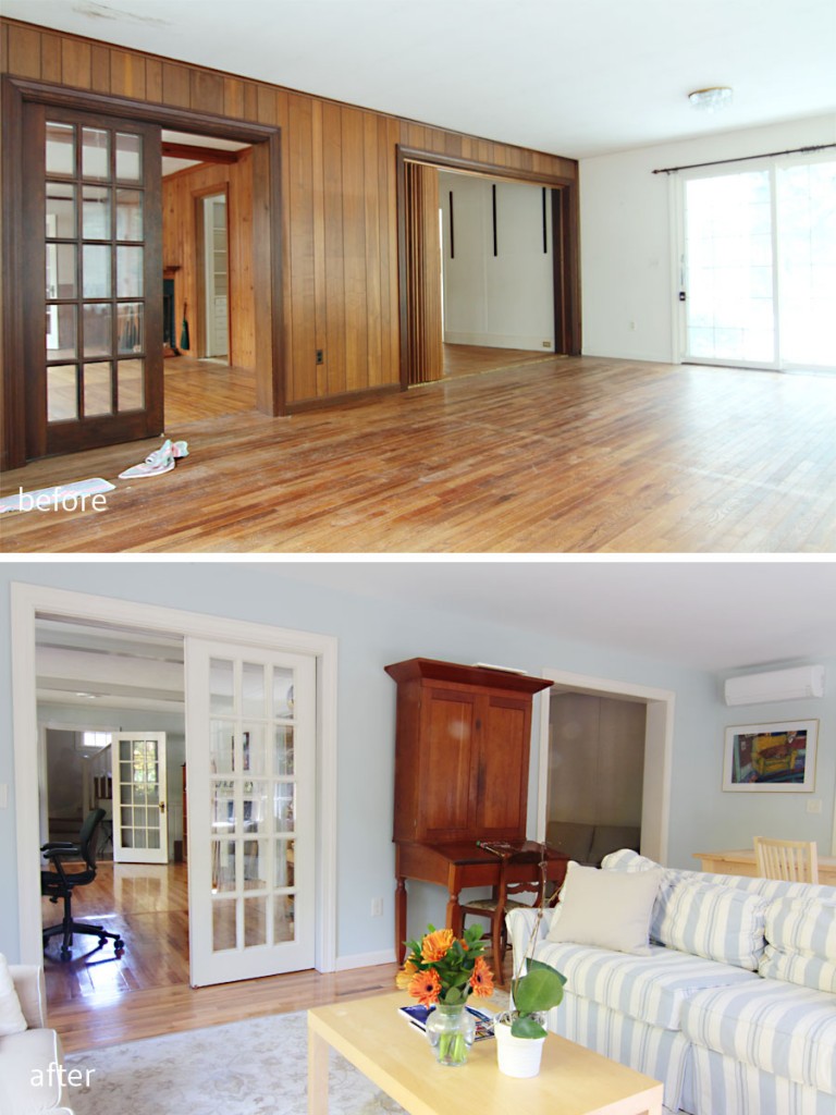
BEFORE: Flooring was in rough shape, original knotty pine panelling, pretty dated feel. AFTER: Brightened up paneling in Repose Gray, refinished flooring, new tile, updated entry.

BEFORE: Flooring was in rough shape, original knotty pine panelling, pretty dated feel. AFTER: Brightened up paneling in Repose Gray, refinished flooring, updated entry.

The next part of the Project W renovation (the AFTER tour) that I want to share with you is the main floor: specifically the library, sun room, and game room. (Now, a small disclaimer: it is virtually impossible to show you only portions of the main floor without sneaking peeks at other room/areas which I will share in greater depth at a later date. Otherwise this post would be 80+ pictures long, and ain’t nobody got time for that. Consider your interest piqued.) This is really where each family member got to carve out space for just themselves.

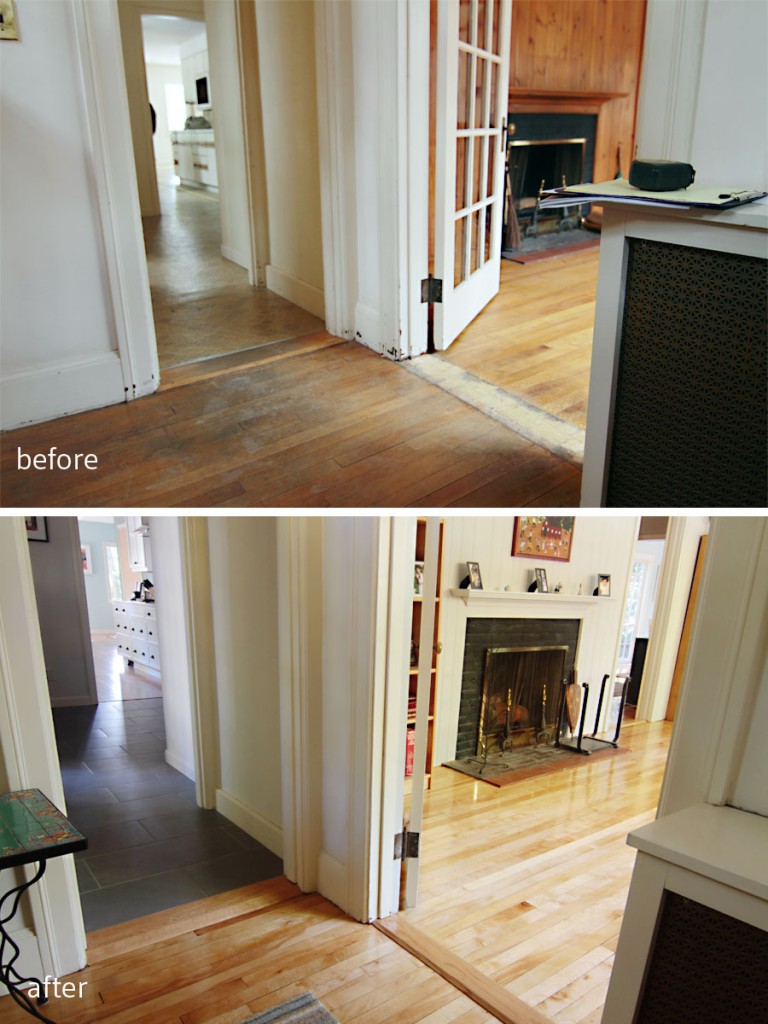
BEFORE: This was the first area you would see upon entering from the main entrance. AFTER: Durable tile (I'll get to that in a later post), original flooring refreshed, fresh color scheme. Welcome.

BEFORE: This was the first area you would see upon entering from the main entrance. AFTER: Durable tile (I’ll get to that in a later post), original flooring refreshed, fresh color scheme. Welcome. (Kitchen and mudroom/entry sneak peek!)

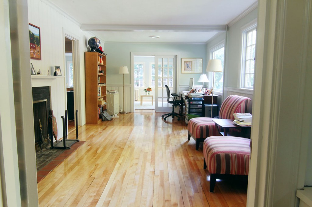
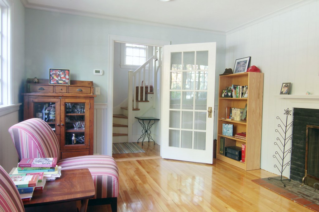
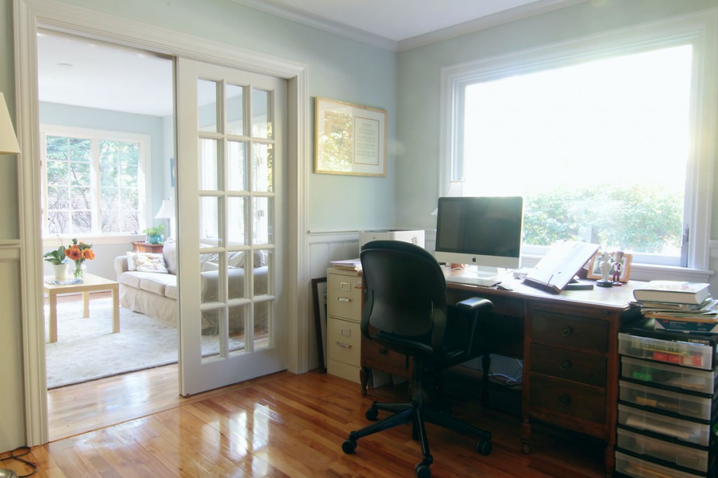
Mr W got half of the library as an office, and Mr and Mrs W will share a cozy seating area by the working fireplace.

This is the library, the area that Mr and Mrs W will use as a primarily adult space. It's handsome, yet bright and airy. I hope it gets cold enough for a fire soon.

This is the library, the area that Mr and Mrs W will use as a primarily adult space. It’s handsome, yet bright and airy. I hope it gets cold enough for a fire soon.

You see, when the house was originally built, before the giant addition in the early 80s, the library was the only living room (and we think the desk area was a 3-season porch), the sunroom was non-existent, and the game room was the former dining room. In fact, the powder room, and hallway connecting the (now tiled) side entry to the front entry (and beyond) was the original kitchen. All that is to say that the house pretty much doubled in size in 1982, and this family of four didn’t quite know what to do with so much glorious space.

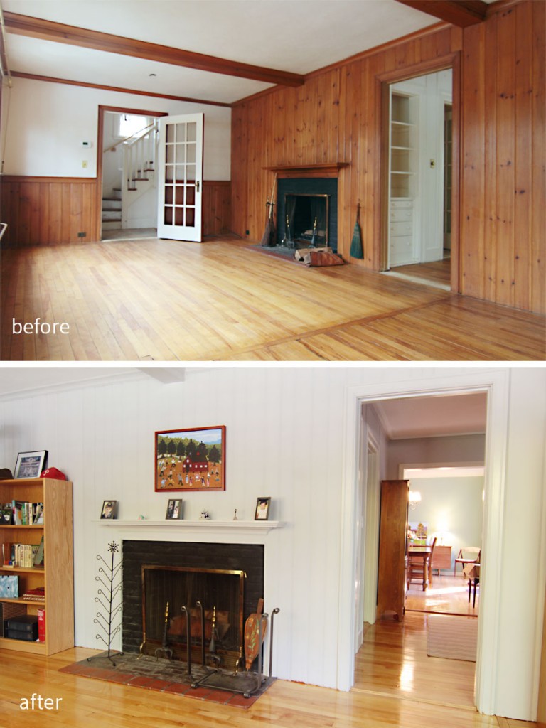
BEFORE: This room was the formal living space once upon a time. AFTER: Now a cozy office and library, the Ws can tuck in with a fire, a sip of adult elixir, and enjoy the reinvented space.

BEFORE: This room was the formal living space once upon a time. AFTER: Now a cozy office and library, the Ws can tuck in with a fire, a sip of adult elixir, and enjoy the reinvented space. (Dining room sneak peek!)

The corner houses a bar, indicating fully that the kids should steer clear of this area. Adults only, please.

This corner houses a bar, indicating fully that the kids should steer clear of this area. Adults only, please.

With plenty of room to spread out, yet lots of zones for family interaction my clients got the best of both worlds: the connection of open plan living with the necessary privacy of homes that were planned with appropriate separations. I firmly believe that in the future, all of these Great-Room-styled homes will fall away, and there will be a return to separate rooms. Anyone who has ever lived with, or been a part of a large family knows that as much as you can love each other, getting away from each other is as equally precious. I think I was able to help the homeowners delineate spaces for specific family activities so that there is plenty of togetherness as well as comfortable, and much required, distance.

Mr W's former office was dark and cut off from the rest of the house. In the new home, he can enjoy a great view, while being centrally located. Now he can be properly distracted by all the lovely things and people around him. Wall color: Comfort Gray.

Mr W’s former office was dark and cut off from the rest of the house. In the new home, he can enjoy a great view, while being centrally located. Now he can be properly distracted by all the lovely things and people around him. Wall color: Comfort Gray. Trim color: Repose Gray.

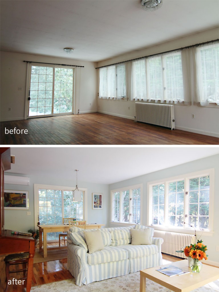
Mrs W got the sunroom – a media-free zone – for reading, entertaining and relaxing, while the kids got a section of the same room for homework, and quiet projects.

BEFORE: You can see the lights that inspired the master bathroom design hanging here. Waste not, want not, as we New Englanders say. AFTER: This room is for quiet studying, reading, entertaining sans electronics, and just generally enjoying three walls of windows with dappled sunlight streaming through. It's pretty great.

BEFORE: You can see the lights that inspired the master bathroom design hanging here. Waste not, want not, as we New Englanders say. AFTER: This room is for quiet studying, reading, entertaining sans electronics, and just generally enjoying three walls of windows with dappled sunlight streaming through. It’s pretty great.

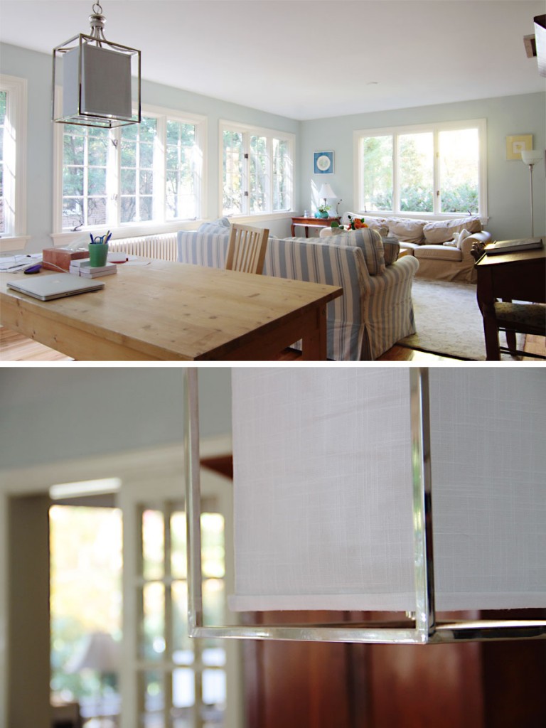
I mean, just look at the sunlight. And the actual light hanging above the kids' study table. Wall color: Sea Salt.

I mean, just look at the sunlight. And the actual light hanging above the kids’ study table. Wall color: Sea Salt.

The kids also got an entire room just for their video game console, but in fairness it is the smallest room in the house, and has no doors, which means lots of parental supervision (much to their chagrin).

BEFORE: The not original (and not wood) panelling hid what was once an exterior wall. The accordion doors were also not original and were pretty gross. AFTER: By narrowing the entry way between the kids' game room (former dining room) and the sun room (former exterior) we left room for future addition of French doors. Then this sun room can double as a guest room when the kids are grown and visit with their own offspring (don't cry Mrs W, they'll always be your babies).

BEFORE: The not original (and not wood) panelling hid what was once an exterior wall. The accordion doors were also not original and were pretty gross. AFTER: By narrowing the entry way between the kids’ game room (former dining room) and the sun room (former exterior) we left room for future addition of French doors. Then this sun room can double as a guest room when the kids are grown and visit with their own offspring (don’t cry Mrs W, they’ll always be your babies).

BEFORE: This room was the original dining room of the house, and even still had the built-in china hutch. AFTER: We kept the hutch (duh) but painted out the vertical strapping on the walls to make the room feel a bit more modern. The four doorways/passageways in this room a perfect spot for the kids' gaming system. Parental supervision ensured.

BEFORE: This room was the original dining room of the house, and even still had the built-in china hutch. AFTER: We kept the hutch (duh) but painted out the vertical strapping on the walls to make the room feel a bit more modern. The four doorways/passageways in this room a perfect spot for the kids’ gaming system. Parental supervision ensured. (Mud room/side entry sneak peek!)

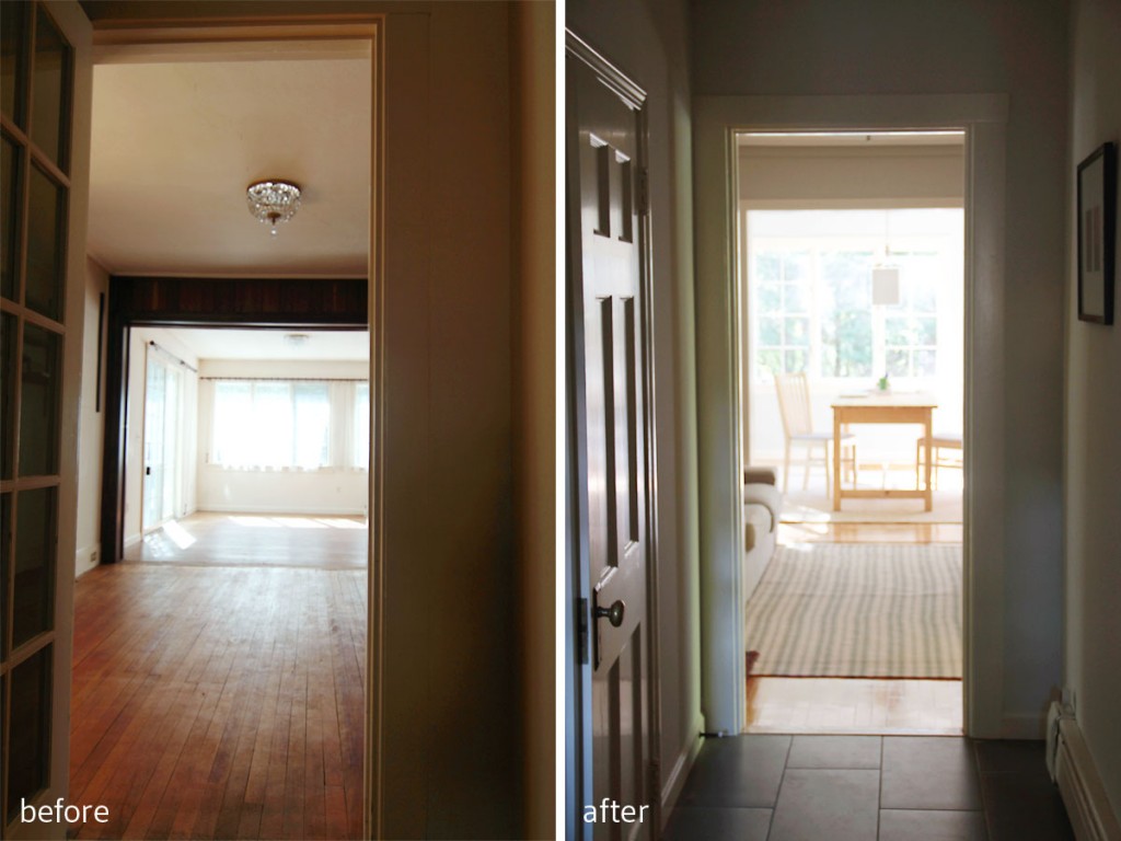
BEFORE: A view to the sunroom through the former dining room. AFTER: Now a sunlit and welcoming spot for homework, and a welcoming spot for playing video games for the kids. After the homework is done, naturally.

BEFORE: A view to the sunroom through the former dining room. AFTER: Now a sunlit and welcoming spot for homework, and a welcoming spot for playing video games for the kids. After the homework is done, naturally.

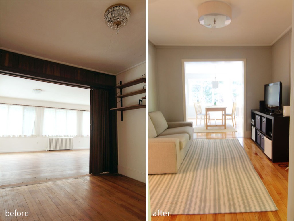
BEFORE: You can see a better angle of the accordion door and cheap paneling (added in the 80s with the addition). AFTER: Now the room has more of a room-like proportion, and is just big enough to seat some gaming teens and tweens.

BEFORE: You can see a better angle of the accordion door and cheap paneling (added in the 80s with the addition). AFTER: By reducing the opening, the space has more of a room-like proportion, and is just big enough to seat some gaming teens and tweens. Wall color: Repose Gray.

This home really had a great set of bones. All I had to do was help the clients choose colors, fixtures, plan out how to place their furnishings and lay out their zones, and they did the rest, injecting so much home into this house that it felt inviting from day one. Eventually they’ll get to the window dressing part (which we all know costs a small fortune), but for now they get uninterrupted views of a gorgeous neighborhood, dappled sunlight from hundred year-old trees, and lots of space to call home.

BEFORE: This room was in rough shape, with a leak that had dripped through the ceiling, and some not so thoughtful decor decisions. AFTER: Now this is the room to beat, bright, welcoming, and soothing. I just know there will be love, life and laughter in here for years to come.

BEFORE: This room was in rough shape, with a leak that had dripped through the ceiling, and some not so thoughtful decor decisions. AFTER: Now this is the room to beat, bright, welcoming, and soothing. I just know there will be love, life and laughter in here for years to come.

xoxo

Take pictures in your mind of your childhood room…*

*Lyrics reluctantly from a Taylor Swift song, Never Grow Up. Reason one: the younger of the two Project W kids, and the one who was most interested in the whole design process, LOVES her, or at least did the last I heard. Reason two: the song I really wanted to use was, well, a bit of a downer, and not at all representative of the beautiful and loving family that I was honored to work with. But, in my defense, the lyrics I was going to pick out from the rejected song (Jeff thought I should leave it out of the post entirely) were the (sweetly, sad, yet) positive bits: “Kid, have your say, ’cause I still love you, even if I don’t see you again.” So, instead I give you vapid tweenie-bop music. You may choose to listen as your mood dictates, but know that the second, deeper one by Neko Case is brutally beautiful, and will probably make you cry. (The first one might make your ears bleed. You have been warned.)

Now it’s time for another installment of Project W: The AFTER tour! When we last left off, we were sneaking around the master bedroom and bath, basking in the improved flow and potential for timeless style. Let’s move into the kids’ wing of the upper floor, shall we?

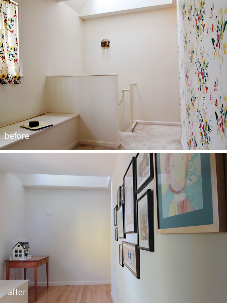
BEFORE: This space started out as a strange pass-through with a skylight and a spiral staircase. AFTER: This little corner will now become a reading nook, or a homework zone if the kids need some quiet space.

BEFORE: This space started out as a strange pass-through with a skylight and a spiral staircase. AFTER: This little corner will now become a reading nook, or a homework zone if the kids need some quiet space.

Just off the area where the spiral staircase used to be (we nixed it in an effort to gain more usable space in the kitchen), is the kids’ wing. It’s private, away from the parents’ master suite, and has its own family bathroom (still to be renovated). While the hallway boasts the same color as all of the transitional spaces in the home – foyer, mudroom, hallways, stairwell all in Toque White (early on my builder asked me to choose only Sherwin Williams colors) – the kids’ rooms depart from the main thrust of the home to reveal individual and personality-based spaces perfect for the rejuvenation of young minds.

read on…

You’ve got to give it what you got now…*

*Lyrics from Mean Streets by Tennis from their new EP Small Sounds. It’s no secret that I love this band, but this mini album is excellent. I dare you not to get this song in your head for several happy days.

I know you’re all still geeking out over the amazing, awesome, inspiring transformations from the One Room Challenge, but do you remember me teasing that I’d soon have pictures to share from my clients’ Project W house? Well, first room, here you go. This is a major BEFORE & AFTER post. Get ready.

BEFORE: Some serious alterations needed to be made. AFTER: A more architecturally appropriate bathroom emerged.

BEFORE: Some serious alterations needed to be made. AFTER: A more architecturally appropriate bathroom emerged.

It seems like so long ago that I first met with my clients on Project W, and first glimpsed at their terrible, wonderful, overwhelmingly dated raw material of a house that was to become their dream home. It seems like another life ago, not only because so much time has passed (and so much has happened), but because their home has completely transformed. You know those makeover shows where people don’t recognize a loved one, or think they’re in someone else’s home? Yeah, their house is kind of like that.

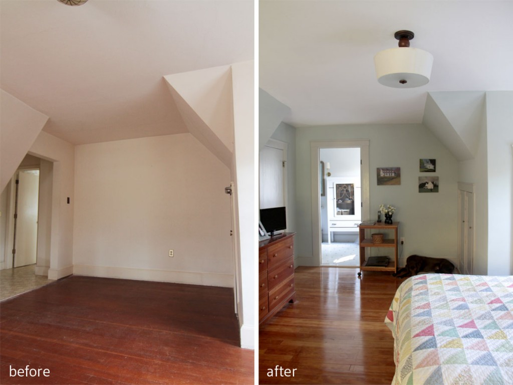
BEFORE: You had to walk underneath that eave to get into the master bathroom. AFTER: We repositioned the entrance to the bathroom, converted the awkward former entry into a large closet, while maintaining a period-appropriate vibe.

BEFORE: You had to walk underneath that eave to get into the master bathroom. AFTER: We repositioned the entrance to the bathroom, converted the awkward former entry into a large closet, while maintaining a period-appropriate vibe.

read on…

You can’t cross the line, but you can’t stop trying…*

*Lyrics from S.O.S. in Bel Air by Pheonix from their album Bankrupt!. Since we’re definitely still in summer-music-mode, and I’m looking for new exercise music, I poked around the recent releases and discovered that Phoenix had a new, very catchy album, perfect for summer ears, and running (ok, trotting) feet. And even though my clients moved into their house in late June, they needed some time to settle in before I could take proper pictures. You other homeowners know that it takes quite a bit of time after a move to feel at home, so I didn’t want to rush my clients into being ‘done’ before they were ready. Hoping to get some final after photos in the fall. Until then, more summer, please!

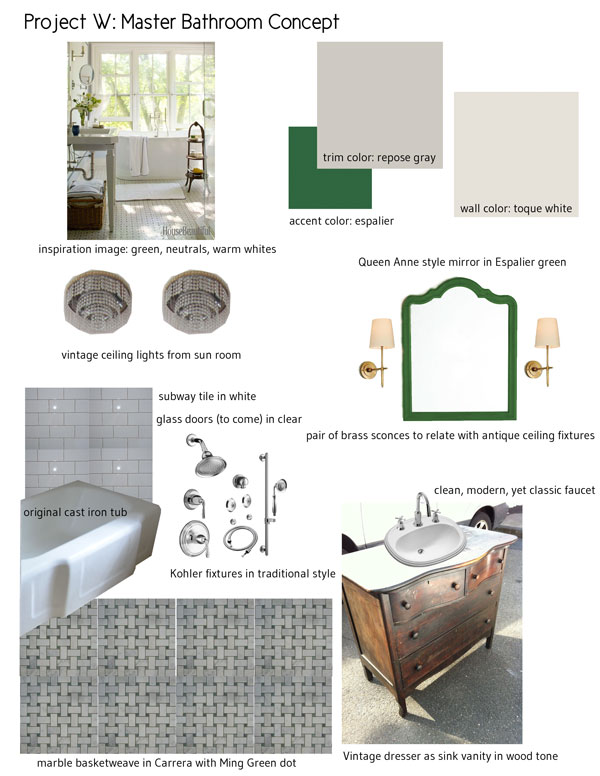
The original plan included salvaging the original cast iron tub, using an old dresser for a vanity, and putting a marble mosaic on the floor for luxury.

Every designer starts out with the best intentions: make something beautiful that functions really well, and keep it within a reasonable budget. Ok, I guess some people don’t have to worry about budgets, but I don’t know them, and I doubt I’d want to. We all have to work within realistic parameters, while keeping our eye on the big picture. Problem is, when those parameters are constantly changing, it’s harder to grab ahold of that vision and steer toward it. Sometimes, as with driving a car in a winter storm, you need to steer into the skid to keep from crashing, despite the fact that you won’t end up where you wanted in the first place.

Inevitably, due to situations outside of my control, I had to dramatically re-think a design concept for my clients on Project W. Despite my best intentions, and my rigorous adherence to my initial budget, my budget dollars were suddenly diverted toward other things, and I was left to scramble to come up with a new plan. Unpleasant, yes. Impossible, no. It’s how the cookie crumbles, and is a good exercise in adapting, going with the flow, and remaining fluid. I wrote about my first (and most painful) lesson in that here, and this was nowhere near that experience (thankfully), but not unrelated. There are times when someone will rip apart your idea, and your only course of action is to shift your perspective.

read on…

Electric ladies, will you sleep? Or will you preach?…*

*Lyrics from Janelle Monáe‘s latest single, Q.U.E.E.N., featuring Erykah Badu. I loved The ArchAndroid, and am very excited about her next album, The Electric Lady. She’s also singing about acceptance, equal rights, and religious hypocrisy – things that are perpetually on my mind, but especially since the local area just sponsored the annual Pride parade. Watch the video, and await with bated breath the next masterpiece by this gifted and unusual artist.


Above: this image inspired my initial plans for the master bathroom at Project W.

Things I’ve discovered: my House Beautiful subscription ended; Instagram is my preferred method of interacting with strangers; Pinterest is the most useful design tool I use.

After initial face-to-face meetings with my Project W clients, I started using Pinterest as a way of narrowing down my vision for their home, and as a way of discovering their style. Visual language, as it were, is tricky to decipher with only words – my use of ‘modern’ might mean clean and bright, while someone else’s might mean black leather and chrome – so Pinterest has been essential in determining what we all mean by what we say.


Above: when I say ‘modern English’ this is what I mean.

read on…

It’s not a perfect plan, but it’s the one we’ve got…*

*Lyrics from St. Vincent‘s Champagne Year from the Strange Mercy album. I still really adore this album, and this song really just felt appropriate for this post. I don’t think I’ve used it before, but I apologize if I have. Plus, we at the new job were all discussing that we felt that this coming year was going to be good. Perhaps not a champagne year, but, well, we could all use a bit of a respite from doom, couldn’t we?

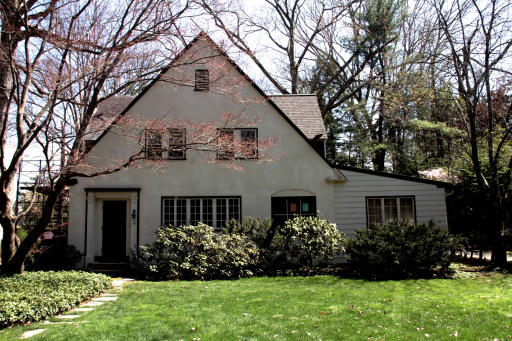
DURING: Exterior, mid-new roof. I neglected to do before shots of the exterior because the place was surrounded by snow every time we saw it until we started.

So, I’ve been pretty absent from the blog lately, and, well, that’s because I’ve been pretty busy in real life. We got the pied-à-deux livable, and then had to immediately return to life in the Big House, in part because I was asked to help some clients design a whole house remodel. You heard that right: they found a fixer in an incredible neighborhood (on a coveted street) and wanted to just go for it. And they requested me. (Picture a small tear of gratitude welling in my eye.)

Having seen Dave’s craftsmanship and my design work in this kitchen and bath, as well as my entire house, they asked to have us come through the house and toss out a few ideas. You can’t imagine how overwhelming it is to meet new people, have brokers, builders, and other subs there, and to try to get to know someone’s taste/aesthetic/vibe right away. As we walked through the house, I got a feeling right away for what it should look like. For how it should be changed to meet the needs of a modern family. I felt like I could do a good job. And I was scared shitless.

read on…