*Lyrics reluctantly from a Taylor Swift song, Never Grow Up. Reason one: the younger of the two Project W kids, and the one who was most interested in the whole design process, LOVES her, or at least did the last I heard. Reason two: the song I really wanted to use was, well, a bit of a downer, and not at all representative of the beautiful and loving family that I was honored to work with. But, in my defense, the lyrics I was going to pick out from the rejected song (Jeff thought I should leave it out of the post entirely) were the (sweetly, sad, yet) positive bits: “Kid, have your say, ’cause I still love you, even if I don’t see you again.” So, instead I give you vapid tweenie-bop music. You may choose to listen as your mood dictates, but know that the second, deeper one by Neko Case is brutally beautiful, and will probably make you cry. (The first one might make your ears bleed. You have been warned.)
Now it’s time for another installment of Project W: The AFTER tour! When we last left off, we were sneaking around the master bedroom and bath, basking in the improved flow and potential for timeless style. Let’s move into the kids’ wing of the upper floor, shall we?
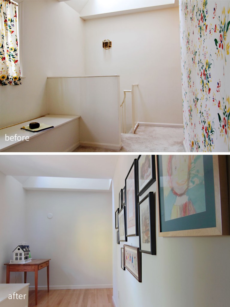
BEFORE: This space started out as a strange pass-through with a skylight and a spiral staircase. AFTER: This little corner will now become a reading nook, or a homework zone if the kids need some quiet space.
Just off the area where the spiral staircase used to be (we nixed it in an effort to gain more usable space in the kitchen), is the kids’ wing. It’s private, away from the parents’ master suite, and has its own family bathroom (still to be renovated). While the hallway boasts the same color as all of the transitional spaces in the home – foyer, mudroom, hallways, stairwell all in Toque White (early on my builder asked me to choose only Sherwin Williams colors) – the kids’ rooms depart from the main thrust of the home to reveal individual and personality-based spaces perfect for the rejuvenation of young minds.
When it came time to fold the kids’ bedrooms into the design scheme, I decided to let their tastes guide me. The elder son was 15 going on 16, and had some pretty strong ideas about what he liked, and who he was. The younger daughter was 11 going on 12, and was completely interested in design (she not only showed up for every design meeting, she paid close attention and offered her own ideas and opinions). Who am I to tell young people what they should or shouldn’t like? I took their major wants and needs, and tried to nudge them a little toward a long-lasting scheme that would adapt with the big changes that they will both face in the coming years.
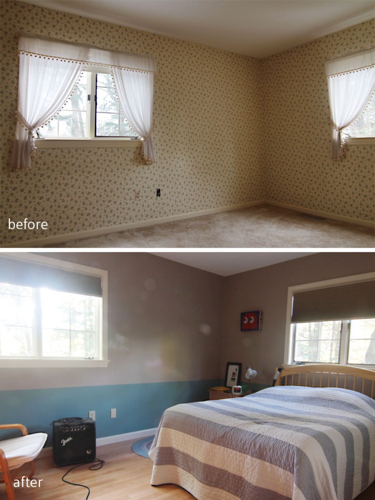
BEFORE: He was none too pleased with the floral wallpaper, dainty curtains, and carpeted floor. AFTER: New wood floors, paint, and a few blackout shades (completely necessary for teenagers) make this space ready to grow along with him.
With his room, I focused on easy masculinity, with a touch of modern edge. He’s a gamer, and a studier, and a quiet dude. Surprisingly, he had a lot to say about my first plan (surprising only to me – I was just getting to know the family when I offered these boards), so I made some adjustments to suit his tastes. Still waters run deep, you know? I ended up offering a slightly more grown-up version of what he liked – chocolate browns and blues – with room to expand a bit. I knew his parents couldn’t afford to simply purchase all new things for him, but that a mood board might guide their purchases in the future.
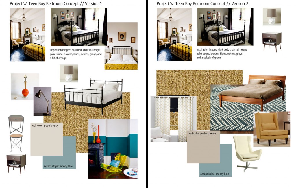
Initially our budget called for replacing the wall-to-wall carpeting with more carpeting, but the clients ended up deciding to splurge on hardwood flooring. I tried to offer some options for what might suit a man-to-be in version 1, and adjusted my notions for a more specific young man in version 2.
For the time being (and until some of the budget coffers are replenished), he is mostly using the furnishings he already had. The wall paint – in Perfect Greige and Moody Blue up to the 30″ mark – helped make the room feel taller, which is helpful for this already nearly 6′ tall young man (his dad is quite tall, so I expect him to keep on growing). We chose a simple ceiling fixture (for both rooms), and focused on a furniture layout that would provide him with the most amount of privacy possible.
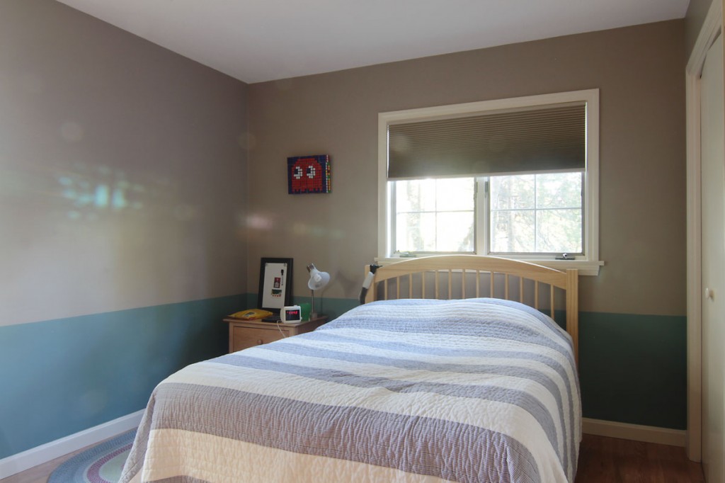
The painted chair rail adds a bit of interest in this primarily neutral space, but doesn’t take our young person too far outside his personal comfort zone.
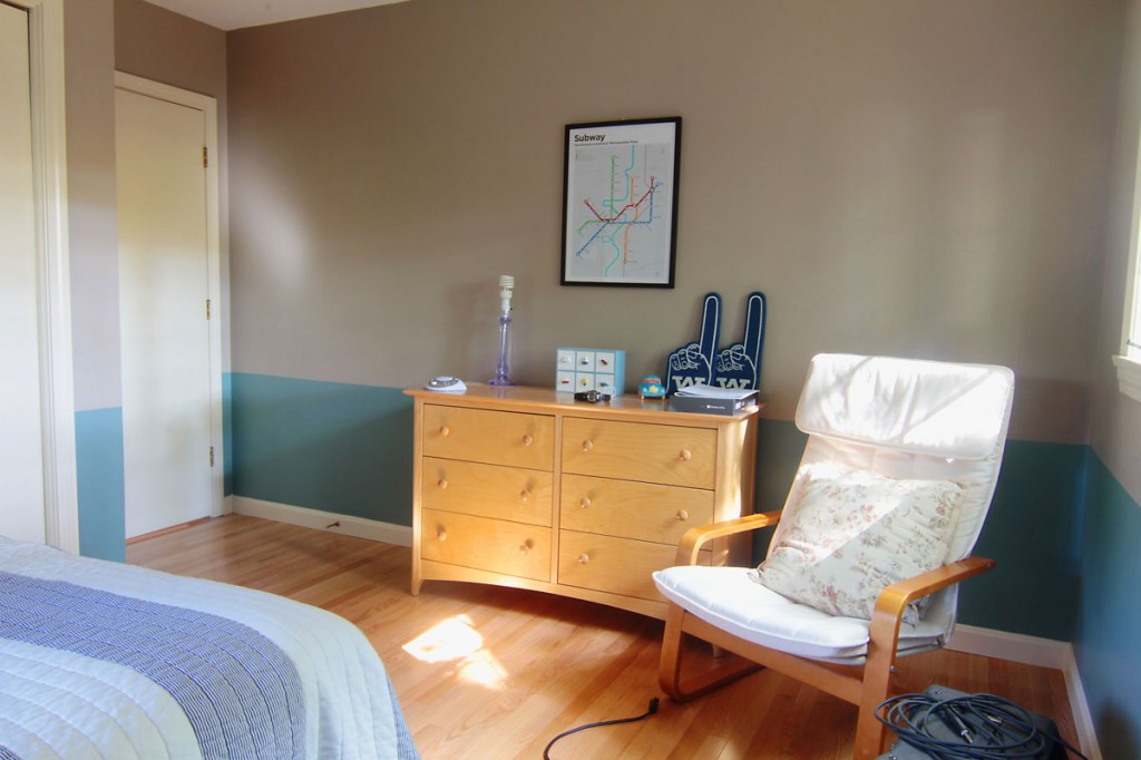
With room for a chair, he can use this room as more of a sanctuary (which we all needed when we were teens, right?).
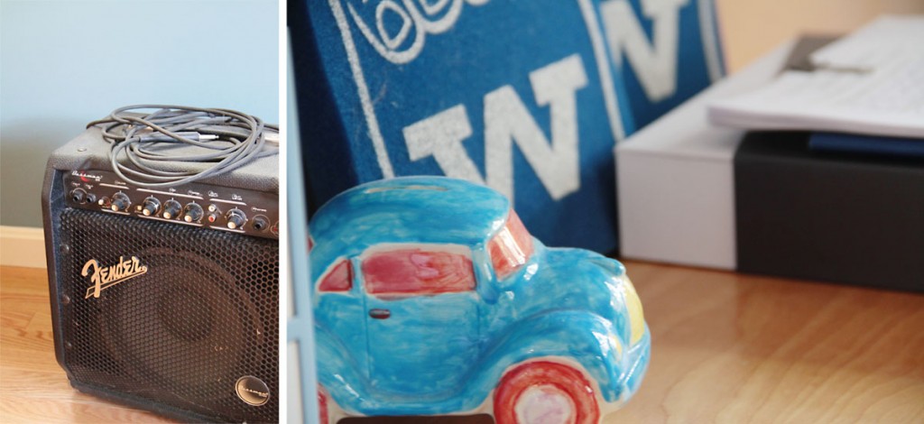
Still personalizing and decorating, our young man has been able to carve out a few spots for his favorite things. I am assured that he is a huge art fan, and I am excited to see which pieces eventually end up on his walls.
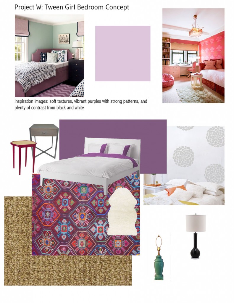
With her room, I focused on her favorite color: purple. Initially she wanted the entire room in a deep, dark hue, but I suggested an accent wall in Vigorous Violet – supported by a pale lilac tone (Euphoric Lilac) – that could be easily adjusted as her tastes (inevitably) change. (She even had a Houzz account that she used to share inspiration images to show me what she wanted – girl was on top of things!)
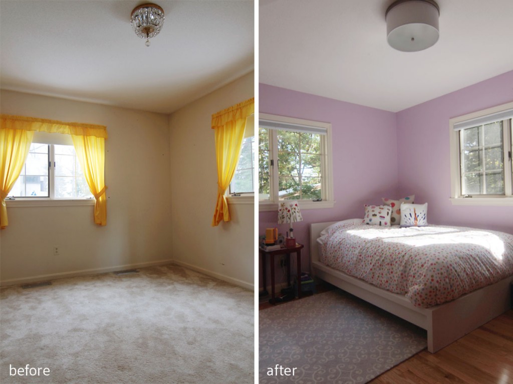
BEFORE: She wasn’t at all happy with the carpeting, or the yellow drapes, but she loved the light (she claimed her room first). AFTER: Her love of purples, plus light, gave us a starting point for a girly but sophisticated space.
We installed some oversized flower decals in silver to lend a girly, but modern edge to the space, and because it wasn’t paint (and it wasn’t permanent), she was able to do it with me (and she can just peel it off when/if she tires of it, which her parents really liked). I loved sharing that experience with her, especially since she seemed so genuinely interested in design.
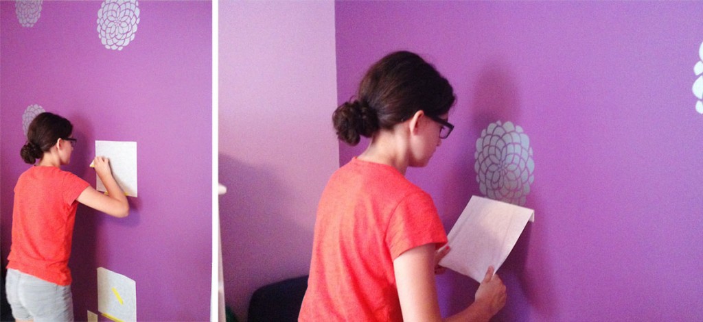
My little helper (whose mother also helped, despite insisting that she was not at all crafty) was intense while she worked. I loved it.
With her mood board, because she was so vocal early on, I was able to make suggestions that would take her room from little girl to young woman, without rushing things along. Nobody wants their baby to grow up too soon, but they also don’t want to be buying new curtains 6 months after they move in, either. We walked that fine line together.
There’s still room for adjusting, and I’m sure the kids will continue to make those spaces their own as time goes on. Since the rooms are tucked away, and not visible to any of the public spaces, I felt the colors need not be as connected to the rest of the home’s color palette. Besides, with kids’ spaces, the rules are really meant to be broken. I really wanted to help support and celebrate the kids’ individuality, as well as give them a sense of ownership in their new home. It’s tough to move, especially when you’re in the depths of teenage-hood, so I wanted to help make the transition as painless as possible.
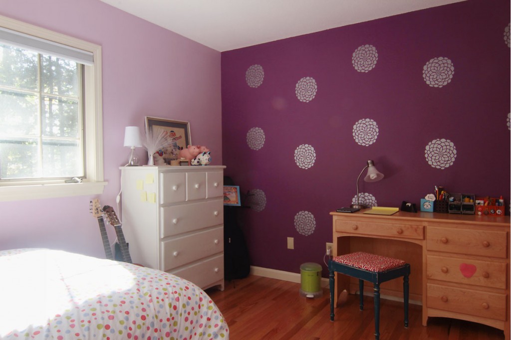
Voila! Our decal layout, and careful application resulted in just what we wanted to achieve: a wallpaper effect that was equal parts trendy and temporary. I know that someday she’ll peel these decals off, and repainting will be a simple affair.
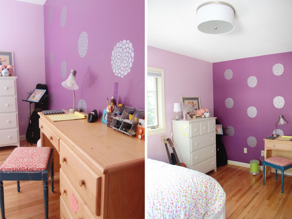
While he didn’t want a desk in his room, she did. I had originally suggested that she position her bed on this feature wall but she wanted to enjoy it from both activity spots in her room.
Lucky for me, this family is incredible, and have taken to these design schemes like ducks to water. I can’t wait to see how these rooms evolve over time.
xoxo
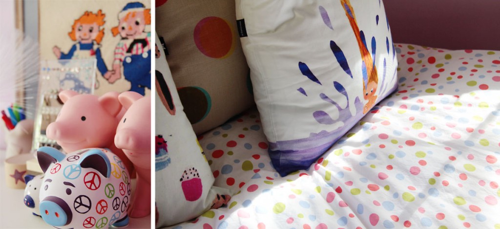
I love the choice of purples. As we all know from the Ace Hardware commercial, finding the right puuuurple can be difficult 🙂
Ha! Thanks, girl.