Category Archives: living room

How long can you stand it, there’s no end in sight…*

*Lyrics from Hold On by Róisín O from their 2012 album, The Secret Life of Blue. I heard this song (easily the best from the album) in an Irish independent movie called The O’Briens, but I can’t recall if the movie was worth watching (watch at your own risk, but I recall thinking it was sweet, if predictable). At any rate, her voice is very pretty. And, for serious, the song lyrics are kind of right fucking on. This MIGHT be your life. Or, rather, my life.

The views of the city skyline are one of the best features of this neighborhood.

The views of the city skyline are one of the best features of this neighborhood.

Ok, well, sigh.

Here’s the thing: we’re no closer to finding an apartment to call our own than we were a year ago. The Brooklyn housing market, as I mentioned before, is crazy, but not regular crazy… it’s the kind of crazy that get articles written about it, that confounds (and, alternately delights) seasoned real estate professionals, and that create a sellers’ market of the sellers’ dreams (ten offers per apartment, please!). At any rate, over the past several weeks we did put in offers on a couple of places, and were promptly overbid. Like, by a lot. The price-per-square-foot is outrageous (some of that is city sticker shock) and steadily rising, but add that to the feeding frenzy of record low inventory, and you get bidding wars that are taking the prices anywhere from 4% to upwards of 13% over asking (asking price means very little right now). All of this is to say, we’re not comfortable buying (or attempting to buy) at the top of what we perceive as a real estate bubble (not to mention that we don’t have the buying power that many of our competitors seemingly have).

A friend posted this to instagram. Yep, says it all.

A friend posted this to instagram. Yep, says it all.

If the market subsides (which all indications say it won’t for some time), we’ll reconsider our position, but for now, we’re tabling the issue. Which really sucks. We might consider trying to find a larger rental apartment, but with summer on the horizon, we’re reluctant to give up our (very rare and private) roof access when there isn’t much public green space/park space to enjoy in the neighborhood. Our location is great for lots of reasons – proximity to Jeff’s office, restaurants, parking, etc – so, for now, we’re going to stay put. read on…

Take me out of this place I’m in…*

*Lyrics from Human by Daughter off their album If You Leave. I found this on spotify (naturally) and really enjoyed their acoustic “spotify session’s” version. I recommend you check it out before you hear their original album version. The song felt appropriate for my first substantive post in a while. After all, we’re all just human, underneath it all.

I know. I know! It’s been a long, LONG time since we moved in. Since I shared anything relevant to design. I know. Let me make it up to you?

Welcome home.

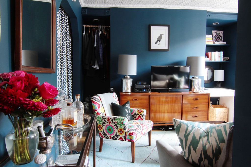
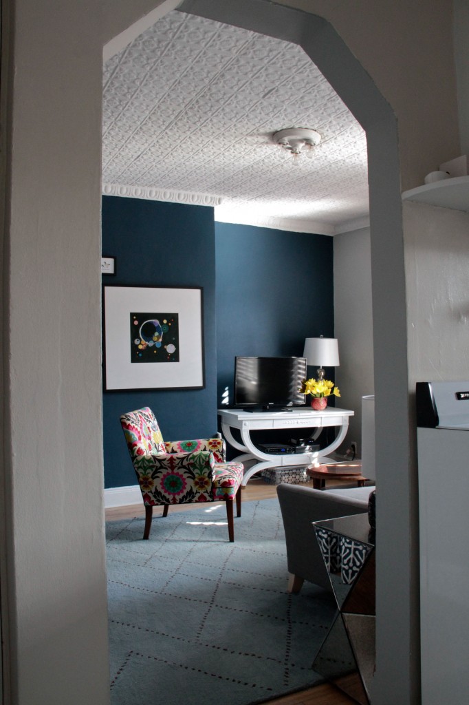
So, here it is, the Pied-à-Deux: our tiny, sweet, tiny, small, cozy, small, bitty, efficient, annoyingly small living room. And it’s our entryway, and our closet, and my office, and our guest room, and part of our bedroom in that the TV sits on a dresser 2/3 full of our clothing. It’s small. It’s been tough to cope with how small it is, but we really tried to make it as beautiful and practical as possible. And we do like it very much.

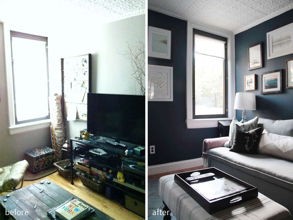
BEFORE (left): Former tenant’s furniture layout didn’t feel as useful to us. AFTER (right): We reoriented the sofa/TV layout to allow for easier access to the niches.

read on…

After everything…*

*Lyrics from Heavy Feet by Local Natives. I listened to their newest album, Hummingbird, on repeat for three days straight, and then I took a break so I wouldn’t ruin it for myself. You all know I love them. This song is why. Plus, read on, and you’ll see why these words resonated for this post.

Our eclectic vibe, inspired in part by a gift from my sister.

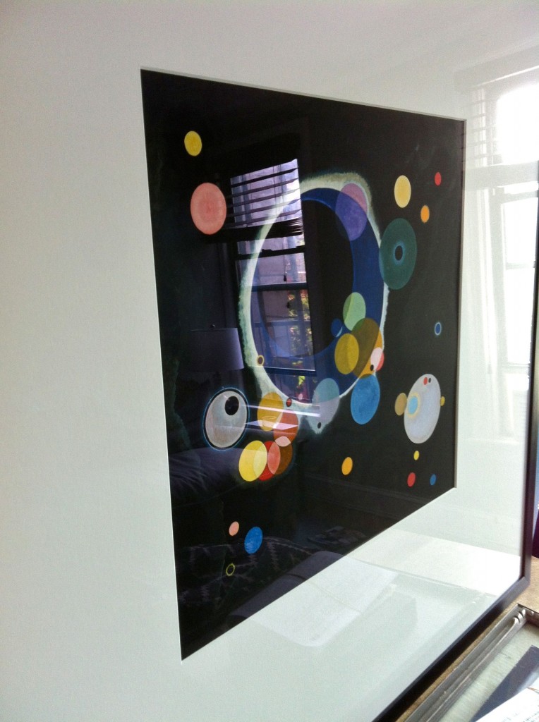
You see, a few Christmases ago, my younger sister gave me a print of a Kandinsky painting she spied that reminded her of my love for blurry dots. I actually and sincerely love that side-effect of having poor distance vision, that blurring of all the edges and background that happens in movies, the way that light turns into semi-transparent glowing orbs that sparkle and move when you blink. It’s really just poor vision, but I find it beautiful (and one of the reasons I don’t want Lasik). It took us years – quite literally two actual years – to muster up the effort to go and have it professionally framed. It was an odd size, and also a really high quality print – no cheap frame would do. But, once we did have it framed, we decided it would be the major inspiration point for our color scheme and vibe at The Pied.

Custom framed with a coupon at Michael's, this bit of art is the center of our design direction.

read on…

In five years time, you might just prove me wrong…*

*Lyrics from Five Years Time by Noah & The Whale. I don’t really know why I chose this song for today – I had a note about using it for this reveal in my phone. Maybe it’s because I don’t expect to be living here in 5 years’ time, nor do I expect to like all the same things that I do now. Hell, I don’t even think I’d recognize my former self from 5 or 10 years ago. Let’s just say I’m a transition-er, in transition, with transitory leanings, and eagerness to roll along. Shall we?

The view from the dining area in the kitchen.

One glance around our pied-a-terre and you’d think we were the vainest bunch around. There are mirrors in every room, including an additional mirror in the bathroom (that means there are two in there), and a mirrored end table that makes the idea of drinking martinis in this space seem that much more glamorous. But, the mirrors aren’t all about looking at ourselves (though that extra one in the bathroom certainly is). They’re about bouncing light around, and making this teeny space feel bigger, brighter, and by extension, more livable for longer.

You see, when we first approached the paint options for the space, we knew we needed to eradicate the pale cream/dirty yellow completely (or as completely as we could – the kitchen still sports that soul-killing color, but we distract ourselves with delicious foods and tantalizing wines). So, we chose a deep tealy-blue – Gentleman’s Gray by BM – for one wall in the living room. (The other walls in the living room are Coventry Gray also by BM. Funnily enough we had chosen another gray, but the clerk made a mistake. We didn’t notice until after we had begun to paint, so we just went with it. Happy accident? Ok, sure.) We wanted the room to feel cozy, but not small, and to highlight the architectural details that were worth noticing – the crisp white painted tin ceiling and crown, the high baseboard moldings – while minimizing the ones that were more awkward – the chimney breast bump out, and the strange little locker storage areas next to it. We wanted to expand the wall to make it feel broad, tall, and rich. Though naturally all that depth came at a price, and that price was light.

read on…

And it was all yellow…*

*Lyrics from Coldplay‘s first single, Yellow, off their first album, Parachutes. Don’t you miss old Coldplay? Don’t get me wrong, I still love Chris Martin’s voice, and they’re clearly talented, but, well, maybe I shouldn’t like the same band that my 9 year-old niece thinks is great (‘OMG, I LOVE them!’). Maybe I’ll just remember when…

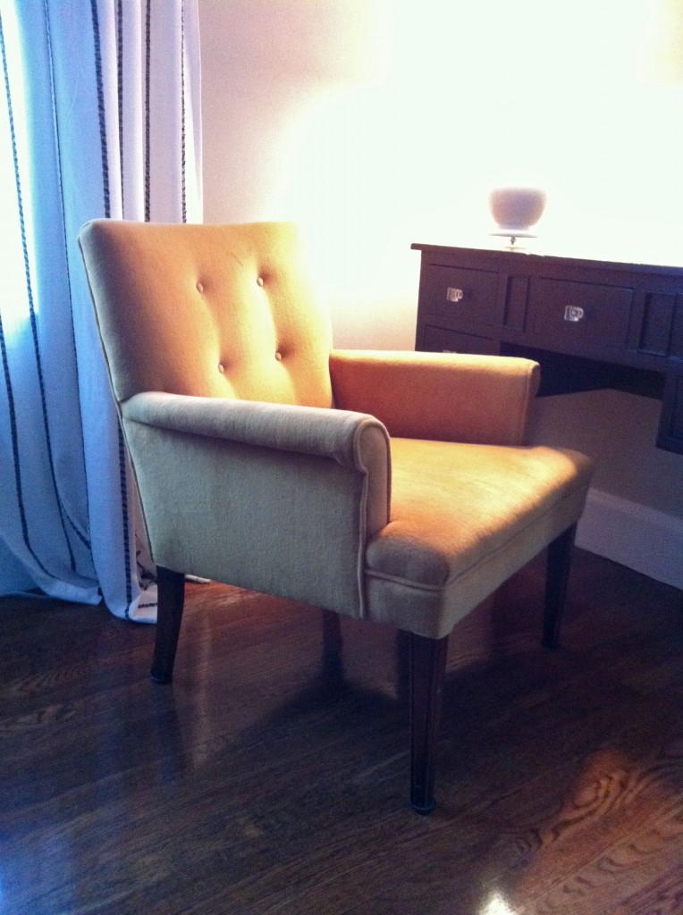
BEFORE: Mustard velvet upholstery, while in excellent shape, wasn't our bag, baby. Plus, there was a squeaky spring in the seat that was mildly annoying.

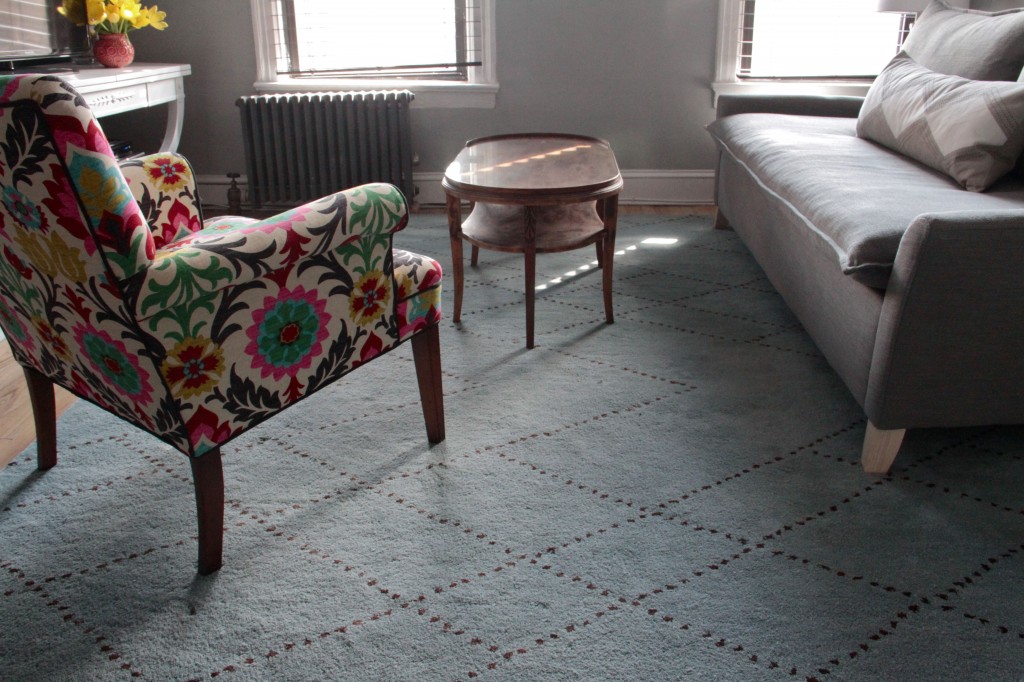
Speaking of ‘remembering when,’ remember when I moved into my pied-à-terre and I was all ‘we’re going to do this fast because we must’? Yeah, well, turns out, not so fast. Some things went really quickly – e.g., choosing and applying paint colors, buying a sofa and mattress, getting some cabinetry for the kitchen – while other things moved much slower – e.g., accessorizing, figuring out where to put things, getting a table for the TV, hanging art. All along, however, there was the dream to reupholster a little vintage chair I had originally purchased for my tiny mom (the chair felt a little lower than today’s chairs, and she’s shrimpy short) and move it to the apartment. We have limited floor space, and limited doorway and hallway space (see: the bed debacle), and this petite chair that wasn’t going to work for my mom seemed perfect. All we had to do was choose a fabric.

Chirp, chirp, chirp. Choosing a fabric. One would think it would be easy. As it turns out, not easy at all. It took months. And months. As a matter of fact, when the upholsterer finally came to pick up the chair (they pick up!) and get started on it, the whole process only took about a week. He had a slot open up in his schedule, and just powered through it. So, we were the hold-up on this one. No one else to blame but ourselves.

read on…

No need to hide, come on inside…*

*Lyrics from I Am An Ape from the collaboration album Love This Giant by David Byrne and St. Vincent. I think this album is challenging, but interesting, and quirky, and catchy, and absolutely worth a serious listen. I don’t always need music to be easy, and when I respect the artists involved, well, it’s kind of like music, to my ears at least. Hope you give it a try, and let me know how you like it.

House Tour: Living Quarters

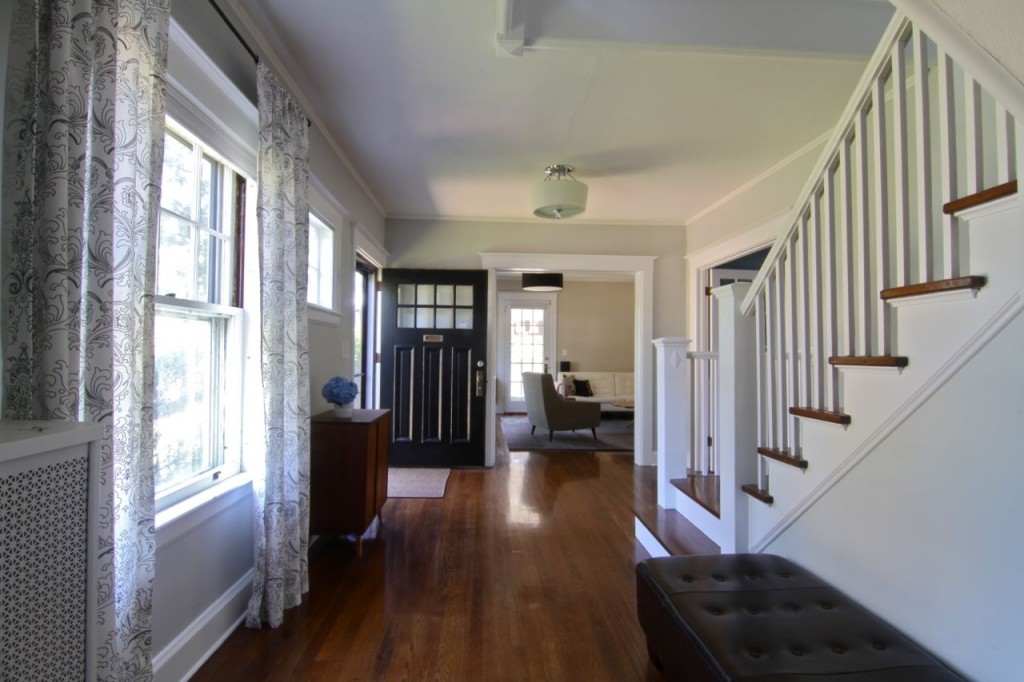
The foyer, or entryway, is both grand and homey. It connects virtually every space in the house, especially when you take into account that the two-story entrance snakes continues on through the hall that connects all the bedrooms upstairs.

Despite our choice to now live a bi-polar dual-homed existence, our home is still actually for sale. And, though my focus is on making the new spot as homey as possible, I thought you might like to see a re-cap of our living space – or, living quarters as I’m calling them. The architecture of this home, built in 1920, provides for a connected-ness that most modern families crave, while at the same time allowing for some privacy, and some division of activities. For example, many people love the look/feel of a so-called ‘open plan’ space, where the kitchen, dining and living rooms are one Great Room. Not me, and apparently not builders in the 1920s. I prefer the kitchen to be its own space – after all, sharp, hot, and time-sensitive duties (i.e., people rushing around with sharp and hot things) are performed there, which can make a mess, which can be unsightly to guests and other family members alike. But, even though I treat the kitchen as a work-zone (which, if you’re like me, it most certainly is), the living room and dining room feel like fluid extensions of one another. The builders in 1920 agreed with me there, too.

read on…

Is this the way to live, is it wrong to want more?…*

*Lyrics from Feist‘s Undiscovered First from her ablum Metals. The video I picked was from the Black Cab Sessions recording, and I chose it for a few reasons: (1) because I always like to showcase an alternate recording to the album version when I can; (2) because they all look like they had tons of fun working in a moving vehicle (and bonus points for it being in an English cab); and, (3) because if Feist can not only perform, but also shine in a tiny, teeny space, then I have no excuse, have I?

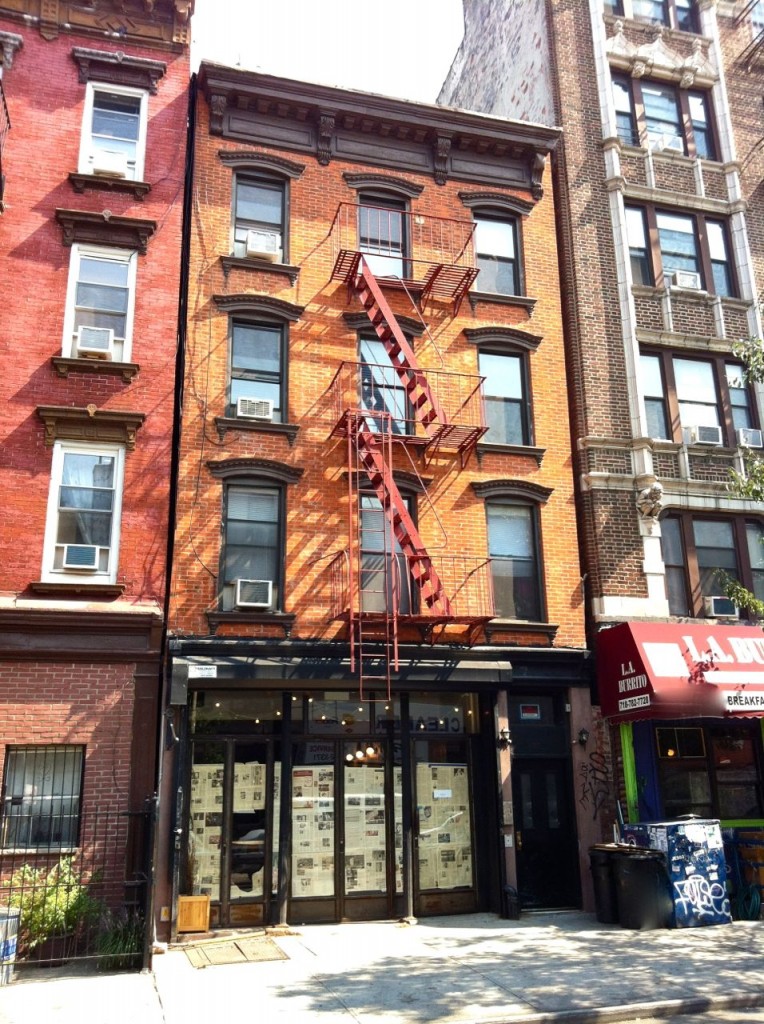
There's the new place! We're above a new restaurant - a sausage and beer place - so quiet, it's not. But, hey, at least there'll be sausage and beer!

The first thing you do when you downsize – and in this case we not only downsized, but also downgraded – is to compare what you had with what you now have. In our case, we’re going from a home that we spent the last few years lovingly renovating to a state of comfort and luxury, to a rental unit that has seen its fair share of occupants (and coats of glossy, pale yellow-ish paint) over the years. The contrast, to put it mildly, is stark.

read on…

My motto’s always been, when it’s right it’s right…*

*Lyrics from the Ron Burgundy and the Channel 4 News Team’s rendition of Afternoon Delight. Feel free to oversaturate your love for Anchorman by watching this clip from them singing it in the movie, too. 

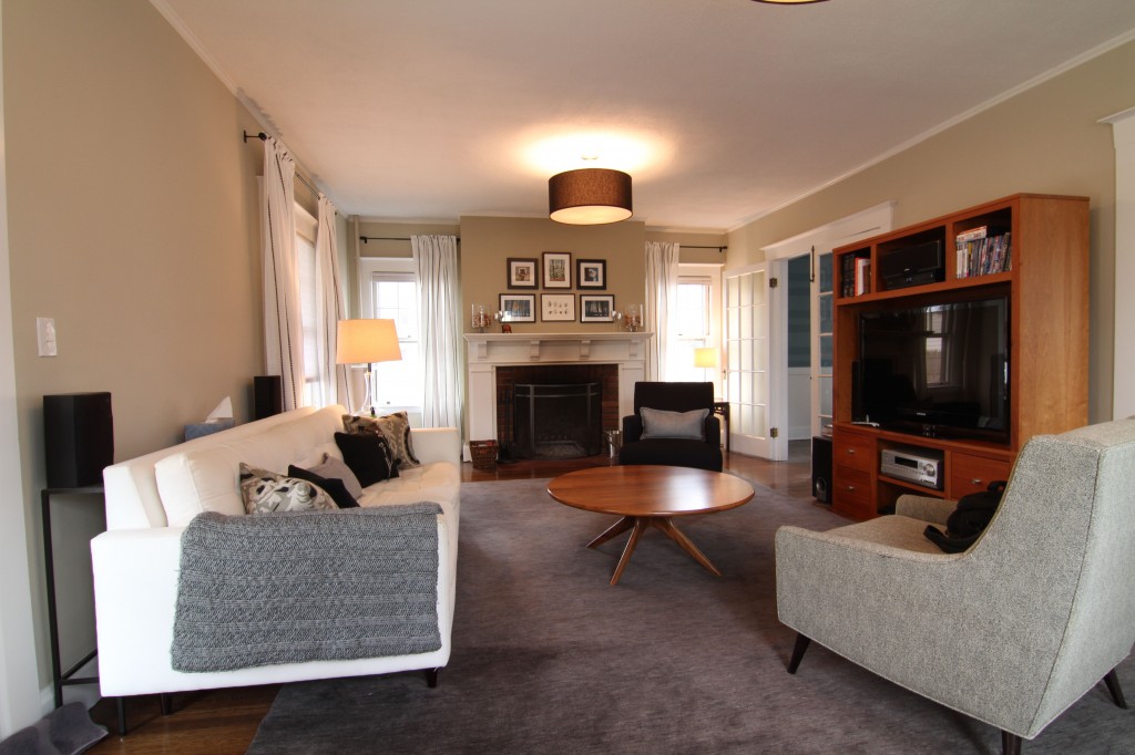
The living room, open to the dining room (and foyer), has handsome drum fixtures on the ceiling, but needs some fresher lights in the face space.

With our new thrift/antique side tables in the living room settling in nicely, and with new curtains beginning to give the space a more homey, lived-in feel (only took us 5 years to nail down a curtain choice), I thought it might be an appropriate time to examine the lighting scheme. As Brick said so eloquently in Anchorman, “I love lamp.” But, as Ron Burgundy questioned him, “Do you really love the lamp, or are you just saying that?” I, too, had a similar conversation with myself, and then with Jeff… did he really love our lamps? Because I certainly did not. Specifically in the living room where IKEA lamps reign supreme, where each lamp is merely a shade balanced on a spindly little tube of chrome (which can be beautiful, don’t get me wrong), and where the only lamp we have that has any mass is too tall (and therefore a tiny bit blinding while sitting) for the space. It’s not really working, and so I’m on the hunt for better choices.

Our sole sofa-side lamp sits just a bit too high causing a bit of a blinding spot on that side of the room.

read on…